Chart position — tracked daily by LaunchShots
Screenshot style breakdown
Sampled from 6 of Weather Perfect - BOM Radar's App Store screenshots — background, accent and theme, measured by LaunchShots (not something Apple publishes).
#F4C454 bg
#D6AC49
#5C7CCC accent
#111111 text
Screenshots
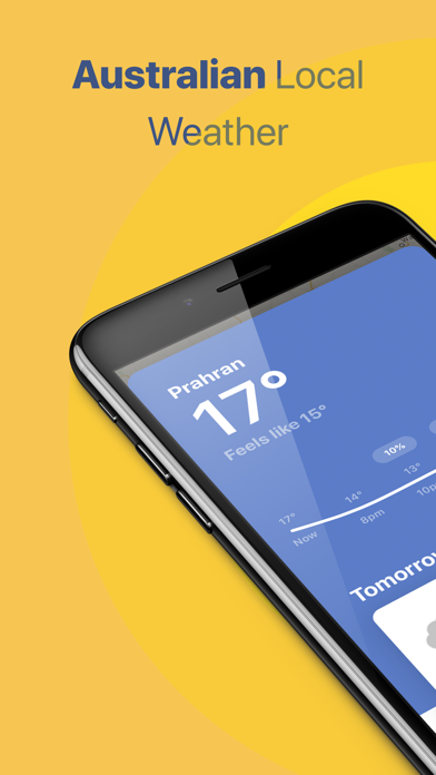

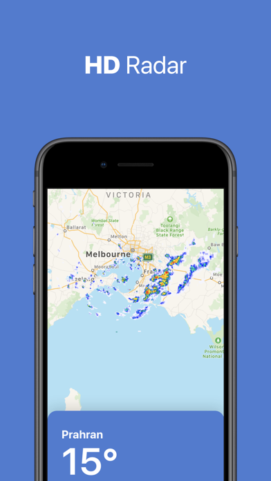
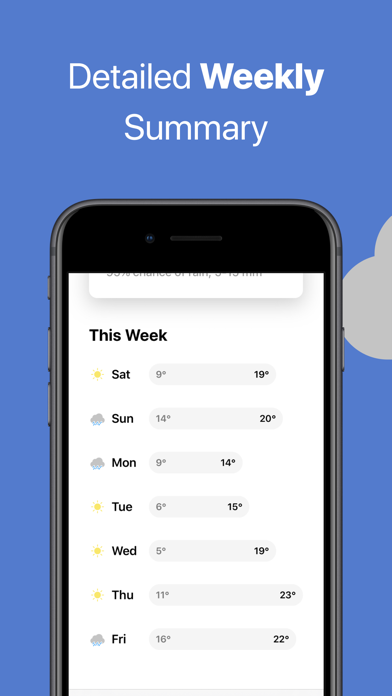


iPad screenshots


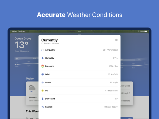

Icon palette
About this app
The perfect app for Australian radar and weather forecasts. Up to the minute hyper accurate weather reports displayed in a beautiful interface. ACCURATE & LOCAL Local weather reports for Australians. Utilising high quality data from the BOM (Bureau of Meteorology), never get caught in the rain again. HD RADAR* Track upcoming storms and rainfall with the interactive HD rain radar. MULTIPLE LOCATIONS* Add your favourite locations to keep track on the weather Australia wide. TODAY WIDGET* Quickly see today's current, forecasted, hourly, and weekly temps from your home screen. Also includes a widget for quick access to detailed condition information include wind, UV, humidity, rainfall and more, WEATHER TIMELINE Explore up to 7 days of hourly forecasts*. Tap the graph to view detailed minute by minute condition, rain, wind, temperature, and UV data. APPLE WATCH APP View the current, …
App details
What you can learn from Weather Perfect - BOM Radar
Every shipping app on the App Store has gone through the same decisions you're working through right now: which screenshot goes first, what caption sits over it, which device frame to show, what color the background should be. The 12 screenshots above are Weather Perfect - BOM Radar's answers to those questions — they're public, they're real, and they made it through Apple's review.
What the numbers say: Weather Perfect - BOM Radar runs a mixed light-and-dark set where the background shifts from screenshot to screenshot (first shot #F4C454) — each image has to stand on its own, so the captions carry more of the story. The accent colour we picked up, #5C7CCC, is the one to reuse for badges, arrows and highlighted words if you borrow this look. Hit Use this style to open the editor with these exact colours and drop your own screenshot in.
Notice the first screenshot in particular. It's the one users see in search results and on the product page, and it's where most apps spend their best caption and tightest design. Look at the proportion of background to phone, where the text sits, what one thing the image is trying to communicate.
Want to see how other Weather apps approach the same problem? Browse more Weather apps in the showcase.
Take what works into your own screenshots
Open LaunchShots and design your App Store & Google Play screenshots — pick a device frame, drop captions, ship in minutes. Free, in your browser.
Open the screenshot editor →Apps with a similar look
Closest background + accent colours among the listings we've analysed — useful when you want to see the same palette handled by a different team.