Chart position — tracked daily by LaunchShots
Screenshot changes — detected by LaunchShots
Screenshot style breakdown
Sampled from 6 of Nihaojewelry-Mayoreo en Línea's App Store screenshots — background, accent and theme, measured by LaunchShots (not something Apple publishes).
#FCF4FC bg
#DDD6DD
#BC9474 accent
#111111 text
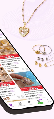
- #1Sin Pedido Minimo Precio De Fabrica
- #3Última LAS ÚLTIMAS ACTUALIZACIONES Bisutería 2026 2026 2026
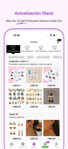
- #4Actualización Diaria Más De 10,000 Productos Nuevos Cada Día 19:28 7.
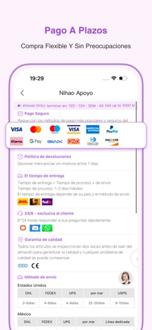
- #5Pago A Plazos Compra Flexible Y Sin Preocupaciones 19:29 se
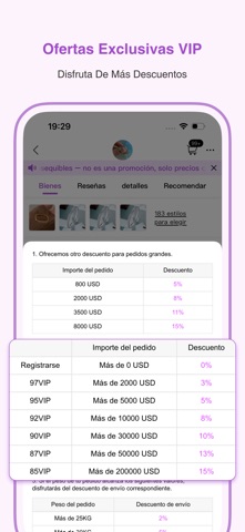
- #6Ofertas Exclusivas VIP Disfruta De Mas Descuentos
Captions read from the screenshots (OCR, may contain small errors): 5 headlines, 8.4 words on average (longest 11).
Screenshots




Icon palette
About this app
Nihaojewelry Joyería y Accesorios de Moda al por Mayor La aplicación Nihaojewelry es un mercado profesional de joyería al por mayor diseñado para pequeños y medianos empresarios, facilitando y haciendo más eficiente la compra y reposición de joyería y accesorios de moda. Ofrece más de 800.000 productos populares sin cantidad mínima de pedido, a precios directos de fábrica y proporciona diversas opciones de pago en cuotas. Se añaden más de 10.000 artículos nuevos cada día, manteniendo a los vendedores actualizados con las últimas tendencias del mercado. Al utilizar la opción de envío “Nihao Prime”, los pequeños vendedores pueden operar sin la carga del despacho de aduanas, aranceles o complejas gestiones logísticas transfronterizas, ya que todos los procesos y costos relacionados son gestionados por Nihaojewelry. También ofrecemos soluciones logísticas flexibles, incluyendo transporte …
App details
What you can learn from Nihaojewelry-Mayoreo en Línea
Every shipping app on the App Store has gone through the same decisions you're working through right now: which screenshot goes first, what caption sits over it, which device frame to show, what color the background should be. The 8 screenshots above are Nihaojewelry-Mayoreo en Línea's answers to those questions — they're public, they're real, and they made it through Apple's review.
What the numbers say: Nihaojewelry-Mayoreo en Línea runs a light set with one background colour (#FCF4FC) carried across every screenshot — the listing reads as a single poster when the shots sit side by side in search results. The accent colour we picked up, #BC9474, is the one to reuse for badges, arrows and highlighted words if you borrow this look. Hit Use this style to open the editor with these exact colours and drop your own screenshot in.
Notice the first screenshot in particular. It's the one users see in search results and on the product page, and it's where most apps spend their best caption and tightest design. Look at the proportion of background to phone, where the text sits, what one thing the image is trying to communicate.
Want to see how other Shopping apps approach the same problem? Browse more Shopping apps in the showcase.
Take what works into your own screenshots
Open LaunchShots and design your App Store & Google Play screenshots — pick a device frame, drop captions, ship in minutes. Free, in your browser.
Open the screenshot editor →Apps with a similar look
Closest background + accent colours among the listings we've analysed — useful when you want to see the same palette handled by a different team.