Chart position — tracked daily by LaunchShots
Screenshot style breakdown
Sampled from 3 of Простой Рабочий Календарь's App Store screenshots — background, accent and theme, measured by LaunchShots (not something Apple publishes).
#747C84 bg
#878E95
#243C5C accent
#FFFFFF text
Screenshots

iPad screenshots
Icon palette
About this app
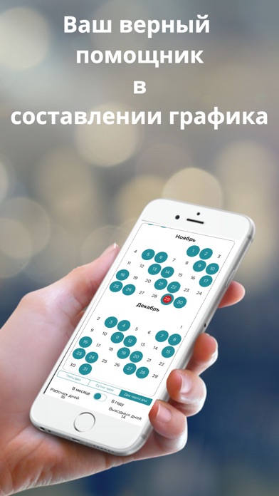
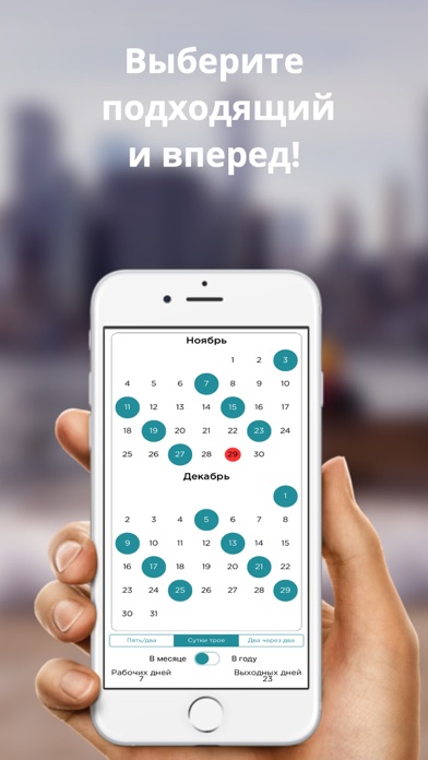
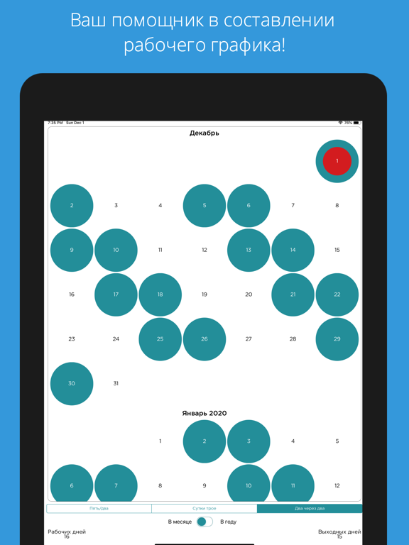
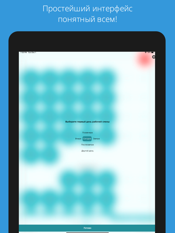
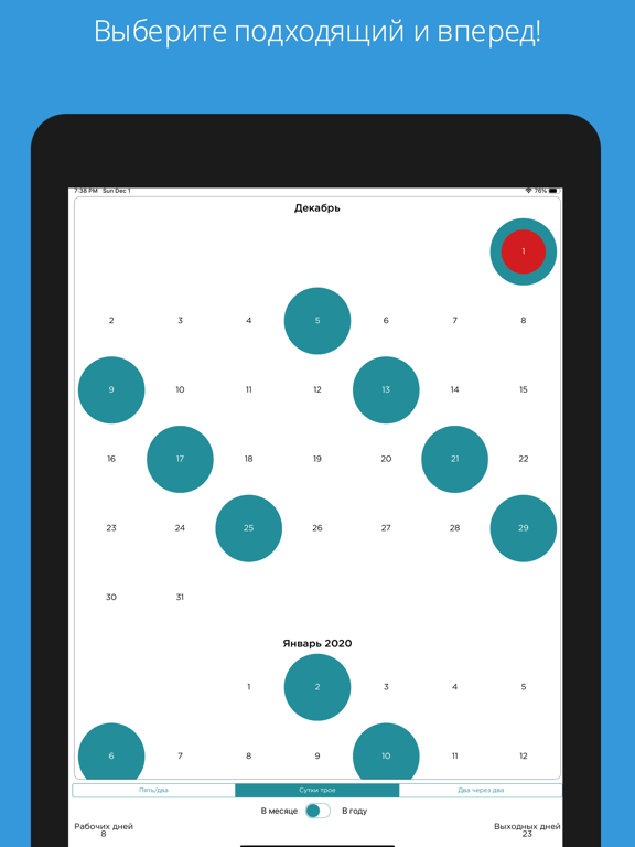
Простой Рабочий Календарь — сменный график работы в пару нажатий. Выберите цикл, отметьте первый рабочий день — календарь сам рассчитает все смены и выходные на годы вперёд. ЛЮБОЙ ГРАФИК • Готовые циклы: 2/2, 3/3, сутки через трое (1/3) • Свой график: любое число рабочих и выходных дней — 5/2, 4/2, 6/1, вахта 15/15 и другие • Скользящий график с любой датой начала — сегодня, завтра, когда хотите! НОЧНЫЕ СМЕНЫ • Отмечайте, какие смены в цикле ночные — они видны тёмным цветом • Нажали на любой день — поменяли: день → ночь → выходной • Ручные правки не ломают график: план остаётся, изменения поверх СЧЁТЧИКИ • Сколько рабочих и выходных в месяце или в году — считается автоматически • Красная точка — сегодня: всегда видно, где вы в цикле ДЛЯ КОГО Медсёстры и врачи, работники заводов и производств, охрана, машинисты, водители, продавцы, спасатели, вахтовики — все, кто работает не по будня…
App details
What you can learn from Простой Рабочий Календарь
Every shipping app on the App Store has gone through the same decisions you're working through right now: which screenshot goes first, what caption sits over it, which device frame to show, what color the background should be. The 6 screenshots above are Простой Рабочий Календарь's answers to those questions — they're public, they're real, and they made it through Apple's review.
What the numbers say: Простой Рабочий Календарь runs a mixed light-and-dark set where the background shifts from screenshot to screenshot (first shot #747C84) — each image has to stand on its own, so the captions carry more of the story. The accent colour we picked up, #243C5C, is the one to reuse for badges, arrows and highlighted words if you borrow this look. Hit Use this style to open the editor with these exact colours and drop your own screenshot in.
Notice the first screenshot in particular. It's the one users see in search results and on the product page, and it's where most apps spend their best caption and tightest design. Look at the proportion of background to phone, where the text sits, what one thing the image is trying to communicate.
Want to see how other Productivity apps approach the same problem? Browse more Productivity apps in the showcase.
Take what works into your own screenshots
Open LaunchShots and design your App Store & Google Play screenshots — pick a device frame, drop captions, ship in minutes. Free, in your browser.
Open the screenshot editor →Apps with a similar look
Closest background + accent colours among the listings we've analysed — useful when you want to see the same palette handled by a different team.