Chart position — tracked daily by LaunchShots
Screenshot changes — detected by LaunchShots
Screenshot style breakdown
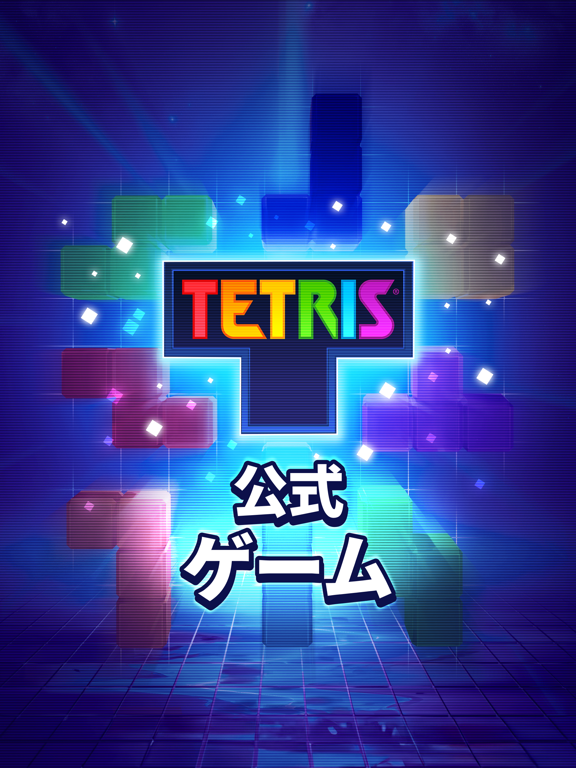
Sampled from 5 of Tetris® - テトリス (公式ゲーム)'s App Store screenshots — background, accent and theme, measured by LaunchShots (not something Apple publishes).
#1C1464 bg
#3B3479
#244CAC accent
#FFFFFF text
Screenshots


iPad screenshots


Icon palette
About this app
積む。消す。繰り返す。TETRIS®、世界で最も象徴的なパズルゲームが、ついにモバイルに登場し、あなたのポケットに戻ってきました。サクッと一勝負、ハイスコアを目指して、または期間限定イベントに参加しましょう。同じ象徴的なブロック、まったく新しいプレイスタイル。 自分のスタイルで遊ぼう • スワイプしてラインを消し、手数がなくなる前にレベルのパズルを解こう。 • クラシックマラソンモードで、終わりなき没入感あふれるプレイを楽しもう。 • TETRISをオフラインで楽しもう。いつでも、どこでも。 TETRISマスターを目指せ • 手作りで設計された数百のレベルを攻略しよう。それぞれに、あなたが愛するクラシックな要素に独自のひねりが加わっています。 • 新しいテクニックを習得し、より難しい目標を乗り越え、リーダーボードを駆け上がろう。 • テトリミノを回転させ、戦略的に積み上げ、TETRISラインクリアを決めるたびに興奮を感じよう。 さらに探索しよう • カスタム背景、アバター、フレームで個性を出そう。 • コインを獲得して、報酬や追加手数…
App details
What you can learn from Tetris® - テトリス (公式ゲーム)
Every shipping app on the App Store has gone through the same decisions you're working through right now: which screenshot goes first, what caption sits over it, which device frame to show, what color the background should be. The 10 screenshots above are Tetris® - テトリス (公式ゲーム)'s answers to those questions — they're public, they're real, and they made it through Apple's review.
What the numbers say: Tetris® - テトリス (公式ゲーム) runs a dark set where the background shifts from screenshot to screenshot (first shot #1C1464) — each image has to stand on its own, so the captions carry more of the story. The accent colour we picked up, #244CAC, is the one to reuse for badges, arrows and highlighted words if you borrow this look. Hit Use this style to open the editor with these exact colours and drop your own screenshot in.
Notice the first screenshot in particular. It's the one users see in search results and on the product page, and it's where most apps spend their best caption and tightest design. Look at the proportion of background to phone, where the text sits, what one thing the image is trying to communicate.
Want to see how other Games apps approach the same problem? Browse more Games apps in the showcase.
Take what works into your own screenshots
Open LaunchShots and design your App Store & Google Play screenshots — pick a device frame, drop captions, ship in minutes. Free, in your browser.
Open the screenshot editor →Apps with a similar look
Closest background + accent colours among the listings we've analysed — useful when you want to see the same palette handled by a different team.