Chart position — tracked daily by LaunchShots
Screenshot changes — detected by LaunchShots
Screenshot style breakdown
Sampled from 4 of ゆず庵's App Store screenshots — background, accent and theme, measured by LaunchShots (not something Apple publishes).
#FCFCFC bg
#DDDDDD
#D42C24 accent
#111111 text
Screenshots



iPad screenshots


Icon palette
About this app
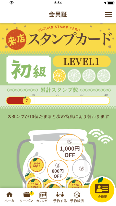
ゆず庵の公式アプリは、お得なクーポンがもらえるだけでなく、お席の予約が簡単にでき、期間限定などの最新情報が満載のゆず庵ファンのためのアプリです。 <スタンプ> ・ご来店1回ごとにスタンプを1つプレゼントいたします。 スタンプを集めれば集めるほど、お得な特典が手に入ります。 スタンプ割引の詳細 スタンプ2個 → 200円引き スタンプ3個 → 300円引き スタンプ5個 → 500円引き スタンプ8個 → 800円引き スタンプ10個 → 1000円引き スタンプ20個 → 2000円引き スタンプ30個 → 3000円引き スタンプ40個 → 5000円引きのクーポンをプレゼントいたします。 ※スタンプは会計翌日以降に付与されます。 ※スタンプ付与は1日に2回までとなります。 ※スタンプの有効期限は最終来店日から1年間となります。1年経つと自動的に消えますのでご注意ください。 ※特典クーポンは、2026年11月10日現在の内容となります。また予告無く特典内容が変更になる場合がございます。 ※スタンプを貯めて取得したクーポンの有効期限は180日間となります。 <クーポン> ・ご自身のお誕生…
App details
What you can learn from ゆず庵
Every shipping app on the App Store has gone through the same decisions you're working through right now: which screenshot goes first, what caption sits over it, which device frame to show, what color the background should be. The 8 screenshots above are ゆず庵's answers to those questions — they're public, they're real, and they made it through Apple's review.
What the numbers say: ゆず庵 runs a light set with one background colour (#FCFCFC) carried across every screenshot — the listing reads as a single poster when the shots sit side by side in search results. The accent colour we picked up, #D42C24, is the one to reuse for badges, arrows and highlighted words if you borrow this look. Hit Use this style to open the editor with these exact colours and drop your own screenshot in.
Notice the first screenshot in particular. It's the one users see in search results and on the product page, and it's where most apps spend their best caption and tightest design. Look at the proportion of background to phone, where the text sits, what one thing the image is trying to communicate.
Want to see how other Food & Drink apps approach the same problem? Browse more Food & Drink apps in the showcase.
Take what works into your own screenshots
Open LaunchShots and design your App Store & Google Play screenshots — pick a device frame, drop captions, ship in minutes. Free, in your browser.
Open the screenshot editor →Apps with a similar look
Closest background + accent colours among the listings we've analysed — useful when you want to see the same palette handled by a different team.