Chart position — tracked daily by LaunchShots
Screenshot changes — detected by LaunchShots
Screenshot style breakdown
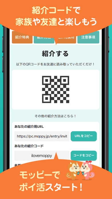
Sampled from 6 of モッピー公式 -ポイ活アプリ's App Store screenshots — background, accent and theme, measured by LaunchShots (not something Apple publishes).
#2CC4BC bg
#26ACA5
#F4E444 accent
#111111 text
Screenshots



Icon palette
About this app
ようこそ!モッピーへ! \モッピー公式アプリは累計700万ダウンロード突破!/ ▼△▼△▼△▼△▼△▼△▼△▼△▼△▼△▼△▼△ 【モッピーってなに?】 これまで、累計1,300万人以上がお得に利用している国内最大級のポイ活サービスです。 商品購入やゲームプレイ、アンケート回答などをすると「1ポイント=1円」の換算率でポイントが貯まっていきます。 貯めたポイントは、モッピー Payはもちろん、お持ちの銀行口座から現金として出金や各種ギフト券、共通ポイント、電子マネー、航空会社のマイルなどにポイント交換することができます。 【こんな方にモッピーのポイ活はおすすめ!】 ・クレジットカードの発行や金融口座の開設を検討している方 ・よくネットショッピングを利用することがある方 ・国内、海外旅行が趣味でマイルを貯めている方 ・商品やサービスの『お試し』が好きな方 ・ドラッグストアをよくご利用される方 ・SNSを利用している方 ・副収入のため、副業をはじめようとお考えの方 ・へそくりや貯蓄、貯金を増やしたいなぁとお思いの方 ・節約をして家計の出費の見直…
App details
What you can learn from モッピー公式 -ポイ活アプリ
Every shipping app on the App Store has gone through the same decisions you're working through right now: which screenshot goes first, what caption sits over it, which device frame to show, what color the background should be. The 8 screenshots above are モッピー公式 -ポイ活アプリ's answers to those questions — they're public, they're real, and they made it through Apple's review.
What the numbers say: モッピー公式 -ポイ活アプリ runs a light set where the background shifts from screenshot to screenshot (first shot #2CC4BC) — each image has to stand on its own, so the captions carry more of the story. The accent colour we picked up, #F4E444, is the one to reuse for badges, arrows and highlighted words if you borrow this look. Hit Use this style to open the editor with these exact colours and drop your own screenshot in.
Notice the first screenshot in particular. It's the one users see in search results and on the product page, and it's where most apps spend their best caption and tightest design. Look at the proportion of background to phone, where the text sits, what one thing the image is trying to communicate.
Want to see how other Lifestyle apps approach the same problem? Browse more Lifestyle apps in the showcase.
Take what works into your own screenshots
Open LaunchShots and design your App Store & Google Play screenshots — pick a device frame, drop captions, ship in minutes. Free, in your browser.
Open the screenshot editor →Apps with a similar look
Closest background + accent colours among the listings we've analysed — useful when you want to see the same palette handled by a different team.