Chart position — tracked daily by LaunchShots
Screenshot style breakdown
Sampled from 6 of Forma - дневник тренировок's App Store screenshots — background, accent and theme, measured by LaunchShots (not something Apple publishes).
#F4F4F4 bg
#D6D6D6
#BC8474 accent
#111111 text
Screenshots




Icon palette
About this app
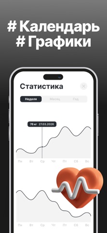
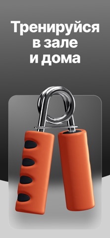
Разрабатывая Forma, я уделил особое внимание минимализму. Как итог, у меня получился полноценный дневник для записи тренировок, с календарем и статистикой, полностью оффлайн и совсем без лишних функций. Интерфейс вышел настолько понятным, что в нем невозможно не разобраться — старался делать качественно, по-человечески. Приложение отлично подходит и для тренажерного зала, и для занятий в домашних условиях, ведь список упражнений составляется тобой же. Вместо сотен предустановленных программ тренировок (придуманных непонятно кем), в которых легко запутаться, ты сам формируешь свою базу данных — оставляй только то, что важно лично для тебя. ‣ Создавай любые упражнения: от йоги до силовых. ‣ Настраивай под себя: занимайся с гантелями, штангой или собственным весом. ‣ Записывай результаты в пару кликов. ‣ Следи за прогрессом: набирай массу, худей или просто будь в тонусе. Вместе с друг…
App details
What you can learn from Forma - дневник тренировок
Every shipping app on the App Store has gone through the same decisions you're working through right now: which screenshot goes first, what caption sits over it, which device frame to show, what color the background should be. The 7 screenshots above are Forma - дневник тренировок's answers to those questions — they're public, they're real, and they made it through Apple's review.
What the numbers say: Forma - дневник тренировок runs a mixed light-and-dark set where the background shifts from screenshot to screenshot (first shot #F4F4F4) — each image has to stand on its own, so the captions carry more of the story. The accent colour we picked up, #BC8474, is the one to reuse for badges, arrows and highlighted words if you borrow this look. Hit Use this style to open the editor with these exact colours and drop your own screenshot in.
Notice the first screenshot in particular. It's the one users see in search results and on the product page, and it's where most apps spend their best caption and tightest design. Look at the proportion of background to phone, where the text sits, what one thing the image is trying to communicate.
Want to see how other Health & Fitness apps approach the same problem? Browse more Health & Fitness apps in the showcase.
Take what works into your own screenshots
Open LaunchShots and design your App Store & Google Play screenshots — pick a device frame, drop captions, ship in minutes. Free, in your browser.
Open the screenshot editor →Apps with a similar look
Closest background + accent colours among the listings we've analysed — useful when you want to see the same palette handled by a different team.