Chart position — tracked daily by LaunchShots
Screenshot style breakdown
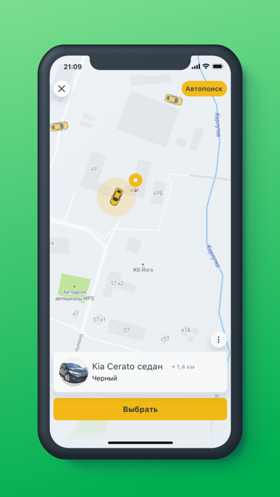
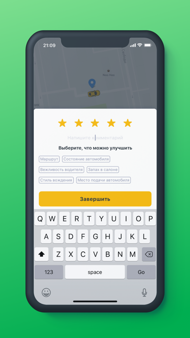
Sampled from 6 of Такси Татарстан's App Store screenshots — background, accent and theme, measured by LaunchShots (not something Apple publishes).
#04AC54 bg
#27B76B
#74DC8C accent
#FFFFFF text
Reading the caption text from the screenshots in your browser…
Screenshots
Icon palette
About this app
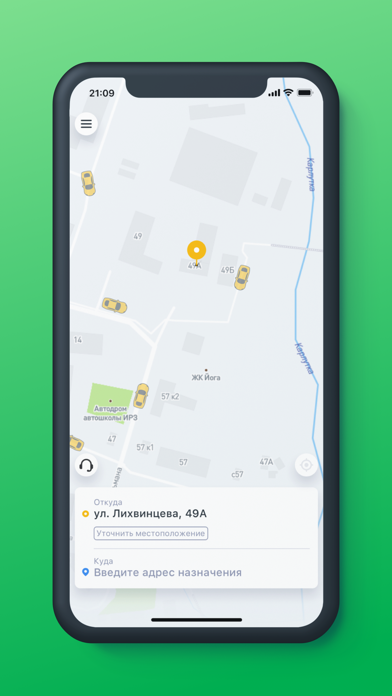
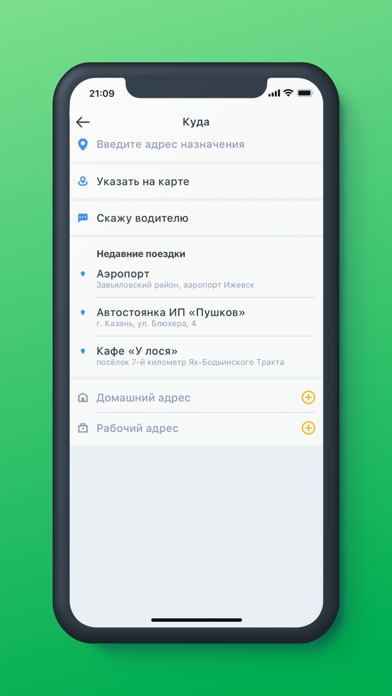
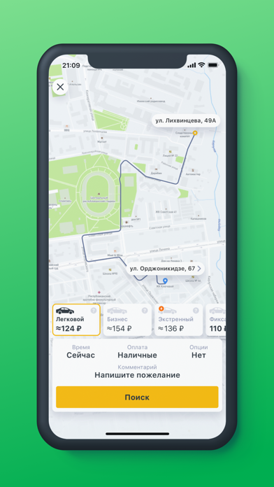
Такси Татарстан – это современный и удобный сервис для вызова такси в Татарстане. Выбор оптимального тарифа. Перед заказом такси вы всегда сможете выбрать подходящий тариф. В приложении доступно несколько вариантов: «Фикс» — это поездки по минимальной цене. Достаточно указать точный адрес откуда и куда поедете. «Стандарт» — для тех, кому также важна невысокая стоимость поездки, но при заказе неизвестен точный конечный адрес или необходимо сделать одну или несколько остановок. «Доставка» — сервис по передаче через водителя небольших посылок (до 20 кг). «Экстренный» - выбирают те, кто очень спешит. «Комфорт» создан для тех, кто предпочитает удобство по приемлемым ценам. «Бизнес-класс» подойдет тем, кто выбирает машины премиального уровня. «МОСТ» - междугородные поездки на такси со скидкой до 40%. Поездку по системе «МОСТ» можно также заказать по бесплатному телефону 8 800 555 30 30.…
App details
What you can learn from Такси Татарстан
Every shipping app on the App Store has gone through the same decisions you're working through right now: which screenshot goes first, what caption sits over it, which device frame to show, what color the background should be. The 6 screenshots above are Такси Татарстан's answers to those questions — they're public, they're real, and they made it through Apple's review.
What the numbers say: Такси Татарстан runs a dark set with one background colour (#04AC54) carried across every screenshot — the listing reads as a single poster when the shots sit side by side in search results. The accent colour we picked up, #74DC8C, is the one to reuse for badges, arrows and highlighted words if you borrow this look. Hit Use this style to open the editor with these exact colours and drop your own screenshot in.
Notice the first screenshot in particular. It's the one users see in search results and on the product page, and it's where most apps spend their best caption and tightest design. Look at the proportion of background to phone, where the text sits, what one thing the image is trying to communicate.
Want to see how other Travel apps approach the same problem? Browse more Travel apps in the showcase.
Take what works into your own screenshots
Open LaunchShots and design your App Store & Google Play screenshots — pick a device frame, drop captions, ship in minutes. Free, in your browser.
Open the screenshot editor →Apps with a similar look
Closest background + accent colours among the listings we've analysed — useful when you want to see the same palette handled by a different team.