Chart position — tracked daily by LaunchShots
Screenshot style breakdown
Sampled from 5 of Düğün.com – Düğün Planlama's App Store screenshots — background, accent and theme, measured by LaunchShots (not something Apple publishes).
#FCFCFC bg
#DDDDDD
#E49C94 accent
#111111 text
Reading the caption text from the screenshots in your browser…
Screenshots



Icon palette
About this app
Düğün.com’un mobil uygulaması ile düğünün için ihtiyaç duyacağın her şey elinin altında. Evlilik hazırlığında olan her 3 çiftten 2’sinin yaptığı gibi, sen de Düğün.com’u kullanarak, düğün mekanı, gelinlik, fotoğraf, davetiye gibi 30 farklı kategoride, 50 binin üzerinde firmayı bir arada bulabilirsin. • Firmaları incelerken, senden önce düğün yapmış çiftlerin deneyimlerinden yararlanmayı unutma! Firma sayfalarına yapılan çift yorumları, hizmet alacağın firmaları seçmende sana yol gösterecek. Ayrıca bütçe dostu seçenekleri görmek için, Kampanya sayfalarını ziyaret edebilirsin. • Firma galerilerinde gezinip, detaylı açıklamaları okuyarak firmaların ürünleri hakkında fikir edinebilir, hızlıca fiyat teklifleri alabilirsin. Dilersen ücretsiz düğün planlama asistanımız bunu senin için yapar. • Düğün planlamanı yaparken ilk bakacağın düğün mekanı olmalı. Mekanını bulduktan sonra tüm taşla…
App details
What you can learn from Düğün.com – Düğün Planlama
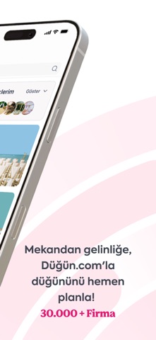
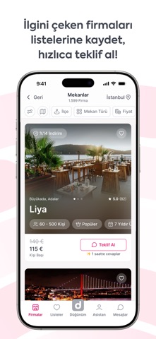
Every shipping app on the App Store has gone through the same decisions you're working through right now: which screenshot goes first, what caption sits over it, which device frame to show, what color the background should be. The 5 screenshots above are Düğün.com – Düğün Planlama's answers to those questions — they're public, they're real, and they made it through Apple's review.
What the numbers say: Düğün.com – Düğün Planlama runs a light set with one background colour (#FCFCFC) carried across every screenshot — the listing reads as a single poster when the shots sit side by side in search results. The accent colour we picked up, #E49C94, is the one to reuse for badges, arrows and highlighted words if you borrow this look. Hit Use this style to open the editor with these exact colours and drop your own screenshot in.
Notice the first screenshot in particular. It's the one users see in search results and on the product page, and it's where most apps spend their best caption and tightest design. Look at the proportion of background to phone, where the text sits, what one thing the image is trying to communicate.
Want to see how other Lifestyle apps approach the same problem? Browse more Lifestyle apps in the showcase.
Take what works into your own screenshots
Open LaunchShots and design your App Store & Google Play screenshots — pick a device frame, drop captions, ship in minutes. Free, in your browser.
Open the screenshot editor →Apps with a similar look
Closest background + accent colours among the listings we've analysed — useful when you want to see the same palette handled by a different team.