Screenshot style breakdown
Sampled from 4 of 息壤阅读's App Store screenshots — background, accent and theme, measured by LaunchShots (not something Apple publishes).
#FCD4EC bg
#DDBACF
#E484AC accent
#111111 text
Screenshots
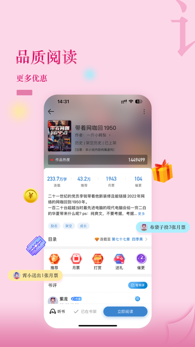
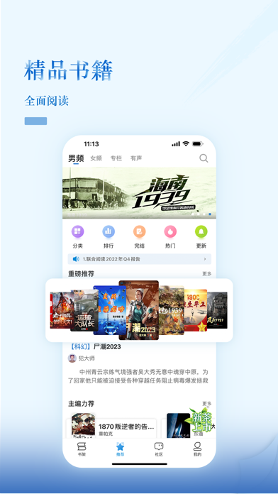
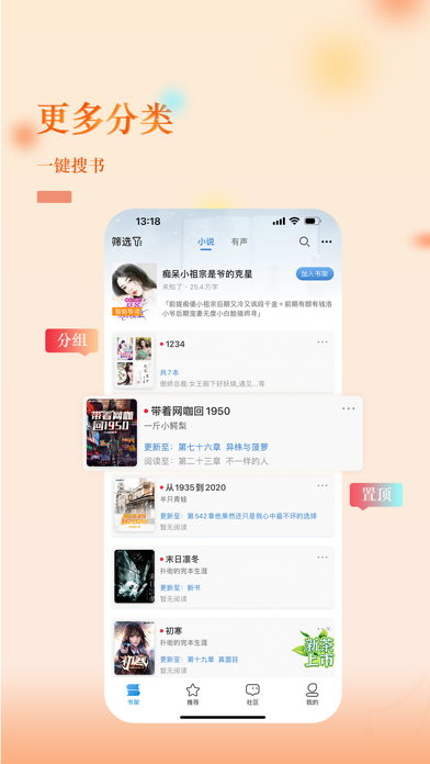
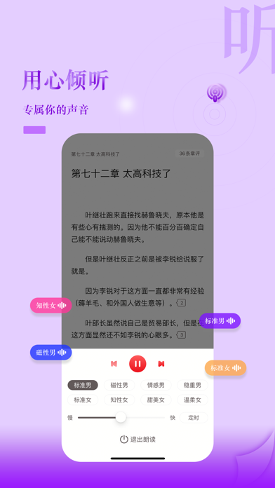
iPad screenshots


Icon palette
About this app
畅享原创精品、遨游精品书海,与无数书友交流互动、与原创作家联合进取的起点……支持正版原创文学,就在息壤中文网。 【志存高远】 “息壤”是中国自古以来的神土,象征着生生不息、象征着勃勃生机、象征着不屈不挠的斗争与反抗!息壤阅读以息壤中文网为载体,依托男频、女频精品阅读为核心,以漫画、有声、少儿为延伸,依托VR、出版、直播、游戏、影视、动漫、文化商城等周边泛文化衍生为合作渠道的原创网络文学创作平台! 【打造精品】息壤阅读倡导精品创作,风格兼容包蓄,以内涵承载价值理念的付费阅读为核心,打造优秀的互动载体,创作提倡求精、求新、求变,不落窠臼、不甘平凡,为精品阅读提供不断茁壮成长的土壤,为网络文学注入更多新鲜活力。
App details
What you can learn from 息壤阅读
Every shipping app on the App Store has gone through the same decisions you're working through right now: which screenshot goes first, what caption sits over it, which device frame to show, what color the background should be. The 8 screenshots above are 息壤阅读's answers to those questions — they're public, they're real, and they made it through Apple's review.
What the numbers say: 息壤阅读 runs a light set where the background shifts from screenshot to screenshot (first shot #FCD4EC) — each image has to stand on its own, so the captions carry more of the story. The accent colour we picked up, #E484AC, is the one to reuse for badges, arrows and highlighted words if you borrow this look. Hit Use this style to open the editor with these exact colours and drop your own screenshot in.
Notice the first screenshot in particular. It's the one users see in search results and on the product page, and it's where most apps spend their best caption and tightest design. Look at the proportion of background to phone, where the text sits, what one thing the image is trying to communicate.
Want to see how other Book apps approach the same problem? Browse more Book apps in the showcase.
Take what works into your own screenshots
Open LaunchShots and design your App Store & Google Play screenshots — pick a device frame, drop captions, ship in minutes. Free, in your browser.
Open the screenshot editor →Apps with a similar look
Closest background + accent colours among the listings we've analysed — useful when you want to see the same palette handled by a different team.