Chart position — tracked daily by LaunchShots
Screenshot changes — detected by LaunchShots
Screenshot style breakdown
Sampled from 6 of التقويم الهجري والميلادي's App Store screenshots — background, accent and theme, measured by LaunchShots (not something Apple publishes).
#041C14 bg
#273B34
#547444 accent
#FFFFFF text
Screenshots

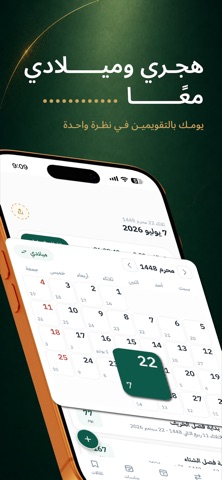


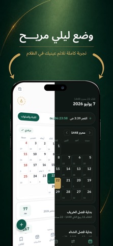
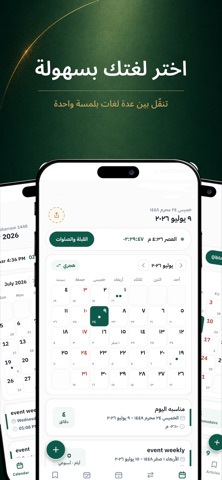
iPad screenshots


Icon palette
About this app
تقويمك الهجري والميلادي، ومواقيت صلاتك، واتجاه قبلتك، ومناسباتك الخاصة — في تطبيق واحد أنيق وسريع، يثق به ملايين المستخدمين. بتصميم جديد كليًا يتناغم مع جميع الشاشات، من الآيفون إلى الآيباد. التقويم - التقويم الهجري والميلادي جنبًا إلى جنب، مع تصفح السنوات والأشهر الماضية والقادمة - تحويل فوري للتاريخ من الهجري إلى الميلادي وبالعكس - المناسبات والأعياد العامة، وإضافة مناسباتك الخاصة مع تذكيرات لا تفوتك - تاريخ اليوم الصلاة - مواقيت الصلاة بدقة حسب موقعك، مع الأذان وتنبيه مستقل لكل صلاة - اتجاه القبلة أينما كنت - إمساكية رمضان ودجات الشاشة الرئيسية - تاريخ اليوم، ومواقيت الصلاة،ومهامك ومناسباتك — أمامك دائمًا دون فتح التطبيق، بتصميم مُجدَّد لجميع الأجهزة تجربة تناسبك - الوضع الليلي المريح - العربية والإنجليزية والفرنسية، مع خيار الأرقام العربية أو الهندية - تحكم كامل في التنبيهات - مصمم للآيفون والآيباد مع دعم تعدد المهام حمّل التطبيق الآن، ودَع تقويمك وصلاتك ومناسباتك في مكان واحد.…
App details
What you can learn from التقويم الهجري والميلادي
Every shipping app on the App Store has gone through the same decisions you're working through right now: which screenshot goes first, what caption sits over it, which device frame to show, what color the background should be. The 16 screenshots above are التقويم الهجري والميلادي's answers to those questions — they're public, they're real, and they made it through Apple's review.
What the numbers say: التقويم الهجري والميلادي runs a dark set with one background colour (#041C14) carried across every screenshot — the listing reads as a single poster when the shots sit side by side in search results. The accent colour we picked up, #547444, is the one to reuse for badges, arrows and highlighted words if you borrow this look. Hit Use this style to open the editor with these exact colours and drop your own screenshot in.
Notice the first screenshot in particular. It's the one users see in search results and on the product page, and it's where most apps spend their best caption and tightest design. Look at the proportion of background to phone, where the text sits, what one thing the image is trying to communicate.
Want to see how other Productivity apps approach the same problem? Browse more Productivity apps in the showcase.
Take what works into your own screenshots
Open LaunchShots and design your App Store & Google Play screenshots — pick a device frame, drop captions, ship in minutes. Free, in your browser.
Open the screenshot editor →Apps with a similar look
Closest background + accent colours among the listings we've analysed — useful when you want to see the same palette handled by a different team.