Chart position — tracked daily by LaunchShots
Screenshot changes — detected by LaunchShots
Screenshot style breakdown
Sampled from 6 of 最佳球会-全新赛季版本's App Store screenshots — background, accent and theme, measured by LaunchShots (not something Apple publishes).
#34BC44 bg
#2DA53B
#3C1C6C accent
#111111 text
Screenshots


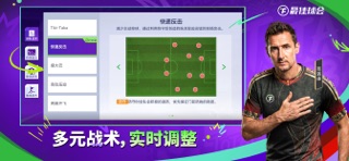

iPad screenshots


Icon palette
About this app
【轻松操控,纯粹足球】《最佳球会》告别梅西特别纪念系列活动正式开启,梅西与他生涯中多名伙伴齐聚球会开启星耀时代; 登录即送年轻梅西,青春球王即刻到手;26/27赛季球员数据全面刷新,俱乐部归属与球员总评同步更新,助你开启全新征程。 即刻加入球会,与球王共同征战绿茵!
App details
What you can learn from 最佳球会-全新赛季版本
Every shipping app on the App Store has gone through the same decisions you're working through right now: which screenshot goes first, what caption sits over it, which device frame to show, what color the background should be. The 14 screenshots above are 最佳球会-全新赛季版本's answers to those questions — they're public, they're real, and they made it through Apple's review.
What the numbers say: 最佳球会-全新赛季版本 runs a mixed light-and-dark set where the background shifts from screenshot to screenshot (first shot #34BC44) — each image has to stand on its own, so the captions carry more of the story. The accent colour we picked up, #3C1C6C, is the one to reuse for badges, arrows and highlighted words if you borrow this look. Hit Use this style to open the editor with these exact colours and drop your own screenshot in.
Notice the first screenshot in particular. It's the one users see in search results and on the product page, and it's where most apps spend their best caption and tightest design. Look at the proportion of background to phone, where the text sits, what one thing the image is trying to communicate.
Want to see how other Games apps approach the same problem? Browse more Games apps in the showcase.
Take what works into your own screenshots
Open LaunchShots and design your App Store & Google Play screenshots — pick a device frame, drop captions, ship in minutes. Free, in your browser.
Open the screenshot editor →Apps with a similar look
Closest background + accent colours among the listings we've analysed — useful when you want to see the same palette handled by a different team.