Screenshot changes — detected by LaunchShots
Screenshot style breakdown
Sampled from 6 of Mobil Krankenkasse - ePA's App Store screenshots — background, accent and theme, measured by LaunchShots (not something Apple publishes).
#FCFCFC bg
#DDDDDD
#FC7C1C accent
#111111 text
Reading the caption text from the screenshots in your browser…
Screenshots
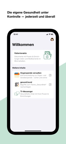


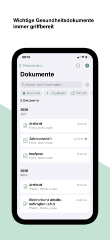
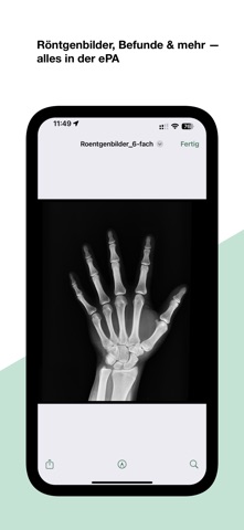
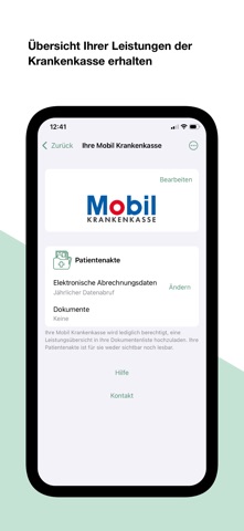

Icon palette
About this app
Die App zur Patientenakte ist das zentrale Portal rund um Ihre Gesundheit. Sie bietet Ihnen Zugang zu verschiedenen Funktionen, Diensten und Angeboten, die alle unabhängig voneinander genutzt werden können. Das Herzstück bildet die elektronische Patientenakte (ePA). Mittels App verwalten Sie Ihre ePA einfach über Ihr Smartphone: • Wichtige Dokumente immer griffbereit • Inhalte der Akte bearbeiten • Zugriffsrechte einstellen • Online Check-in – weisen Sie sich bei teilnehmenden Arztpraxen und Einrichtungen sicher und digital auch ohne elektronische Gesundheitskarte (eGK) aus. Die elektronische Patientenakte ist der digitale Speicherort für Ihre persönlichen Gesundheitsdaten: Ein Archiv aus gesammelten Unterlagen und Erkenntnissen rund um Ihre Gesundheit. Sie erleichtert den Wissensaustausch - unter anderem zwischen Ihnen und Ihren behandelnden Ärztinnen und Ärzten. Das Teilen der ePA-…
App details
What you can learn from Mobil Krankenkasse - ePA
Every shipping app on the App Store has gone through the same decisions you're working through right now: which screenshot goes first, what caption sits over it, which device frame to show, what color the background should be. The 7 screenshots above are Mobil Krankenkasse - ePA's answers to those questions — they're public, they're real, and they made it through Apple's review.
What the numbers say: Mobil Krankenkasse - ePA runs a light set with one background colour (#FCFCFC) carried across every screenshot — the listing reads as a single poster when the shots sit side by side in search results. The accent colour we picked up, #FC7C1C, is the one to reuse for badges, arrows and highlighted words if you borrow this look. Hit Use this style to open the editor with these exact colours and drop your own screenshot in.
Notice the first screenshot in particular. It's the one users see in search results and on the product page, and it's where most apps spend their best caption and tightest design. Look at the proportion of background to phone, where the text sits, what one thing the image is trying to communicate.
Want to see how other Health & Fitness apps approach the same problem? Browse more Health & Fitness apps in the showcase.
Take what works into your own screenshots
Open LaunchShots and design your App Store & Google Play screenshots — pick a device frame, drop captions, ship in minutes. Free, in your browser.
Open the screenshot editor →Apps with a similar look
Closest background + accent colours among the listings we've analysed — useful when you want to see the same palette handled by a different team.