Chart position — tracked daily by LaunchShots
Screenshot style breakdown
Sampled from 5 of テガラみる's App Store screenshots — background, accent and theme, measured by LaunchShots (not something Apple publishes).
#FCFCFC bg
#DDDDDD
#048C8C accent
#111111 text
Reading the caption text from the screenshots in your browser…
Screenshots


Icon palette
About this app
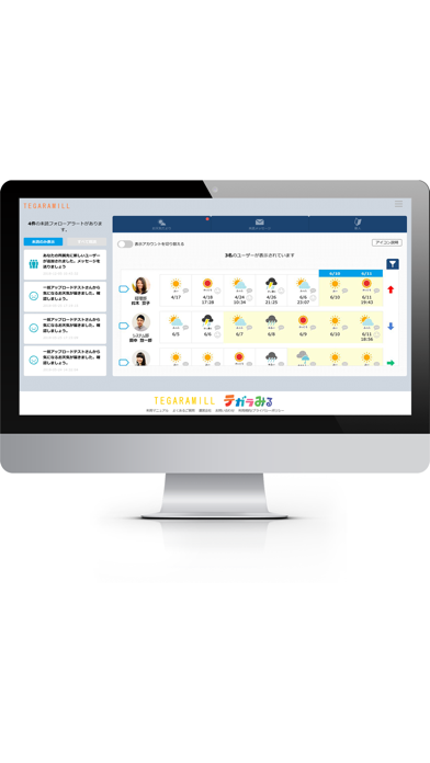
【ダウンロード対象者】 ・従業員の皆さま ・管理者の皆さま ※「テガラみる」を法人契約されている企業様のみ利用可能です ※従業員の方も管理者の方も同じアプリケーションをご利用下さい(ログイン後の画面は異なります。) 【ご利用開始まで】 ① まずは勤務先の管理画面であなたのアカウントが発行されます ② アカウントが発行されると、勤務先に登録しているメールアドレス宛にログインIDと仮パスワードをお送りいたします ③ アプリを開き、ログインIDと仮パスワードを入力するとご利用いただけます 【使い方①】従業員の方用 ○ お仕事終了後に、その日の気分に合う「お天気アイコン」で記録 ○ 仲間への「お疲れさま!」や「ありがとう」などの気持ちを、スタンプで伝えあう ○ 業務でわからないことや、困っていることがあれば、気軽に先輩に相談 そうすることで・・・ 上司からの適切なサポートが受けることができたり、職場内のチームワーク活性を「テガラみる」がお手伝いします! そのほかにも、会社からのお知らせ受信など、便利な機能がついています! あ…
App details
What you can learn from テガラみる
Every shipping app on the App Store has gone through the same decisions you're working through right now: which screenshot goes first, what caption sits over it, which device frame to show, what color the background should be. The 5 screenshots above are テガラみる's answers to those questions — they're public, they're real, and they made it through Apple's review.
What the numbers say: テガラみる runs a light set with one background colour (#FCFCFC) carried across every screenshot — the listing reads as a single poster when the shots sit side by side in search results. The accent colour we picked up, #048C8C, is the one to reuse for badges, arrows and highlighted words if you borrow this look. Hit Use this style to open the editor with these exact colours and drop your own screenshot in.
Notice the first screenshot in particular. It's the one users see in search results and on the product page, and it's where most apps spend their best caption and tightest design. Look at the proportion of background to phone, where the text sits, what one thing the image is trying to communicate.
Want to see how other Business apps approach the same problem? Browse more Business apps in the showcase.
Take what works into your own screenshots
Open LaunchShots and design your App Store & Google Play screenshots — pick a device frame, drop captions, ship in minutes. Free, in your browser.
Open the screenshot editor →Apps with a similar look
Closest background + accent colours among the listings we've analysed — useful when you want to see the same palette handled by a different team.