Chart position — tracked daily by LaunchShots
Screenshot changes — detected by LaunchShots
Screenshot style breakdown
Sampled from 6 of создать приглашение открытки's App Store screenshots — background, accent and theme, measured by LaunchShots (not something Apple publishes).
#FCF4F4 bg
#DDD6D6
#FC4464 accent
#111111 text
Reading the caption text from the screenshots in your browser…
Screenshots
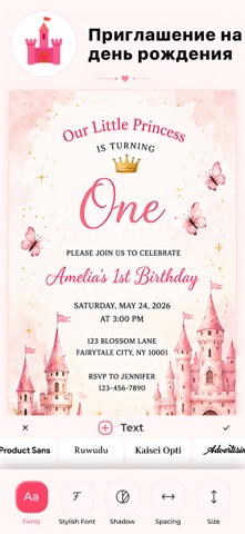
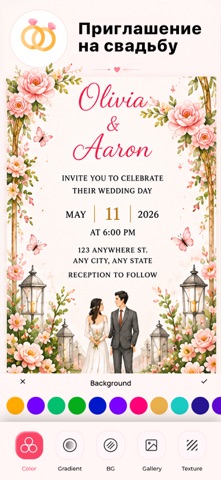
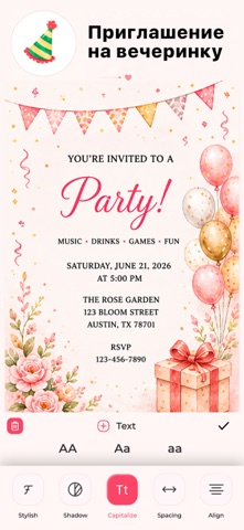


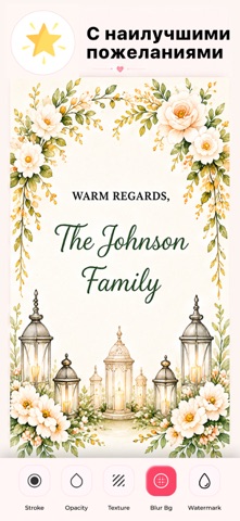
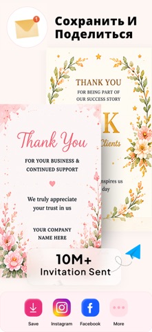
iPad screenshots


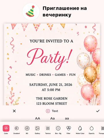

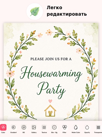

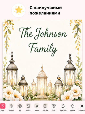

Icon palette
About this app
Invitation Maker Card Design дает вам бесплатные профессиональные шаблоны пригласительных билетов, которые вы можете использовать для своего мероприятия, вечеринки или любого случая. Карточку сделать проще. Приглашения на свадьбу День Рождения Музыкальная вечеринка Годовщина Пасха День матери Хорошая пятница Путешествовать Новый год день Труда & Многое другое. Вы можете использовать карты сочетания цветов в приложении. Используйте собственные фотографии в шаблонах. Функции Несколько вариантов фона Вы можете использовать огромную библиотеку фона для улучшения своих карт. Цвета, градиенты, текстуры, размытие фона, акварель. Цветовые наборы Для фона и шрифтов предоставляется широкий диапазон цветов. Наклейки Встроены категории симпатичных наклеек, которые вы можете выбрать в соответствии с вашими требованиями или случаем. Текст Текст в шаблонах можно редактировать. Вы можете добавит…
App details
What you can learn from создать приглашение открытки
Every shipping app on the App Store has gone through the same decisions you're working through right now: which screenshot goes first, what caption sits over it, which device frame to show, what color the background should be. The 16 screenshots above are создать приглашение открытки's answers to those questions — they're public, they're real, and they made it through Apple's review.
What the numbers say: создать приглашение открытки runs a light set with one background colour (#FCF4F4) carried across every screenshot — the listing reads as a single poster when the shots sit side by side in search results. The accent colour we picked up, #FC4464, is the one to reuse for badges, arrows and highlighted words if you borrow this look. Hit Use this style to open the editor with these exact colours and drop your own screenshot in.
Notice the first screenshot in particular. It's the one users see in search results and on the product page, and it's where most apps spend their best caption and tightest design. Look at the proportion of background to phone, where the text sits, what one thing the image is trying to communicate.
Want to see how other Graphics & Design apps approach the same problem? Browse more Graphics & Design apps in the showcase.
Take what works into your own screenshots
Open LaunchShots and design your App Store & Google Play screenshots — pick a device frame, drop captions, ship in minutes. Free, in your browser.
Open the screenshot editor →Apps with a similar look
Closest background + accent colours among the listings we've analysed — useful when you want to see the same palette handled by a different team.