Chart position — tracked daily by LaunchShots
Screenshot changes — detected by LaunchShots
Screenshot style breakdown
Sampled from 5 of Серьёзные знакомства Sitelove's App Store screenshots — background, accent and theme, measured by LaunchShots (not something Apple publishes).
#FCACDC bg
#DD97C1
#FC6C64 accent
#111111 text
Screenshots
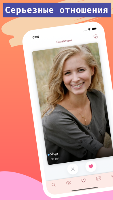
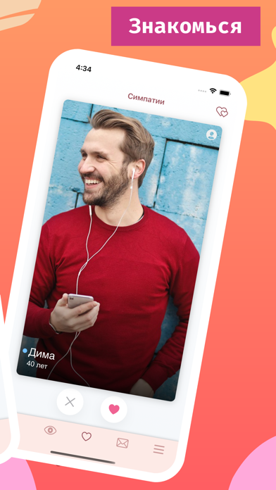
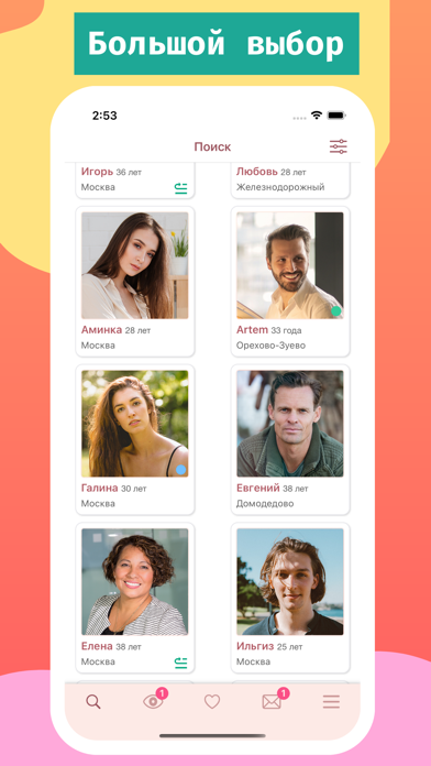
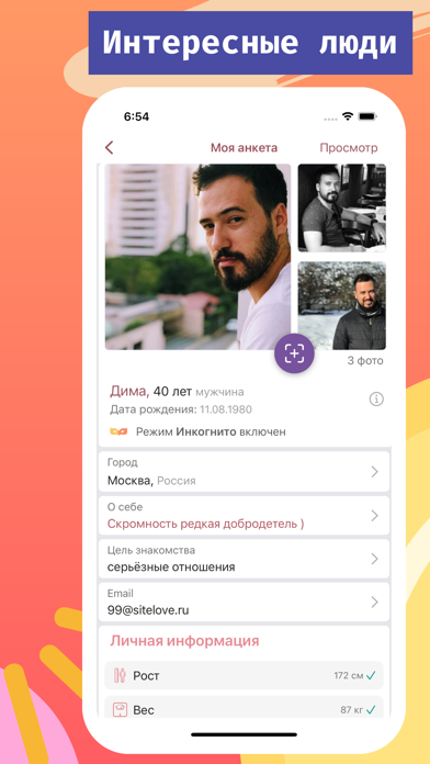
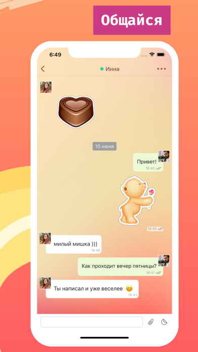
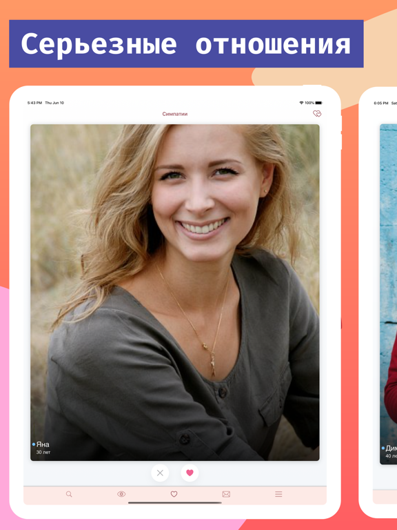
iPad screenshots


Icon palette
About this app
Приложение знакомств без подписок и рекламы ! Сервис Sitelove просто необходимо девушкам и парням, заинтересованным в поиске спутника жизни, серьезных отношениях и семье. Мы понимаем важность и придаём огромное значение модерации анкет и отсеву посетителей, ищущих развлечения и мимолётные встречи. Навсегда блокируются выявленные фейки и мошенники. Это позволяет искать вторую половинку в приятной атмосфере в кругу мужчин и женщин с такой же целью, без пошлости и грубости. Другие же сайты знакомств, в основном, носят развлекательный характер. Сайтлав – это: - лучший сайт знакомств для пользователей, которые ищут серьезные отношения и любовь; - строгий контроль профайлов, формирующий сообщество людей, которые хотят создать семью; - международные знакомства с иностранцами; - неограниченные симпатии; - невысокая цена единовременной активации профиля и отсутствие регулярной абонентской плат…
App details
What you can learn from Серьёзные знакомства Sitelove
Every shipping app on the App Store has gone through the same decisions you're working through right now: which screenshot goes first, what caption sits over it, which device frame to show, what color the background should be. The 10 screenshots above are Серьёзные знакомства Sitelove's answers to those questions — they're public, they're real, and they made it through Apple's review.
What the numbers say: Серьёзные знакомства Sitelove runs a light set where the background shifts from screenshot to screenshot (first shot #FCACDC) — each image has to stand on its own, so the captions carry more of the story. The accent colour we picked up, #FC6C64, is the one to reuse for badges, arrows and highlighted words if you borrow this look. Hit Use this style to open the editor with these exact colours and drop your own screenshot in.
Notice the first screenshot in particular. It's the one users see in search results and on the product page, and it's where most apps spend their best caption and tightest design. Look at the proportion of background to phone, where the text sits, what one thing the image is trying to communicate.
Want to see how other Social Networking apps approach the same problem? Browse more Social Networking apps in the showcase.
Take what works into your own screenshots
Open LaunchShots and design your App Store & Google Play screenshots — pick a device frame, drop captions, ship in minutes. Free, in your browser.
Open the screenshot editor →Apps with a similar look
Closest background + accent colours among the listings we've analysed — useful when you want to see the same palette handled by a different team.