Chart position — tracked daily by LaunchShots
Screenshot changes — detected by LaunchShots
Screenshot style breakdown
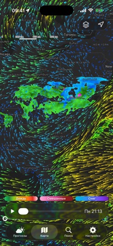
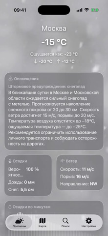
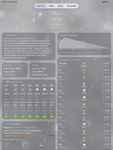
Sampled from 6 of Погода +'s App Store screenshots — background, accent and theme, measured by LaunchShots (not something Apple publishes).
#2C74D4 bg
#4987DA
#84B4EC accent
#FFFFFF text
Screenshots



iPad screenshots



Icon palette
About this app
Красивые, точные прогнозы погоды под рукой. Смотрите, что впереди, с 16-дневными прогнозами, картами радара в реальном времени и мониторингом качества воздуха, чтобы всегда быть на шаг впереди. НАДЁЖНЫЕ ПРОГНОЗЫ Планируйте свой день, неделю или следующее приключение с уверенностью. Получайте детальные 16-дневные прогнозы с мин/макс температурами, вероятностью осадков и временем восхода/захода солнца. Изучайте почасовые разбивки, чтобы точно знать, когда изменится погода. ИНТЕРАКТИВНЫЙ РАДАР В РЕАЛЬНОМ ВРЕМЕНИ Следите за погодой в реальном времени. Отслеживайте дождь, снег и грозы по мере их прохождения через вашу область. Наблюдайте за молниями, следите за тропическими циклонами и будьте в курсе лесных пожаров и землетрясений с нашими комплексными слоями карты. МОНИТОРИНГ КАЧЕСТВА ВОЗДУХА Дышите спокойно с показателями AQI в реальном времени и детальными данными о загрязнителях (PM2.…
App details
What you can learn from Погода +
Every shipping app on the App Store has gone through the same decisions you're working through right now: which screenshot goes first, what caption sits over it, which device frame to show, what color the background should be. The 10 screenshots above are Погода +'s answers to those questions — they're public, they're real, and they made it through Apple's review.
What the numbers say: Погода + runs a mixed light-and-dark set where the background shifts from screenshot to screenshot (first shot #2C74D4) — each image has to stand on its own, so the captions carry more of the story. The accent colour we picked up, #84B4EC, is the one to reuse for badges, arrows and highlighted words if you borrow this look. Hit Use this style to open the editor with these exact colours and drop your own screenshot in.
Notice the first screenshot in particular. It's the one users see in search results and on the product page, and it's where most apps spend their best caption and tightest design. Look at the proportion of background to phone, where the text sits, what one thing the image is trying to communicate.
Want to see how other Weather apps approach the same problem? Browse more Weather apps in the showcase.
Take what works into your own screenshots
Open LaunchShots and design your App Store & Google Play screenshots — pick a device frame, drop captions, ship in minutes. Free, in your browser.
Open the screenshot editor →Apps with a similar look
Closest background + accent colours among the listings we've analysed — useful when you want to see the same palette handled by a different team.