Chart position — tracked daily by LaunchShots
Screenshot style breakdown
Sampled from 6 of 呪術廻戦 ファントムパレード's App Store screenshots — background, accent and theme, measured by LaunchShots (not something Apple publishes).
#040404 bg
#272727
#444C74 accent
#FFFFFF text
Screenshots

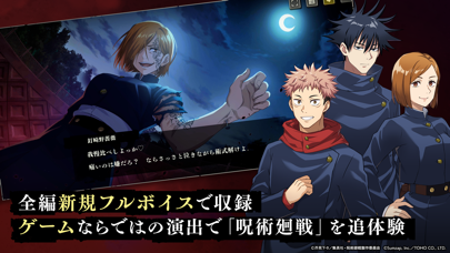
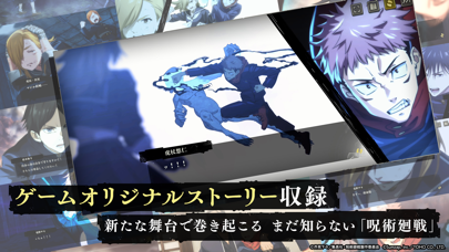
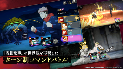
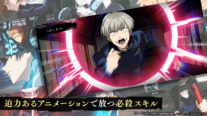
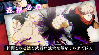
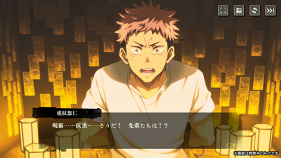

iPad screenshots


Icon palette
About this app
『呪術廻戦 ファントムパレード(ファンパレ)』とは ◆”TVアニメ”の世界観と”ゲーム”ならではの『呪術廻戦』の物語◆ アニメのストーリーを新規フルボイスで再現。さらに、様々なキャラクターの視点で描かれるストーリーもフルボイスで実装。 ◆その手で、術式を操り、TVアニメさながらのバトルで呪霊を祓え◆ ハイクオリティで展開されるバトル。自分だけのチーム編成で、強大な呪霊を祓え。 ◆ゲームならではの『呪術廻戦』の戦いをその手で体感◆ 各階層毎に存在する呪霊に挑む「領域調査」。成長させたキャラクター達と共に領域を攻略しよう。 ◆ゲームで描かれる『呪術廻戦』の新たなシーン”廻想残滓”◆ 新たに描かれた『呪術廻戦』の1シーン”廻想残滓”。”廻想残滓”をキャラクターに装備し、能力を強化しよう。 ◆物語を彩るキャラクター&豪華声優陣◆ 虎杖悠仁:榎木淳弥 伏黒 恵:内田雄馬 釘崎野薔薇:瀬戸麻沙美 禪院真希:小松未可子 狗巻 棘:内山昂輝 パンダ:関 智一 五条 悟:中村悠一 夜蛾正道:黒田崇矢 七海建人:津田健次郎 伊地知…
App details
What you can learn from 呪術廻戦 ファントムパレード
Every shipping app on the App Store has gone through the same decisions you're working through right now: which screenshot goes first, what caption sits over it, which device frame to show, what color the background should be. The 16 screenshots above are 呪術廻戦 ファントムパレード's answers to those questions — they're public, they're real, and they made it through Apple's review.
What the numbers say: 呪術廻戦 ファントムパレード runs a dark set where the background shifts from screenshot to screenshot (first shot #040404) — each image has to stand on its own, so the captions carry more of the story. The accent colour we picked up, #444C74, is the one to reuse for badges, arrows and highlighted words if you borrow this look. Hit Use this style to open the editor with these exact colours and drop your own screenshot in.
Notice the first screenshot in particular. It's the one users see in search results and on the product page, and it's where most apps spend their best caption and tightest design. Look at the proportion of background to phone, where the text sits, what one thing the image is trying to communicate.
Want to see how other Games apps approach the same problem? Browse more Games apps in the showcase.
Take what works into your own screenshots
Open LaunchShots and design your App Store & Google Play screenshots — pick a device frame, drop captions, ship in minutes. Free, in your browser.
Open the screenshot editor →Apps with a similar look
Closest background + accent colours among the listings we've analysed — useful when you want to see the same palette handled by a different team.