Chart position — tracked daily by LaunchShots
Screenshot style breakdown
Sampled from 3 of Synergia's App Store screenshots — background, accent and theme, measured by LaunchShots (not something Apple publishes).
#FCFCFC bg
#DDDDDD
#04BCB4 accent
#111111 text
Reading the caption text from the screenshots in your browser…
Screenshots
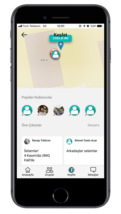


iPad screenshots


Icon palette
About this app
Synergia Coworking & İş Hizmetleri her ölçekten şirketin verimliliğine, büyümesine ve globalleşmesine fiziksel, dijital ve entelektüel hizmetlerle katkı sağlayan profesyonel, yüksek kaliteli ve yeni nesil bir ofis yönetim ve hizmet şirketidir. Synergia farklı sektörlerden bir araya getirilmiş mikro ve küçük ölçekli şirketlerin işlerini en etkili şekilde büyütmeleri için hazırlanmış bir buluşma noktasıdır. Geleneksel paylaşımlı ofislerin aksine Synergia kendini “Bütün şirketler, üniversiteler ve kurumlar için hizmet merkezi” olarak tanımlamaktadır. Bu, farklı alanlarda sağlanan 150’den fazla farklı hizmetle gerçekleştirilmektedir (İş geliştirme, danışmanlık, bulut hizmetleri, vergi, muhasebe, satış ve pazarlama, yaygın kaynak kullanımı, dijital hizmetler, finans, hibe danışmanlığı, eğitim vb.). Bu kapsamda Synergia sadece paylaşımlı ofis değil, aynı zamanda bir hizmet platformu ve inova…
App details
What you can learn from Synergia
Every shipping app on the App Store has gone through the same decisions you're working through right now: which screenshot goes first, what caption sits over it, which device frame to show, what color the background should be. The 6 screenshots above are Synergia's answers to those questions — they're public, they're real, and they made it through Apple's review.
What the numbers say: Synergia runs a light set with one background colour (#FCFCFC) carried across every screenshot — the listing reads as a single poster when the shots sit side by side in search results. The accent colour we picked up, #04BCB4, is the one to reuse for badges, arrows and highlighted words if you borrow this look. Hit Use this style to open the editor with these exact colours and drop your own screenshot in.
Notice the first screenshot in particular. It's the one users see in search results and on the product page, and it's where most apps spend their best caption and tightest design. Look at the proportion of background to phone, where the text sits, what one thing the image is trying to communicate.
Want to see how other Social Networking apps approach the same problem? Browse more Social Networking apps in the showcase.
Take what works into your own screenshots
Open LaunchShots and design your App Store & Google Play screenshots — pick a device frame, drop captions, ship in minutes. Free, in your browser.
Open the screenshot editor →Apps with a similar look
Closest background + accent colours among the listings we've analysed — useful when you want to see the same palette handled by a different team.