Chart position — tracked daily by LaunchShots
Screenshot changes — detected by LaunchShots
Screenshot style breakdown
Sampled from 6 of Мо Медитация, Сон, Поддержка's App Store screenshots — background, accent and theme, measured by LaunchShots (not something Apple publishes).
#0C0C4C bg
#2E2E65
#9CBCFC accent
#FFFFFF text
Reading the caption text from the screenshots in your browser…
Screenshots

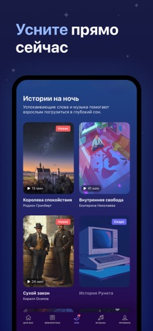


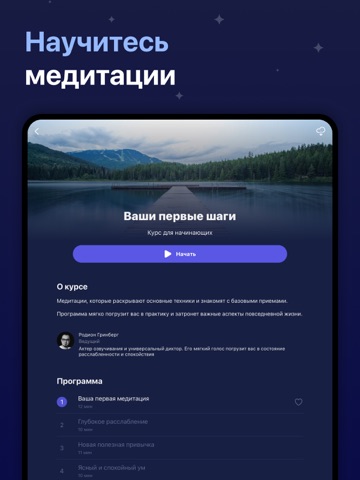
iPad screenshots




Icon palette
About this app
Mo — приложение №1 для тех, кто хочет избавиться от вредных привычек, лучше спать и испытывать меньше стресса. Если вы хотите бросить курить, сократить потребление алкоголя или просто выработать полезные привычки, наши программы помогут вам добиться стабильных результатов. Присоединяйтесь к более чем 4 миллионам людей, которые уже используют Mo, чтобы улучшить свое самочувствие! ■ НАУЧНЫЙ ПОДХОД Наши курсы разработаны и рекомендованы психологами и терапевтами. Они основаны на научных исследованиях и помогают решать конкретные задачи, связанные с психологическим здоровьем. ■ ЕЖЕДНЕВНАЯ ПРАКТИКА Занятия в Mo короткие и простые: начинать можно всего с четырех минут в день. Это идеальный формат для новичков. Постепенно такие небольшие шаги превращаются в устойчивые привычки и помогают заметно улучшить самочувствие. ■ ИЗМЕНЕНИЯ НАЧИНАЮТСЯ СО СНА Многочисленные исследования подтверждают: …
App details
What you can learn from Мо Медитация, Сон, Поддержка
Every shipping app on the App Store has gone through the same decisions you're working through right now: which screenshot goes first, what caption sits over it, which device frame to show, what color the background should be. The 14 screenshots above are Мо Медитация, Сон, Поддержка's answers to those questions — they're public, they're real, and they made it through Apple's review.
What the numbers say: Мо Медитация, Сон, Поддержка runs a dark set with one background colour (#0C0C4C) carried across every screenshot — the listing reads as a single poster when the shots sit side by side in search results. The accent colour we picked up, #9CBCFC, is the one to reuse for badges, arrows and highlighted words if you borrow this look. Hit Use this style to open the editor with these exact colours and drop your own screenshot in.
Notice the first screenshot in particular. It's the one users see in search results and on the product page, and it's where most apps spend their best caption and tightest design. Look at the proportion of background to phone, where the text sits, what one thing the image is trying to communicate.
Want to see how other Health & Fitness apps approach the same problem? Browse more Health & Fitness apps in the showcase.
Take what works into your own screenshots
Open LaunchShots and design your App Store & Google Play screenshots — pick a device frame, drop captions, ship in minutes. Free, in your browser.
Open the screenshot editor →Apps with a similar look
Closest background + accent colours among the listings we've analysed — useful when you want to see the same palette handled by a different team.