Chart position — tracked daily by LaunchShots
Screenshot style breakdown
Sampled from 3 of P-Appli's App Store screenshots — background, accent and theme, measured by LaunchShots (not something Apple publishes).
#ECF4FC bg
#CFD6DD
#343C94 accent
#111111 text
Screenshots
Icon palette
About this app
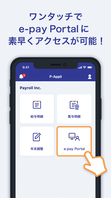
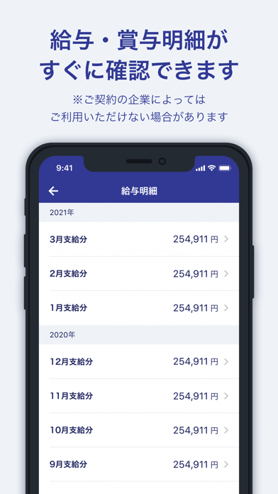
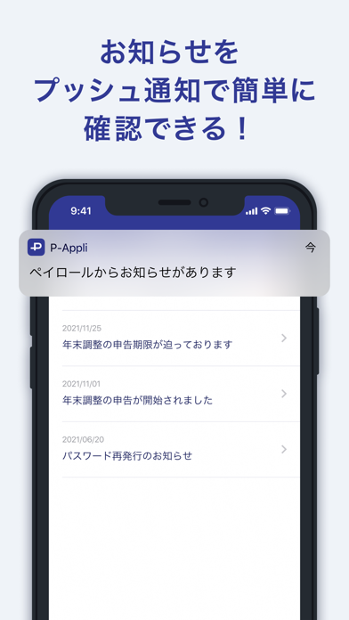
株式会社ペイロールが提供する公式アプリです。 アプリをご利用いただくことで、弊社が提供するシステムへ簡単にログインが可能となりました。 弊社が提供するサービスをアプリでご利用いただけます。 【ご利用になれる方】 ・弊社アプリサービスのご利用可能な企業にお勤めの従業員様 弊社サービスをご利用いただいていても、企業様によっては、アプリをご利用いただけない場合がございます。 【推奨環境】 ・OS:iOS最新版 ・ブラウザ:Safari最新版 ※本アプリ対応機種以外のスマートフォンで本サービスをお使いの場合、表示情報の誤植・欠落など、正常にご利用いただけない可能性がございます。 ※本アプリ対応機種であっても、スマートフォンの利用状態等によっては、本アプリが正常に動作せず、ご利用いただけない場合がございます。 ※タブレット端末ではご利用いただけません。 【ご留意事項】 ・アプリのご利用は無料です。ただし、アプリの利用およびダウンロードには別途通信料がかかり、お客さまのご負担になります(再設定等の際にかかる通信料を含み…
App details
What you can learn from P-Appli
Every shipping app on the App Store has gone through the same decisions you're working through right now: which screenshot goes first, what caption sits over it, which device frame to show, what color the background should be. The 3 screenshots above are P-Appli's answers to those questions — they're public, they're real, and they made it through Apple's review.
What the numbers say: P-Appli runs a light set with one background colour (#ECF4FC) carried across every screenshot — the listing reads as a single poster when the shots sit side by side in search results. The accent colour we picked up, #343C94, is the one to reuse for badges, arrows and highlighted words if you borrow this look. Hit Use this style to open the editor with these exact colours and drop your own screenshot in.
Notice the first screenshot in particular. It's the one users see in search results and on the product page, and it's where most apps spend their best caption and tightest design. Look at the proportion of background to phone, where the text sits, what one thing the image is trying to communicate.
Want to see how other Business apps approach the same problem? Browse more Business apps in the showcase.
Take what works into your own screenshots
Open LaunchShots and design your App Store & Google Play screenshots — pick a device frame, drop captions, ship in minutes. Free, in your browser.
Open the screenshot editor →Apps with a similar look
Closest background + accent colours among the listings we've analysed — useful when you want to see the same palette handled by a different team.