Chart position — tracked daily by LaunchShots
Screenshot style breakdown
Sampled from 5 of 桃源深处有人家's App Store screenshots — background, accent and theme, measured by LaunchShots (not something Apple publishes).
#B46424 bg
#BE7942
#FCAC1C accent
#FFFFFF text
Screenshots


iPad screenshots



Icon palette
About this app
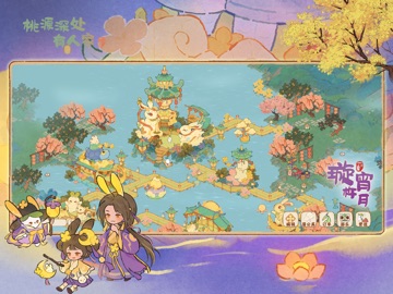
《桃源深处有人家》是一款悠然治愈的国风山水田园经营手游。游戏以传统文化为基础,以温暖治愈为主题,为简单质朴的田园生活赋予青绿山水的国风美学,打造了一个朴实祥和的世外桃源。并获得「2023年最佳创新中国文化奖」、「第十届金茶奖·2023年度最值得期待游戏」、「金翎奖·2023年度最值得期待游戏」等诸多奖项。 【世界观介绍】 每个人心中都有一个桃源, 那里悠闲、温暖、安宁, 心念里有了桃源,它就会出现。 但,桃源并非逃避的港湾, 它是我们歇歇脚、缓一缓, 选择再次启程的地方。 【游戏特色】 耕作经营——建设专属于你的世外桃源 归园田居——享受安静恬淡的山居生活 古韵悠然——品味青绿山水的国风画卷 萌物陪伴——邂逅性格迥异的可爱萝卜 桃源一梦——探索动人心弦的神秘故事 非遗元素——体验生活相关的非遗技艺 在这里,你将伴随哥哥妹妹,一同回到童年的小茅屋 你可以和小萝卜们一起耕地种植,建设自己温馨的田园小家 也可以在清风明月下备一桌好菜,和村民们聊聊温暖的故事 在这里,你可以放下心中杂念 看山中花开花谢,品云间星…
App details
What you can learn from 桃源深处有人家
Every shipping app on the App Store has gone through the same decisions you're working through right now: which screenshot goes first, what caption sits over it, which device frame to show, what color the background should be. The 10 screenshots above are 桃源深处有人家's answers to those questions — they're public, they're real, and they made it through Apple's review.
What the numbers say: 桃源深处有人家 runs a mixed light-and-dark set where the background shifts from screenshot to screenshot (first shot #B46424) — each image has to stand on its own, so the captions carry more of the story. The accent colour we picked up, #FCAC1C, is the one to reuse for badges, arrows and highlighted words if you borrow this look. Hit Use this style to open the editor with these exact colours and drop your own screenshot in.
Notice the first screenshot in particular. It's the one users see in search results and on the product page, and it's where most apps spend their best caption and tightest design. Look at the proportion of background to phone, where the text sits, what one thing the image is trying to communicate.
Want to see how other Games apps approach the same problem? Browse more Games apps in the showcase.
Take what works into your own screenshots
Open LaunchShots and design your App Store & Google Play screenshots — pick a device frame, drop captions, ship in minutes. Free, in your browser.
Open the screenshot editor →Apps with a similar look
Closest background + accent colours among the listings we've analysed — useful when you want to see the same palette handled by a different team.