Screenshot style breakdown
Sampled from 6 of Budget Türkiye - Araç Kiralama's App Store screenshots — background, accent and theme, measured by LaunchShots (not something Apple publishes).
#04245C bg
#274272
#546C8C accent
#FFFFFF text
Reading the caption text from the screenshots in your browser…
Screenshots
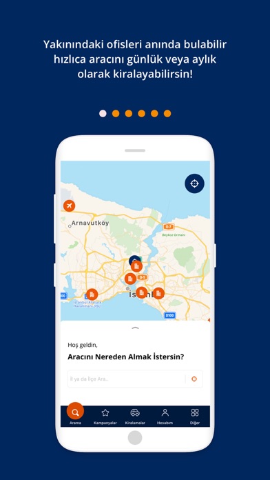
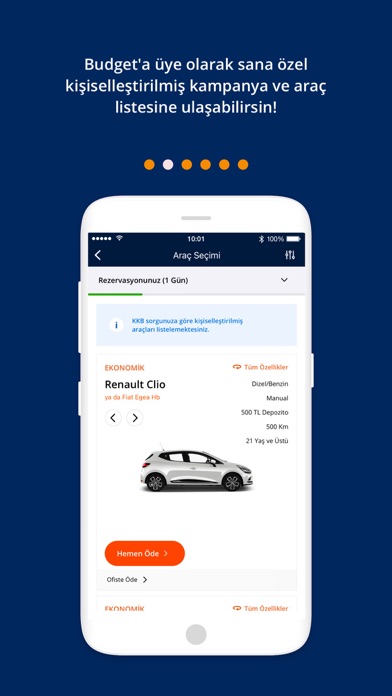
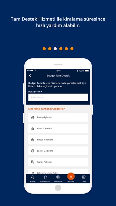
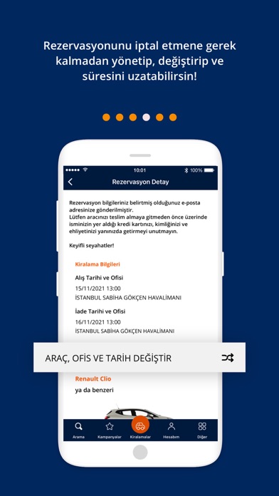
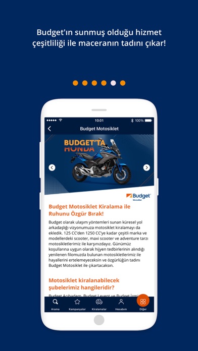
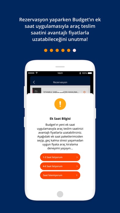
Icon palette
About this app
Dünyanın köklü araç kiralama markası Budget, şimdi cebinizde! 128 ülkede 3.400'den fazla ofisiyle dünyanın en büyük araç kiralama markalarından biri olan Budget; küresel gücünü, yerel bilgi birikimi ve bütçenize en uygun hizmet anlayışıyla Türkiye'de sizinle buluşturuyor. NEDEN BUDGET TÜRKİYE? - 1958'den bu yana dünyada güvenilir araç kiralama deneyimi - Türkiye'de 2007'den itibaren Otokoç Otomotiv güvencesiyle hizmet - Her şey dahil şeffaf fiyatlar, gizli maliyet yok - Ön ödeme ve esnek ödeme seçenekleri - Her kiralama öncesi güvenlik kontrolü ve temizlenmiş araçlar - Sürekli yenilenen filoda en yeni model araçlar KÜRESEL AĞ, YEREL HİZMET 128 ülke, 3.400+ ofis. İster yurt içi ister yurt dışı — Budget ile nerede olursanız olun güvende yolculuk edin. TÜRKİYE GENELİNDE HİZMET İstanbul, Ankara, İzmir, Antalya, Bodrum, Dalaman ve Türkiye'nin dört bir yanındaki Budget ofislerinde ya…
App details
What you can learn from Budget Türkiye - Araç Kiralama
Every shipping app on the App Store has gone through the same decisions you're working through right now: which screenshot goes first, what caption sits over it, which device frame to show, what color the background should be. The 6 screenshots above are Budget Türkiye - Araç Kiralama's answers to those questions — they're public, they're real, and they made it through Apple's review.
What the numbers say: Budget Türkiye - Araç Kiralama runs a dark set with one background colour (#04245C) carried across every screenshot — the listing reads as a single poster when the shots sit side by side in search results. The accent colour we picked up, #546C8C, is the one to reuse for badges, arrows and highlighted words if you borrow this look. Hit Use this style to open the editor with these exact colours and drop your own screenshot in.
Notice the first screenshot in particular. It's the one users see in search results and on the product page, and it's where most apps spend their best caption and tightest design. Look at the proportion of background to phone, where the text sits, what one thing the image is trying to communicate.
Want to see how other Travel apps approach the same problem? Browse more Travel apps in the showcase.
Take what works into your own screenshots
Open LaunchShots and design your App Store & Google Play screenshots — pick a device frame, drop captions, ship in minutes. Free, in your browser.
Open the screenshot editor →Apps with a similar look
Closest background + accent colours among the listings we've analysed — useful when you want to see the same palette handled by a different team.