Chart position — tracked daily by LaunchShots
Screenshot changes — detected by LaunchShots
Screenshot style breakdown
Sampled from 6 of マイ ニフティ's App Store screenshots — background, accent and theme, measured by LaunchShots (not something Apple publishes).
#0C346C bg
#2E5080
#347CAC accent
#FFFFFF text
Screenshots




Icon palette
About this app
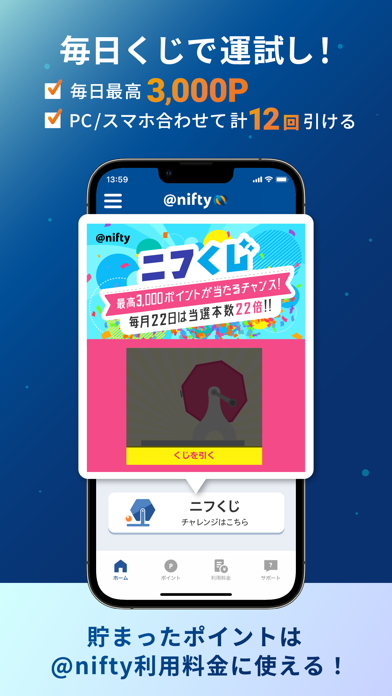
「安心×便利×楽しい×お得」が詰まった@nifty会員向け公式アプリです。 【@nifty会員向けアプリでできること】 ・ニフティからの重要なお知らせはアプリに通知 - キャッシュバック特典のご案内や@nifty光の開通までの進捗状況を確認いただけます。 ・料金確認 - 請求情報が決まったらプッシュ通知でお知らせします。 ・ご契約内容確認・各種変更お手続き ・ニフティポイント - お買い物や無料ゲーム・アンケートなどでポイントを貯められます。 - 「@nifty使用権」へ交換なら1P=1.5円相当。月々のご利用料金に充当できます。 - 1P=1円として現金や電子マネーに交換可能 ・ニフくじ - 毎日無料で運試し!毎月22日は「ニフティの日」ニフくじ当選本数22倍! ・NifMo - データ残量や過去の通信量がグラフで確認できます。 - データ残量を使い切った後も、簡単にデータのおかわりが可能です。 【ご注意事項】 ・本アプリは@niftyのサービスをご利用中の個人会員様向けのアプリです。法人会員様はログインいただけないのでご注意ください。 ・本アプ…
App details
What you can learn from マイ ニフティ
Every shipping app on the App Store has gone through the same decisions you're working through right now: which screenshot goes first, what caption sits over it, which device frame to show, what color the background should be. The 6 screenshots above are マイ ニフティ's answers to those questions — they're public, they're real, and they made it through Apple's review.
What the numbers say: マイ ニフティ runs a dark set with one background colour (#0C346C) carried across every screenshot — the listing reads as a single poster when the shots sit side by side in search results. The accent colour we picked up, #347CAC, is the one to reuse for badges, arrows and highlighted words if you borrow this look. Hit Use this style to open the editor with these exact colours and drop your own screenshot in.
Notice the first screenshot in particular. It's the one users see in search results and on the product page, and it's where most apps spend their best caption and tightest design. Look at the proportion of background to phone, where the text sits, what one thing the image is trying to communicate.
Want to see how other Utilities apps approach the same problem? Browse more Utilities apps in the showcase.
Take what works into your own screenshots
Open LaunchShots and design your App Store & Google Play screenshots — pick a device frame, drop captions, ship in minutes. Free, in your browser.
Open the screenshot editor →Apps with a similar look
Closest background + accent colours among the listings we've analysed — useful when you want to see the same palette handled by a different team.