Screenshot style breakdown
Sampled from 6 of サンエー's App Store screenshots — background, accent and theme, measured by LaunchShots (not something Apple publishes).
#FCFCFC bg
#DDDDDD
#5CBCEC accent
#111111 text
Screenshots




Icon palette
About this app
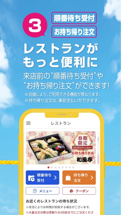
① 便利なデジタルサンエーカード サンエーポイントが貯まる・使える! ポイント数の確認もできます。 ※デジタルサンエーカードは食品館、衣料館で使えます。 ② 見逃せないチラシやお知らせ よく行く店舗をフォローし、アプリトップに表示できます。 ③ レストランがもっと便利に 来店前の “順番待ち予約” や“持ち帰り注文” ができます。 ④ おトクいっぱいクーポン 事前予約でポイントが貯まるクーポンや店頭でおトクに買えるクーポンがいっぱい! ⑤ ラクラク・キャンペーン応募 ボタンを押すだけでキャンペーン応募完了! 面倒な手続きは不要です。 ⑥ ネット注文へのリンクも 「オンラインショップ」、「ネットスーパー」、「オードブルのネット予約」サイトにもつながる!
App details
What you can learn from サンエー
Every shipping app on the App Store has gone through the same decisions you're working through right now: which screenshot goes first, what caption sits over it, which device frame to show, what color the background should be. The 6 screenshots above are サンエー's answers to those questions — they're public, they're real, and they made it through Apple's review.
What the numbers say: サンエー runs a light set where the background shifts from screenshot to screenshot (first shot #FCFCFC) — each image has to stand on its own, so the captions carry more of the story. The accent colour we picked up, #5CBCEC, is the one to reuse for badges, arrows and highlighted words if you borrow this look. Hit Use this style to open the editor with these exact colours and drop your own screenshot in.
Notice the first screenshot in particular. It's the one users see in search results and on the product page, and it's where most apps spend their best caption and tightest design. Look at the proportion of background to phone, where the text sits, what one thing the image is trying to communicate.
Want to see how other Lifestyle apps approach the same problem? Browse more Lifestyle apps in the showcase.
Take what works into your own screenshots
Open LaunchShots and design your App Store & Google Play screenshots — pick a device frame, drop captions, ship in minutes. Free, in your browser.
Open the screenshot editor →Apps with a similar look
Closest background + accent colours among the listings we've analysed — useful when you want to see the same palette handled by a different team.