Chart position — tracked daily by LaunchShots
Screenshot style breakdown
Sampled from 5 of مصحف ابن عثيمين وتفسيره's App Store screenshots — background, accent and theme, measured by LaunchShots (not something Apple publishes).
#7C3C14 bg
#8E5734
#A47C5C accent
#FFFFFF text
Screenshots
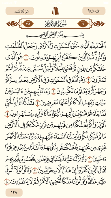
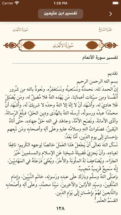
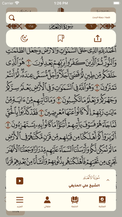
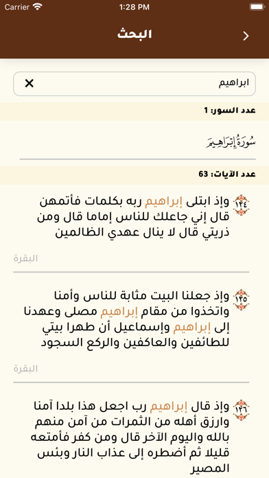
iPad screenshots


Icon palette
About this app
لقد كان من الأعمال الجليلة لصاحب الفضيلة الشيخ العلامة محمد بن صالح العثيمين رحمه الله تعالى، عنايته واهتمامه وحرصه التام بتقرير القواعد والأصول في العلوم الشرعية، ليسلك بذلك طلاب العلم أقرب الطرق وأسلمها للظفر بالتحصيل العلمي المنشود، وإدراك معاني النصوص الشرعية واستنباط الأحكام والفوائد منها. وقد أثمرت جهوده المباركة -بفضل الله تعالى- في هذا المقام الجليل تراثا علميا نافعا في تدبر القرآن وقراءته على بصيرة، فكان لتدبر معاني القرآن الكريم وفهم أوامره ونواهيه وقصصه معانٍ جليلة ومفاهيم دقيقة، لا سيما إذا كانت من كلام عالم رباني كبير قضى عمره في تدبره آيات الله عز وجل وفهم سنة رسوله صلى الله عليه وسلم. وقد قال صلى الله عليه وسلم: «من قرأ حرفا من كتاب الله فله به حسنة، والحسنة بعشر أمثالها، لا أقول الم حرف، ولكن ألف حرف ولام حرف وميم حرف» [أخرجه الترمذي وصححه]. قامت مؤسسة الشيخ محمد بن صالح العثيمين الخيرية بجمع ما قام فضيلة الشيخ رحمه الله بتفسيره، ضمن هذا التطبيق المبارك، والذي من مميزاته…
App details
What you can learn from مصحف ابن عثيمين وتفسيره
Every shipping app on the App Store has gone through the same decisions you're working through right now: which screenshot goes first, what caption sits over it, which device frame to show, what color the background should be. The 10 screenshots above are مصحف ابن عثيمين وتفسيره's answers to those questions — they're public, they're real, and they made it through Apple's review.
What the numbers say: مصحف ابن عثيمين وتفسيره runs a mixed light-and-dark set where the background shifts from screenshot to screenshot (first shot #7C3C14) — each image has to stand on its own, so the captions carry more of the story. The accent colour we picked up, #A47C5C, is the one to reuse for badges, arrows and highlighted words if you borrow this look. Hit Use this style to open the editor with these exact colours and drop your own screenshot in.
Notice the first screenshot in particular. It's the one users see in search results and on the product page, and it's where most apps spend their best caption and tightest design. Look at the proportion of background to phone, where the text sits, what one thing the image is trying to communicate.
Want to see how other Book apps approach the same problem? Browse more Book apps in the showcase.
Take what works into your own screenshots
Open LaunchShots and design your App Store & Google Play screenshots — pick a device frame, drop captions, ship in minutes. Free, in your browser.
Open the screenshot editor →Apps with a similar look
Closest background + accent colours among the listings we've analysed — useful when you want to see the same palette handled by a different team.