Chart position — tracked daily by LaunchShots
Screenshot style breakdown
Sampled from 6 of 花粉浓度播报's App Store screenshots — background, accent and theme, measured by LaunchShots (not something Apple publishes).
#ECECC4 bg
#CFCFAC
#2CC4E4 accent
#111111 text
Screenshots
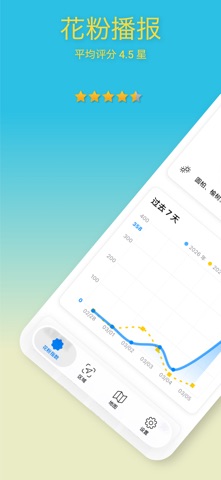
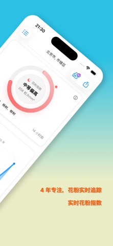
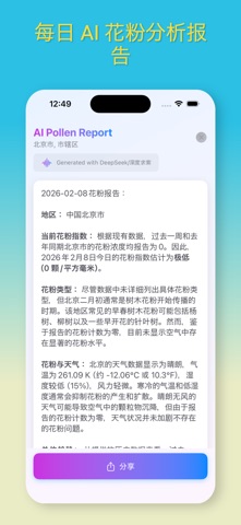

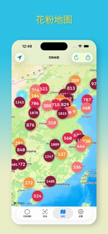

iPad screenshots

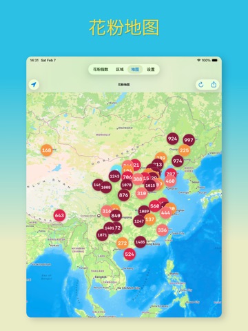
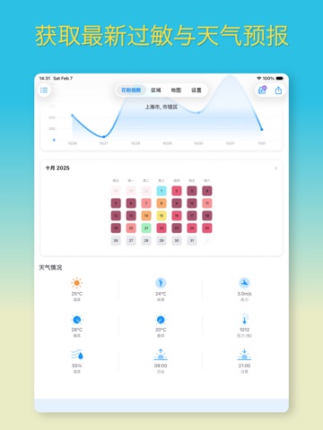


Icon palette
About this app
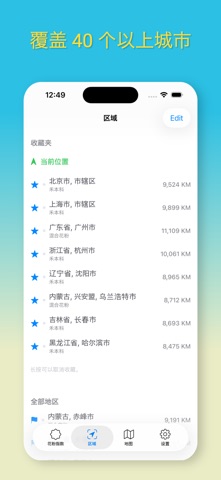
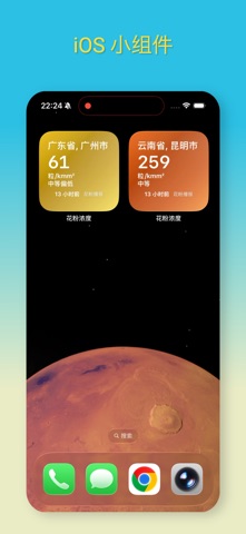
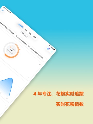
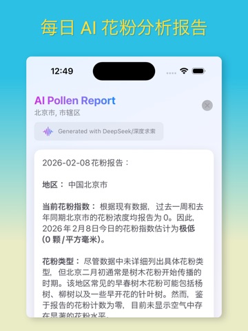
感谢您在过去 5 年中对我们的支持。 「花粉播报」,作为中国领先的季节性过敏症健康应用之一,专注于帮助您有效管理过敏症状,并全面掌握您所在区域的过敏情况。我们为您提供覆盖超过30个地区的实时24小时花粉过敏信息,确保您随时了解自己周边的花粉状况。 又是一年花粉季,我们衷心感谢过去三年的支持,并邀请大家做好准备,携手共度这一季。 「花粉播报」的功能卓越,特点包括: - 提供最新花粉过敏和天气预报,涵盖从南至北,东至西的超过30个地区; - 根据您的需求发送不同地点的过敏水平变化通知; - 轻松分享当前的过敏水平信息给朋友和家人; - 深入了解您所在地区的花粉过敏数据以及对健康有影响的过敏原。 作为一款免费应用,「花粉播报」旨在帮助您更好地控制过敏症状,目前仅适用于中国大陆地区。 订阅「花粉播报」高级会员享受: - 在订阅期内享有所有高级内容和服务; - 高级服务包括个性化通知、小工具、所有地区全覆盖、花粉指数地图以及无广告体验; - 订阅费用:每周3.99美元、每月14.99美元及每年99.99美元, 或等同于「苹果应用商店价格矩阵…
App details
What you can learn from 花粉浓度播报
Every shipping app on the App Store has gone through the same decisions you're working through right now: which screenshot goes first, what caption sits over it, which device frame to show, what color the background should be. The 16 screenshots above are 花粉浓度播报's answers to those questions — they're public, they're real, and they made it through Apple's review.
What the numbers say: 花粉浓度播报 runs a light set where the background shifts from screenshot to screenshot (first shot #ECECC4) — each image has to stand on its own, so the captions carry more of the story. The accent colour we picked up, #2CC4E4, is the one to reuse for badges, arrows and highlighted words if you borrow this look. Hit Use this style to open the editor with these exact colours and drop your own screenshot in.
Notice the first screenshot in particular. It's the one users see in search results and on the product page, and it's where most apps spend their best caption and tightest design. Look at the proportion of background to phone, where the text sits, what one thing the image is trying to communicate.
Want to see how other Health & Fitness apps approach the same problem? Browse more Health & Fitness apps in the showcase.
Take what works into your own screenshots
Open LaunchShots and design your App Store & Google Play screenshots — pick a device frame, drop captions, ship in minutes. Free, in your browser.
Open the screenshot editor →Apps with a similar look
Closest background + accent colours among the listings we've analysed — useful when you want to see the same palette handled by a different team.