Screenshot style breakdown
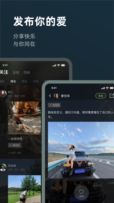
Sampled from 4 of 旅尤圈 - 高颜值旅行圈子's App Store screenshots — background, accent and theme, measured by LaunchShots (not something Apple publishes).
#142C3C bg
#344957
#546C8C accent
#FFFFFF text
Screenshots


Icon palette
About this app
旅尤圈是一款旅行圈子软件,以“跟想旅行的人一起旅行”为旅行价值主张,旨在为旅行爱好者们打造一个个性化、自主化旅行需求的旅行平台。 我们将呈现这些东西: 「发布邀请」 —筛选可以与你一起同行或去同一旅行目的地的用户,共同探讨旅行攻略、网红景点等。让旅途不再孤单,让圈子更有趣味。 —无论是穷游、自驾游、周边游等,都能发现有趣靠谱的旅行伙伴,一同经历一场难忘的旅行。 「动态分享」 —像朋友圈一样发布生活日常、旅途见闻,和想玩的人一起分享旅行见闻。 —碎片分享,聚焦当下最热门的旅行玩法,足不出户也能掌握旅行动态。 —新颖标签,吸引志同道合的朋友一起碰撞不一样的火花。 旅行新花样,始于旅尤圈。
App details
What you can learn from 旅尤圈 - 高颜值旅行圈子
Every shipping app on the App Store has gone through the same decisions you're working through right now: which screenshot goes first, what caption sits over it, which device frame to show, what color the background should be. The 4 screenshots above are 旅尤圈 - 高颜值旅行圈子's answers to those questions — they're public, they're real, and they made it through Apple's review.
What the numbers say: 旅尤圈 - 高颜值旅行圈子 runs a dark set with one background colour (#142C3C) carried across every screenshot — the listing reads as a single poster when the shots sit side by side in search results. The accent colour we picked up, #546C8C, is the one to reuse for badges, arrows and highlighted words if you borrow this look. Hit Use this style to open the editor with these exact colours and drop your own screenshot in.
Notice the first screenshot in particular. It's the one users see in search results and on the product page, and it's where most apps spend their best caption and tightest design. Look at the proportion of background to phone, where the text sits, what one thing the image is trying to communicate.
Want to see how other Travel apps approach the same problem? Browse more Travel apps in the showcase.
Take what works into your own screenshots
Open LaunchShots and design your App Store & Google Play screenshots — pick a device frame, drop captions, ship in minutes. Free, in your browser.
Open the screenshot editor →Apps with a similar look
Closest background + accent colours among the listings we've analysed — useful when you want to see the same palette handled by a different team.