Chart position — tracked daily by LaunchShots
Screenshot style breakdown
Sampled from 6 of 東京都水道局アプリ's App Store screenshots — background, accent and theme, measured by LaunchShots (not something Apple publishes).
#FCFCFC bg
#DDDDDD
#1C74B4 accent
#111111 text
Screenshots
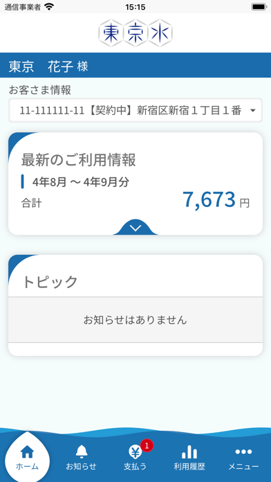


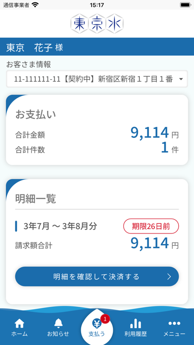


iPad screenshots


Icon palette
About this app
1.スマートフォンから簡単スピーディーに手続可能 引っ越しの際の水道の使用開始、使用中止手続、水道・下水道料金の口座振替やクレジットカード払い等のお申込 2.スマートフォン決済やクレジットカード都度払いなど様々な支払い可能 【対応可能なスマホ決済アプリ】PayPay・FamiPay・auPAY・d払い・楽天Payの5種類に対応 ※請求書は電子配信となり、現金でのお支払いはできません 3.アプリ上で検針票や使用水量の照会が可能 紙の検針票に代わり、アプリ内に検針票を電子配信。過去2年間の使用水量や料金を分かりやすいグラフで確認できます。 4.スマートフォンで、さまざまな情報を確認可能 水道局からのお知らせ、災害時給水ステーションの照会が可能 2023年3月1日より英語モード搭載。 (英語モードでは利用できる機能は、引越しのお手続のみです) It is able to applicate the following procedure in English. 1. applicate start to water service 2. applicate stop to water service
App details
What you can learn from 東京都水道局アプリ
Every shipping app on the App Store has gone through the same decisions you're working through right now: which screenshot goes first, what caption sits over it, which device frame to show, what color the background should be. The 12 screenshots above are 東京都水道局アプリ's answers to those questions — they're public, they're real, and they made it through Apple's review.
What the numbers say: 東京都水道局アプリ runs a light set with one background colour (#FCFCFC) carried across every screenshot — the listing reads as a single poster when the shots sit side by side in search results. The accent colour we picked up, #1C74B4, is the one to reuse for badges, arrows and highlighted words if you borrow this look. Hit Use this style to open the editor with these exact colours and drop your own screenshot in.
Notice the first screenshot in particular. It's the one users see in search results and on the product page, and it's where most apps spend their best caption and tightest design. Look at the proportion of background to phone, where the text sits, what one thing the image is trying to communicate.
Want to see how other Lifestyle apps approach the same problem? Browse more Lifestyle apps in the showcase.
Take what works into your own screenshots
Open LaunchShots and design your App Store & Google Play screenshots — pick a device frame, drop captions, ship in minutes. Free, in your browser.
Open the screenshot editor →Apps with a similar look
Closest background + accent colours among the listings we've analysed — useful when you want to see the same palette handled by a different team.