Chart position — tracked daily by LaunchShots
Screenshot style breakdown
Sampled from 4 of 在庫ノート - 家庭・小売の在庫管理を共有して使える -'s App Store screenshots — background, accent and theme, measured by LaunchShots (not something Apple publishes).
#646474 bg
#797987
#FC4C3C accent
#FFFFFF text
Screenshots
iPad screenshots
Icon palette
About this app
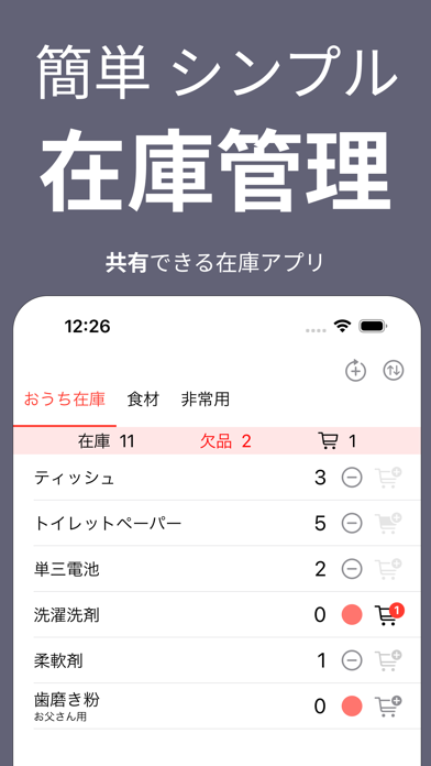
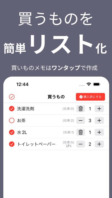
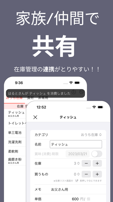
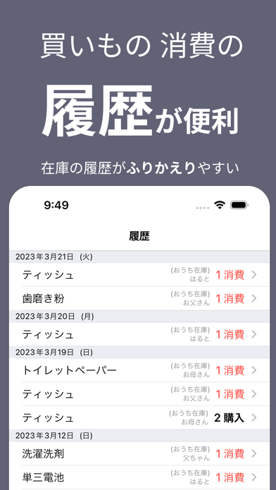
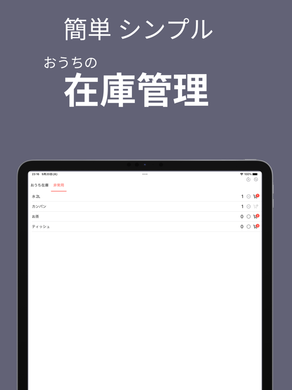
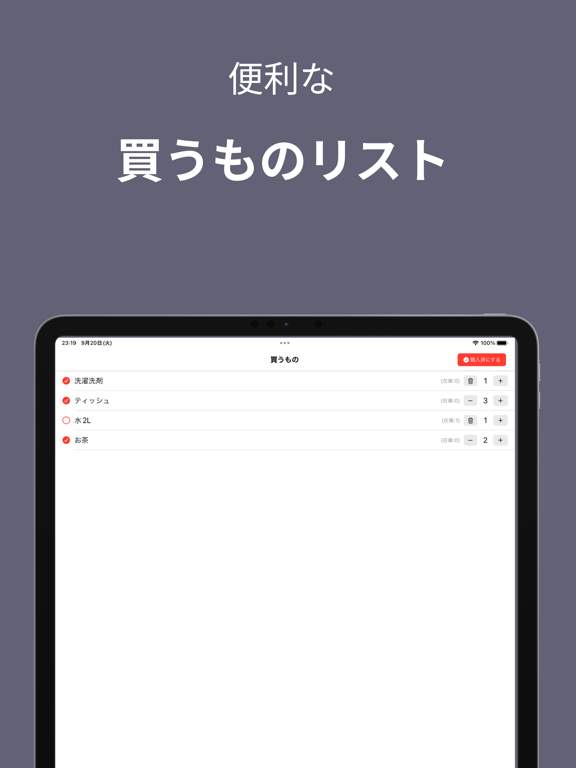
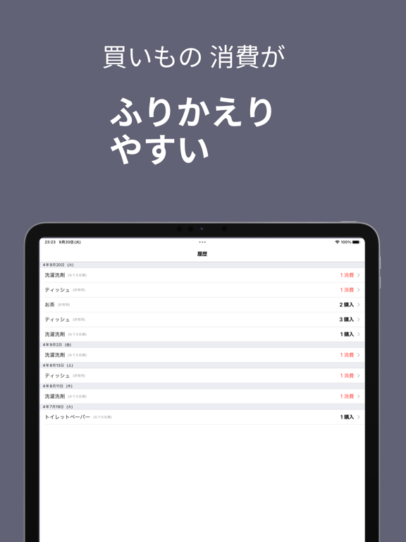
簡単シンプルな家庭/小売向け無料の在庫記録アプリ。リアルタイムで共有できるので、複数人での在庫把握、消費管理もスムーズです。 在庫の消費時にワンタップで消費カウントし、簡単に買うものへの追加ができます。Amazon、楽天、ヨドバシなどのサイトもワンタップで開けるため、簡単に買い物できます。 ◆◆こんな方におススメ◆◆ ・パパや子供の消耗品の消費状況をまとめて把握したい ・家族と分担して在庫記録をしたい ・在庫切れになる前に確実に買い足したい ・離れた一人暮らしのお子様、お父様お母様の在庫を把握したい ・Webでのお買い物を簡単にしたい ◆◆記録項目◆◆ 在庫カテゴリ、在庫名、在庫数、消費(賞味)期限、商品URL、在庫メモ、買うもの数量、あとで買うもの ◆◆履歴画面◆◆ ・消費、購入の日時が自動で記録され、在庫アイテムごとに把握できるから、どのぐらいのペースで消費してるかも把握しやすい ・すべての買い物の一覧表示もできるので、買い物がふりかえりやすい ◆◆共有機能◆◆ ・入力した記録はリアルタイムで共有されるので家族で在庫状況…
App details
What you can learn from 在庫ノート - 家庭・小売の在庫管理を共有して使える -
Every shipping app on the App Store has gone through the same decisions you're working through right now: which screenshot goes first, what caption sits over it, which device frame to show, what color the background should be. The 7 screenshots above are 在庫ノート - 家庭・小売の在庫管理を共有して使える -'s answers to those questions — they're public, they're real, and they made it through Apple's review.
What the numbers say: 在庫ノート - 家庭・小売の在庫管理を共有して使える - runs a dark set with one background colour (#646474) carried across every screenshot — the listing reads as a single poster when the shots sit side by side in search results. The accent colour we picked up, #FC4C3C, is the one to reuse for badges, arrows and highlighted words if you borrow this look. Hit Use this style to open the editor with these exact colours and drop your own screenshot in.
Notice the first screenshot in particular. It's the one users see in search results and on the product page, and it's where most apps spend their best caption and tightest design. Look at the proportion of background to phone, where the text sits, what one thing the image is trying to communicate.
Want to see how other Utilities apps approach the same problem? Browse more Utilities apps in the showcase.
Take what works into your own screenshots
Open LaunchShots and design your App Store & Google Play screenshots — pick a device frame, drop captions, ship in minutes. Free, in your browser.
Open the screenshot editor →Apps with a similar look
Closest background + accent colours among the listings we've analysed — useful when you want to see the same palette handled by a different team.