Screenshot style breakdown
Sampled from 6 of 피아노키위즈's App Store screenshots — background, accent and theme, measured by LaunchShots (not something Apple publishes).
#4CC454 bg
#42AC49
#9C7C64 accent
#111111 text
Screenshots


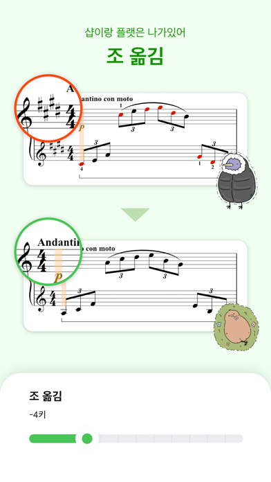

iPad screenshots


Icon palette
About this app
넘겨줄게요, 당신의 악보, 당신의 한계 - 다양한 기능을 갖춘 피아노 악보와 함께 피아노를 배워보세요. - 조금 다르더라도 사람이 듣는 것처럼 악보를 자연스럽게 넘겨줘요. - 소리 기반으로 어쿠스틱, 디지털 피아노 모두 사용할 수 있어요. - 누구나 악보를 올리면 피아노키위즈의 연주 분석 기능을 쓸 수 있어요. 이용약관: https://pianokiwis.com/terms 개인정보처리방침: https://pianokiwis.com/privacyPolicy
App details
What you can learn from 피아노키위즈
Every shipping app on the App Store has gone through the same decisions you're working through right now: which screenshot goes first, what caption sits over it, which device frame to show, what color the background should be. The 12 screenshots above are 피아노키위즈's answers to those questions — they're public, they're real, and they made it through Apple's review.
What the numbers say: 피아노키위즈 runs a light set where the background shifts from screenshot to screenshot (first shot #4CC454) — each image has to stand on its own, so the captions carry more of the story. The accent colour we picked up, #9C7C64, is the one to reuse for badges, arrows and highlighted words if you borrow this look. Hit Use this style to open the editor with these exact colours and drop your own screenshot in.
Notice the first screenshot in particular. It's the one users see in search results and on the product page, and it's where most apps spend their best caption and tightest design. Look at the proportion of background to phone, where the text sits, what one thing the image is trying to communicate.
Want to see how other Music apps approach the same problem? Browse more Music apps in the showcase.
Take what works into your own screenshots
Open LaunchShots and design your App Store & Google Play screenshots — pick a device frame, drop captions, ship in minutes. Free, in your browser.
Open the screenshot editor →Apps with a similar look
Closest background + accent colours among the listings we've analysed — useful when you want to see the same palette handled by a different team.