Chart position — tracked daily by LaunchShots
Screenshot changes — detected by LaunchShots
Screenshot style breakdown
Sampled from 6 of A101: Tek Uygulama's App Store screenshots — background, accent and theme, measured by LaunchShots (not something Apple publishes).
#A4E4F4 bg
#90C8D6
#24B4CC accent
#111111 text
Reading the caption text from the screenshots in your browser…
Screenshots


Icon palette
About this app
A101 Tek Uygulama - A101 fiyatıyla kazandıran uygulama Bildiğin A101 fiyatıyla, şimdi tüm ihtiyaçların tek uygulamada. Market alışverişinden elektroniğe, sana özel avantajlardan patili dostunun ihtiyaçlarına kadar A101 dünyasına tek yerden ulaş. A101 Kapıda, A101 Ekstra, A101 Artı ve A101 Pati ile bütçeni korurken alışverişten daha fazlasını kazan. A101 Kapıda — Tüm market ihtiyaçların A101 fiyatıyla, şimdi kapında. Günlük market alışverişinden mutfak ve ev ihtiyaçlarına kadar binlerce ürünü A101 Kapıda’dan seç, siparişin kapına gelsin. Kolaylık için fazladan ödemeye gerek yok. Sen listeni hazırla. Gerisi A101 fiyatıyla kapıda. A101 Ekstra — Beklediğin fiyat. Beklemediğin ürünler. Elektronikten beyaz eşyaya, mobilyadan giyime kadar birçok kategoride sevilen markalar A101 Ekstra’da. Aradığını bul, farklı kategorileri keşfet, A101 fiyatıyla kazan. A101 Artı — Alışveriş akıllısı, A1…
App details
What you can learn from A101: Tek Uygulama
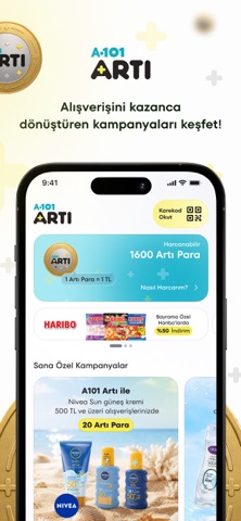
Every shipping app on the App Store has gone through the same decisions you're working through right now: which screenshot goes first, what caption sits over it, which device frame to show, what color the background should be. The 9 screenshots above are A101: Tek Uygulama's answers to those questions — they're public, they're real, and they made it through Apple's review.
What the numbers say: A101: Tek Uygulama runs a light set where the background shifts from screenshot to screenshot (first shot #A4E4F4) — each image has to stand on its own, so the captions carry more of the story. The accent colour we picked up, #24B4CC, is the one to reuse for badges, arrows and highlighted words if you borrow this look. Hit Use this style to open the editor with these exact colours and drop your own screenshot in.
Notice the first screenshot in particular. It's the one users see in search results and on the product page, and it's where most apps spend their best caption and tightest design. Look at the proportion of background to phone, where the text sits, what one thing the image is trying to communicate.
Want to see how other Shopping apps approach the same problem? Browse more Shopping apps in the showcase.
Take what works into your own screenshots
Open LaunchShots and design your App Store & Google Play screenshots — pick a device frame, drop captions, ship in minutes. Free, in your browser.
Open the screenshot editor →Apps with a similar look
Closest background + accent colours among the listings we've analysed — useful when you want to see the same palette handled by a different team.