Chart position — tracked daily by LaunchShots
Screenshot changes — detected by LaunchShots
Screenshot style breakdown
Sampled from 5 of Без вредных привычек: дни's App Store screenshots — background, accent and theme, measured by LaunchShots (not something Apple publishes).
#141414 bg
#343434
#C44454 accent
#FFFFFF text
Screenshots



iPad screenshots



Icon palette
About this app
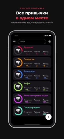
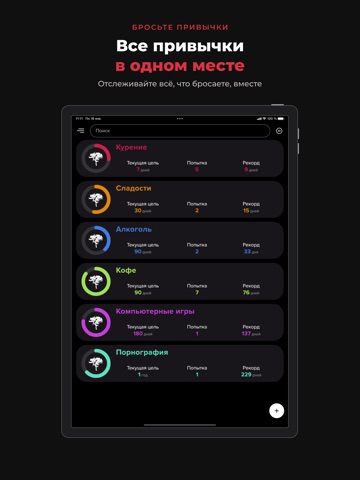
Верните контроль над своей жизнью с Bad Habit Break — честным, мотивирующим спутником, чтобы бросить вредные привычки и победить любую зависимость: курение, алкоголь, вейпинг, никотин, кофеин, сахар, азартные игры, видеоигры или что угодно другое, что вас тормозит. Bad Habit Break — это больше, чем трекер. Это союзник, который идёт рядом с вами по пути саморазвития, считает каждую трезвую секунду и превращает ваш прогресс в доказательство того, что перемены возможны. Ведя подробную историю своих побед, чувств и даже срывов, вы начинаете понимать собственные закономерности — а понимание это первый шаг к прочной свободе. ПОЧЕМУ ВАМ ПОНРАВИТСЯ • Счётчик трезвости: смотрите, как растут дни, часы, минуты и секунды с момента отказа. • Неограниченные привычки: отслеживайте сколько угодно вредных привычек или зависимостей сразу. • Подробная история: пересмотрите свой путь и анализируйте свои…
App details
What you can learn from Без вредных привычек: дни
Every shipping app on the App Store has gone through the same decisions you're working through right now: which screenshot goes first, what caption sits over it, which device frame to show, what color the background should be. The 10 screenshots above are Без вредных привычек: дни's answers to those questions — they're public, they're real, and they made it through Apple's review.
What the numbers say: Без вредных привычек: дни runs a dark set with one background colour (#141414) carried across every screenshot — the listing reads as a single poster when the shots sit side by side in search results. The accent colour we picked up, #C44454, is the one to reuse for badges, arrows and highlighted words if you borrow this look. Hit Use this style to open the editor with these exact colours and drop your own screenshot in.
Notice the first screenshot in particular. It's the one users see in search results and on the product page, and it's where most apps spend their best caption and tightest design. Look at the proportion of background to phone, where the text sits, what one thing the image is trying to communicate.
Want to see how other Lifestyle apps approach the same problem? Browse more Lifestyle apps in the showcase.
Take what works into your own screenshots
Open LaunchShots and design your App Store & Google Play screenshots — pick a device frame, drop captions, ship in minutes. Free, in your browser.
Open the screenshot editor →Apps with a similar look
Closest background + accent colours among the listings we've analysed — useful when you want to see the same palette handled by a different team.