Chart position — tracked daily by LaunchShots
Screenshot changes — detected by LaunchShots
Screenshot style breakdown
Sampled from 6 of Отелло: бронирование отелей's App Store screenshots — background, accent and theme, measured by LaunchShots (not something Apple publishes).
#0464BC bg
#2779C5
#3CE404 accent
#FFFFFF text
Reading the caption text from the screenshots in your browser…
Screenshots




Icon palette
About this app
Ищете отель, гостиницу или апартаменты для поездки? Скачайте Отелло — сервис бронирования отелей и гостиниц. Бронируйте размещение в России и за границей: отели Сочи и Крыма, апартаменты в Петербурге, гостиницы в Казани, отели Турции и Греции. Что доступно в приложении Отелло: — Бронирование отелей, гостиниц, апартаментов и хостелов — Поиск по фильтрам: бассейн, завтраки, категория, питание — Сохранение истории и избранных объектов — Поддержка до, во время и после поездки — Оплата картой, частями и без предоплаты — Начисление бонусов Спасибо Куда можно забронировать отель или гостиницу: В России: — Сочи, Крым, Петербург, Казань, Калининград — Алтай, Байкал, Кавказ и другие регионы За границей: — Турция, ОАЭ, Таиланд, Греция — Испания, Италия, Кипр и другие направления Что можно выбрать: — Отели, гостиницы, апартаменты, хостелы, мини-отели, глэмпинги — Жильё на побережье, в центр…
App details
What you can learn from Отелло: бронирование отелей
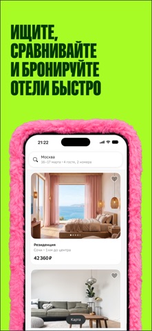
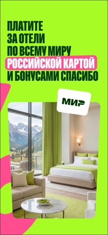
Every shipping app on the App Store has gone through the same decisions you're working through right now: which screenshot goes first, what caption sits over it, which device frame to show, what color the background should be. The 7 screenshots above are Отелло: бронирование отелей's answers to those questions — they're public, they're real, and they made it through Apple's review.
What the numbers say: Отелло: бронирование отелей runs a mixed light-and-dark set where the background shifts from screenshot to screenshot (first shot #0464BC) — each image has to stand on its own, so the captions carry more of the story. The accent colour we picked up, #3CE404, is the one to reuse for badges, arrows and highlighted words if you borrow this look. Hit Use this style to open the editor with these exact colours and drop your own screenshot in.
Notice the first screenshot in particular. It's the one users see in search results and on the product page, and it's where most apps spend their best caption and tightest design. Look at the proportion of background to phone, where the text sits, what one thing the image is trying to communicate.
Want to see how other Travel apps approach the same problem? Browse more Travel apps in the showcase.
Take what works into your own screenshots
Open LaunchShots and design your App Store & Google Play screenshots — pick a device frame, drop captions, ship in minutes. Free, in your browser.
Open the screenshot editor →Apps with a similar look
Closest background + accent colours among the listings we've analysed — useful when you want to see the same palette handled by a different team.