Screenshot changes — detected by LaunchShots
Screenshot style breakdown
Sampled from 6 of 我的休闲时光's App Store screenshots — background, accent and theme, measured by LaunchShots (not something Apple publishes).
#2C4C94 bg
#4965A2
#8494D4 accent
#FFFFFF text
Screenshots


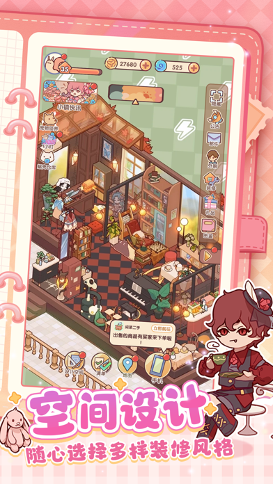


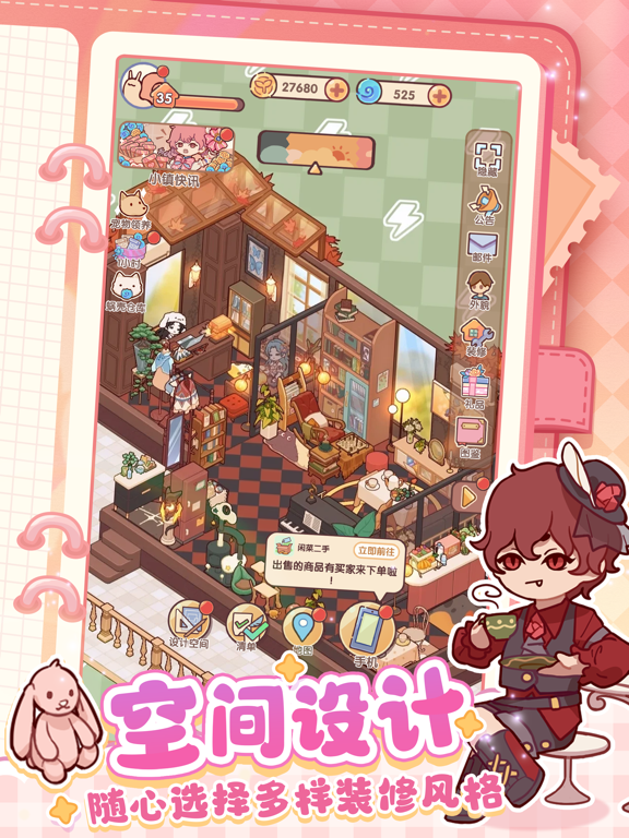
iPad screenshots




Icon palette
About this app
3.4版本将于8月12日正式上线! 「兰夜弄针」套间正式登场!万点河灯祈巧愿,兰夜弄针寄相思。参与「兰夜迷踪」活动可获丰富兰夜设计稿~ 七夕特别活动「彩缕乞巧」即将上线啦~活动期间参与问答小游戏即可获得头饰「朝颜绾」及节日限定家具哦~ 新学期也要元气满满!升学限时活动「元气好运签」开启!活动期间参与签到即可领取「薄荷协奏套装」及趣味家具哦~ 灵感蓝图大升级,可以上传和套用全屋装修方案啦!创作更自由,灵感不设限! -------------------------------------------- 你醒啦,这个小屋现在是你的咯! 我们是《我的休闲时光》开发小队,是由美术和程序猿两人轮流爆肝为大家送上了这款游戏。 某一天我提出了一个疑问:“摆家具的话,不能把喜欢的杯子也摆进家里吗?” 于是程序猿扯了两搓头发把杯子放在了柜子上,“你买的杯子到家了!” 没多久我又提出了一个疑问:“摆花盆的话,不能在里面种花吗?” 程序猿又扯了三搓头发把种子种在了花盆里。 后来我冒着被程序猿献祭的风险,又提出一个疑问:“小屋里的抽屉,不能打开吗?” 程序猿扯下最后几搓头发把抽…
App details
What you can learn from 我的休闲时光
Every shipping app on the App Store has gone through the same decisions you're working through right now: which screenshot goes first, what caption sits over it, which device frame to show, what color the background should be. The 12 screenshots above are 我的休闲时光's answers to those questions — they're public, they're real, and they made it through Apple's review.
What the numbers say: 我的休闲时光 runs a mixed light-and-dark set where the background shifts from screenshot to screenshot (first shot #2C4C94) — each image has to stand on its own, so the captions carry more of the story. The accent colour we picked up, #8494D4, is the one to reuse for badges, arrows and highlighted words if you borrow this look. Hit Use this style to open the editor with these exact colours and drop your own screenshot in.
Notice the first screenshot in particular. It's the one users see in search results and on the product page, and it's where most apps spend their best caption and tightest design. Look at the proportion of background to phone, where the text sits, what one thing the image is trying to communicate.
Want to see how other Games apps approach the same problem? Browse more Games apps in the showcase.
Take what works into your own screenshots
Open LaunchShots and design your App Store & Google Play screenshots — pick a device frame, drop captions, ship in minutes. Free, in your browser.
Open the screenshot editor →Apps with a similar look
Closest background + accent colours among the listings we've analysed — useful when you want to see the same palette handled by a different team.