Chart position — tracked daily by LaunchShots
Screenshot changes — detected by LaunchShots
Screenshot style breakdown
Sampled from 6 of 読書管理ブクログ - 本棚/読書記録's App Store screenshots — background, accent and theme, measured by LaunchShots (not something Apple publishes).
#5CC4EC bg
#50ACCF
#BC8C5C accent
#111111 text
Reading the caption text from the screenshots in your browser…
Screenshots




Icon palette
About this app
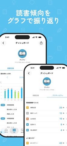
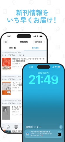
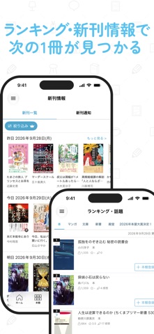
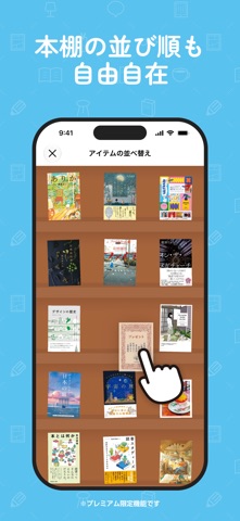
250万人以上が使う人気の読書記録アプリ「ブクログ」。 読んだ本を気軽に記録して、次に読みたい本にも出会える。 読書の楽しみが広がる、そんな場所がブクログです。 感想やレビュー、話題の本やランキング、新刊通知やジャンル検索など あなたの読書スタイルに合った「本との出会い方」がきっと見つかります。 【ブクログの主な機能】 ● 読書記録・本棚管理 - 読んだ本・読みたい本・気になる本をかんたん登録 - 読書メモや本の感想、印象に残ったフレーズを自由に記録 - 読書状況・カテゴリ・タグで本を整理して管理できる ● 本と出会えるきっかけがたくさん - 感想・レビューを見て、気になる本に出会える - キーワードや著者を登録しておけば新刊通知が届く - 話題の本・ランキング・本屋大賞などもアプリ内でチェック可能 - 独自のジャンルからも探せるから、偶然の出会いも - 読書履歴や評価に応じたおすすめ本も自動で提案 ● バーコードで簡単登録 - カメラで本のバーコードを読み取るだけ - 連続スキャン対応でまとめて登録もOK - 書籍検索やキーワード…
App details
What you can learn from 読書管理ブクログ - 本棚/読書記録
Every shipping app on the App Store has gone through the same decisions you're working through right now: which screenshot goes first, what caption sits over it, which device frame to show, what color the background should be. The 10 screenshots above are 読書管理ブクログ - 本棚/読書記録's answers to those questions — they're public, they're real, and they made it through Apple's review.
What the numbers say: 読書管理ブクログ - 本棚/読書記録 runs a light set where the background shifts from screenshot to screenshot (first shot #5CC4EC) — each image has to stand on its own, so the captions carry more of the story. The accent colour we picked up, #BC8C5C, is the one to reuse for badges, arrows and highlighted words if you borrow this look. Hit Use this style to open the editor with these exact colours and drop your own screenshot in.
Notice the first screenshot in particular. It's the one users see in search results and on the product page, and it's where most apps spend their best caption and tightest design. Look at the proportion of background to phone, where the text sits, what one thing the image is trying to communicate.
Want to see how other Book apps approach the same problem? Browse more Book apps in the showcase.
Take what works into your own screenshots
Open LaunchShots and design your App Store & Google Play screenshots — pick a device frame, drop captions, ship in minutes. Free, in your browser.
Open the screenshot editor →Apps with a similar look
Closest background + accent colours among the listings we've analysed — useful when you want to see the same palette handled by a different team.