Chart position — tracked daily by LaunchShots
Screenshot style breakdown
Sampled from 6 of 携程旅行-订酒店机票火车票's App Store screenshots — background, accent and theme, measured by LaunchShots (not something Apple publishes).
#ACD4C4 bg
#97BAAC
#04BCCC accent
#111111 text
Screenshots


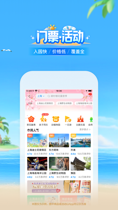


iPad screenshots


Icon palette
About this app
携程旅行——携程在手,说走就走 携程打造了一个整合丰富旅行产品的生态系统,使每次旅行都个性化、便捷、愉悦且启发灵感。我们多样化的产品组合以及不断拓展的目的地资源,可以迎合客户日益变化的出行需求。 “酒店 – 随心安住”携程提供丰富的住宿服务产品,涵盖酒店、民宿、度假村、公寓、别墅、汽车旅馆、住宅等住宿形式;并升级上线全球酒店精选频道,覆盖海外热门目的地如巴黎、东京、迪拜、伦敦、纽约、曼谷、新加坡、悉尼、首尔、里约热内卢等,更有华人礼遇,全球200+国家/地区安心住服务;更可以预订超过200个国家/地区的全球民宿资源,包罗城堡、房车、树屋、百年建筑等新奇特色美宿,民宿性价比更高、更有当地风情,适合多人出游、还能洗衣做饭。 国内覆盖北京、上海、广州、深圳、重庆、成都、香港、澳门等120+核心城市酒店,从经济连锁到奢华五星,随心选择。 “机票 - 全球便捷”携程覆盖北美、欧洲、澳新、日韩、东南亚等国际航线,支持实时价格检索、行李直挂、多语言客服,并同步开放热门目的地签证与接送机一键联订服务。 “火车票 - 智能抢票”携程不…
App details
What you can learn from 携程旅行-订酒店机票火车票
Every shipping app on the App Store has gone through the same decisions you're working through right now: which screenshot goes first, what caption sits over it, which device frame to show, what color the background should be. The 18 screenshots above are 携程旅行-订酒店机票火车票's answers to those questions — they're public, they're real, and they made it through Apple's review.
What the numbers say: 携程旅行-订酒店机票火车票 runs a light set where the background shifts from screenshot to screenshot (first shot #ACD4C4) — each image has to stand on its own, so the captions carry more of the story. The accent colour we picked up, #04BCCC, is the one to reuse for badges, arrows and highlighted words if you borrow this look. Hit Use this style to open the editor with these exact colours and drop your own screenshot in.
Notice the first screenshot in particular. It's the one users see in search results and on the product page, and it's where most apps spend their best caption and tightest design. Look at the proportion of background to phone, where the text sits, what one thing the image is trying to communicate.
Want to see how other Travel apps approach the same problem? Browse more Travel apps in the showcase.
Take what works into your own screenshots
Open LaunchShots and design your App Store & Google Play screenshots — pick a device frame, drop captions, ship in minutes. Free, in your browser.
Open the screenshot editor →Apps with a similar look
Closest background + accent colours among the listings we've analysed — useful when you want to see the same palette handled by a different team.