Chart position — tracked daily by LaunchShots
Screenshot style breakdown
Sampled from 6 of Awrad - أوراد's App Store screenshots — background, accent and theme, measured by LaunchShots (not something Apple publishes).
#FCFCFC bg
#DDDDDD
#046464 accent
#111111 text
Reading the caption text from the screenshots in your browser…
Screenshots


Icon palette
About this app
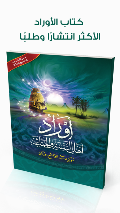
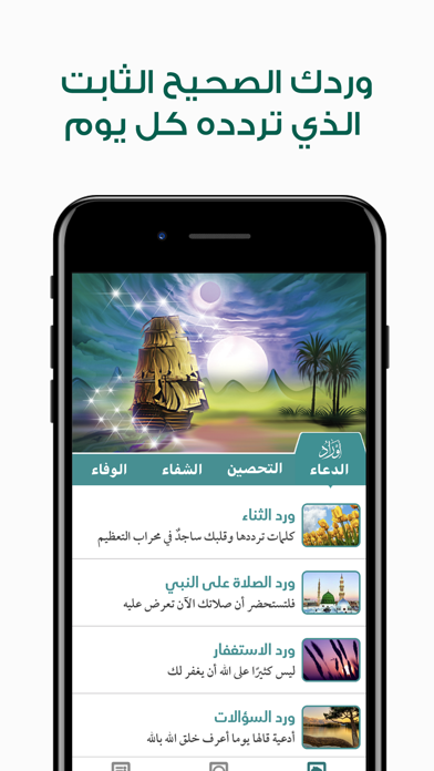
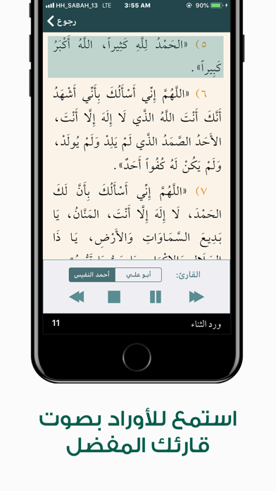
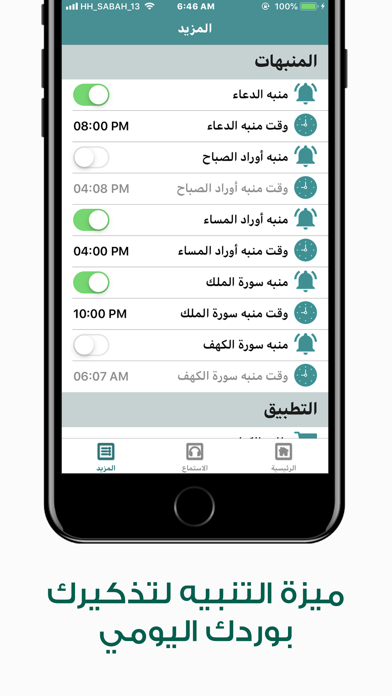
الوصف: أول تطبيق يجمع أدعية النبي صلى الله عليه وسلم حسب معناها، فمن أراد الاستغفار فورد الاستغفار يحوي بحور المغفرة بإذن الله، ومن أرقته الهموم والغموم فورد الكرب والهم أمامه وهكذا. كما يمتاز التطبيق بميزة فريدة عن بقية تطبيقات الأذكار الموجودة في متجر البرامج وهي: دقة تشكيل الكلمات ووضوحها. بالإضافة إلى خاصية جديدة في عالم الأذكار؛ وهي خاصية الاسترخاء بسماع الأدعية بصوت القارىء المتميز الشيخ: أحمد النفيس، والمنشد المتألق: موسى العميرة ( أبو علي)؛ كل هذا بالتزامن مع أصوات الطبيعة. تصميم التطبيق عصري ومتميز. يحتوي التطبيق على أربعة أقسام رئيسية؛ وهي: القسم الأول: أوراد الدعاء، وفيه: ورد الثناء على الله ورد الصلاة على النبي -صلى الله عليه وسلم ورد الاستغفار ورد السؤالات ورد الاستعاذات ورد الرقية الشرعية ورد الهم والكرب القسم الثاني: أوراد التحصين؛ ويحوي: ورد الصباح والمساء ورد النوم ورد الاستيقاظ سورة الملك سورة الكهف القسم الثالث: أوراد الشفاء، ويحوي: الرقية للعين والحسد الرقية ل…
App details
What you can learn from Awrad - أوراد
Every shipping app on the App Store has gone through the same decisions you're working through right now: which screenshot goes first, what caption sits over it, which device frame to show, what color the background should be. The 6 screenshots above are Awrad - أوراد's answers to those questions — they're public, they're real, and they made it through Apple's review.
What the numbers say: Awrad - أوراد runs a mixed light-and-dark set where the background shifts from screenshot to screenshot (first shot #FCFCFC) — each image has to stand on its own, so the captions carry more of the story. The accent colour we picked up, #046464, is the one to reuse for badges, arrows and highlighted words if you borrow this look. Hit Use this style to open the editor with these exact colours and drop your own screenshot in.
Notice the first screenshot in particular. It's the one users see in search results and on the product page, and it's where most apps spend their best caption and tightest design. Look at the proportion of background to phone, where the text sits, what one thing the image is trying to communicate.
Want to see how other Book apps approach the same problem? Browse more Book apps in the showcase.
Take what works into your own screenshots
Open LaunchShots and design your App Store & Google Play screenshots — pick a device frame, drop captions, ship in minutes. Free, in your browser.
Open the screenshot editor →Apps with a similar look
Closest background + accent colours among the listings we've analysed — useful when you want to see the same palette handled by a different team.