Chart position — tracked daily by LaunchShots
Screenshot changes — detected by LaunchShots
Screenshot style breakdown
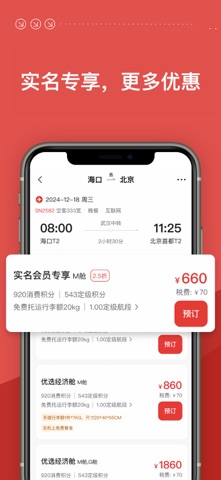
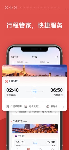
Sampled from 5 of 海南航空's App Store screenshots — background, accent and theme, measured by LaunchShots (not something Apple publishes).
#E4544C bg
#E76B65
#A4241C accent
#FFFFFF text
Screenshots


Icon palette
About this app
海南航空App-一站式选购海航航空集团旗下11家航司机票产品 官方指定,值得信赖 l 自助选座值机 l 多种升舱选择 l 海航飞灵活预约 l 随时随地贴心服务 l 海南航空、首都航空、天津航空、祥鹏航空、西部航空、北部湾航空、福州航空、乌鲁木齐航空、长安航空、金鹏航空、大新华航空 尽在海南航空App 海南航空控股股份有限公司(以下简称“新海航海南航空”)于1993年1月成立,起步于中国最大的经济特区和自由贸易港——海南省,致力于为旅客提供全方位无缝隙的航空服务,打造安全舒适的旅行体验。 2026年上半年,新海航海南航空及旗下控股子公司共运营国内外航线逾1,400条,其中国内航线逾1,200条,覆盖内陆所有省、自治区和直辖市;国际及地区航线近200条,覆盖亚洲、欧洲、北美洲、大洋洲和非洲,通航境外53个城市。公司积极响应国家倡议,融入“一带一路”建设,专注打造国际国内高效互动的、品质型、规模化的卓越型世界级航空网络。积极落实“民航强国”发展战略,在海口、北京、广州、深圳等23个城市建立航空营运基地/分公司。 1993年至今,新海航海南航空安全运营33…
App details
What you can learn from 海南航空
Every shipping app on the App Store has gone through the same decisions you're working through right now: which screenshot goes first, what caption sits over it, which device frame to show, what color the background should be. The 5 screenshots above are 海南航空's answers to those questions — they're public, they're real, and they made it through Apple's review.
What the numbers say: 海南航空 runs a dark set with one background colour (#E4544C) carried across every screenshot — the listing reads as a single poster when the shots sit side by side in search results. The accent colour we picked up, #A4241C, is the one to reuse for badges, arrows and highlighted words if you borrow this look. Hit Use this style to open the editor with these exact colours and drop your own screenshot in.
Notice the first screenshot in particular. It's the one users see in search results and on the product page, and it's where most apps spend their best caption and tightest design. Look at the proportion of background to phone, where the text sits, what one thing the image is trying to communicate.
Want to see how other Travel apps approach the same problem? Browse more Travel apps in the showcase.
Take what works into your own screenshots
Open LaunchShots and design your App Store & Google Play screenshots — pick a device frame, drop captions, ship in minutes. Free, in your browser.
Open the screenshot editor →Apps with a similar look
Closest background + accent colours among the listings we've analysed — useful when you want to see the same palette handled by a different team.