Screenshot style breakdown
Sampled from 6 of Deluxe Moon • Лунный календарь's App Store screenshots — background, accent and theme, measured by LaunchShots (not something Apple publishes).
#040404 bg
#272727
#1C3454 accent
#FFFFFF text
Reading the caption text from the screenshots in your browser…
Screenshots
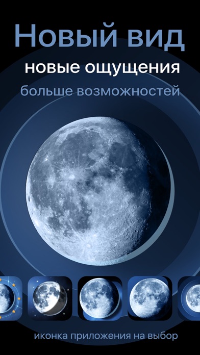
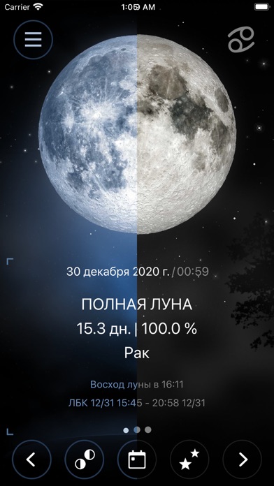
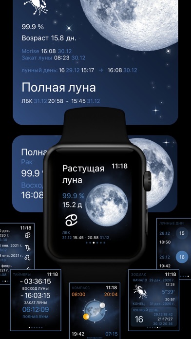
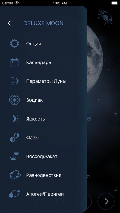



iPad screenshots
Icon palette
About this app
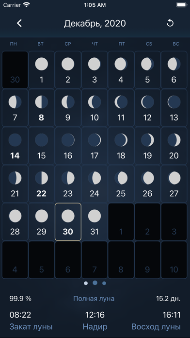
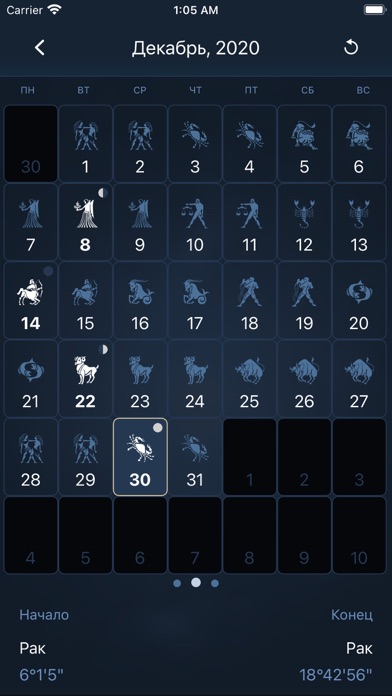
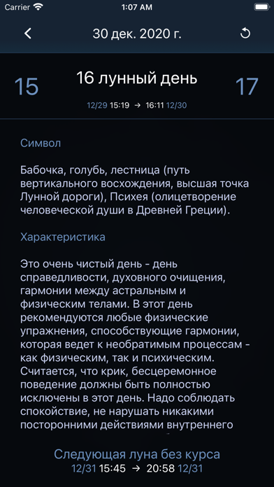
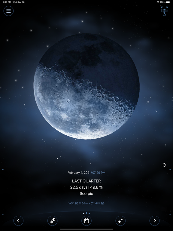
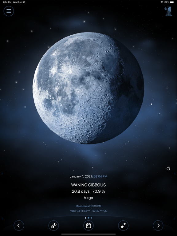
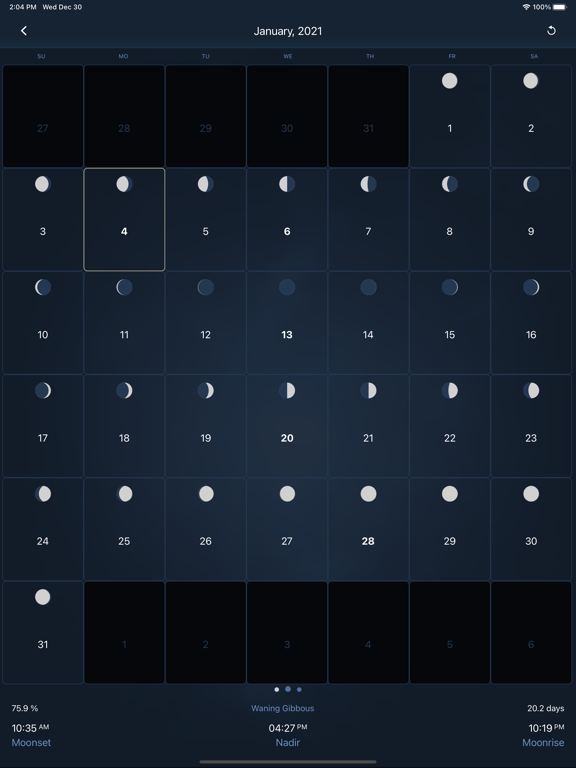
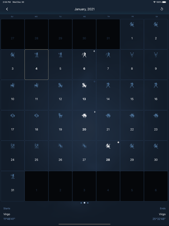
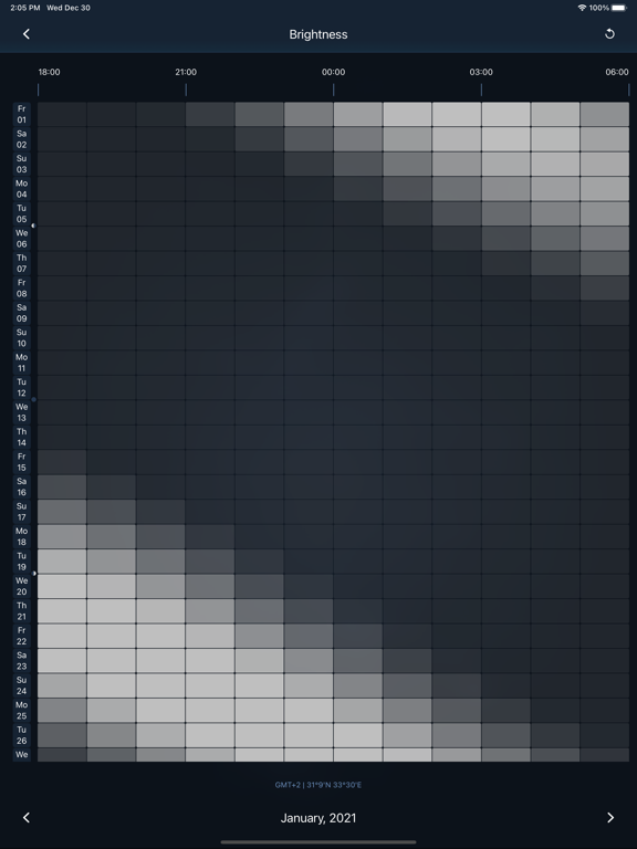
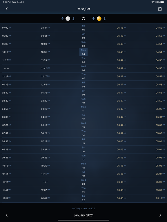
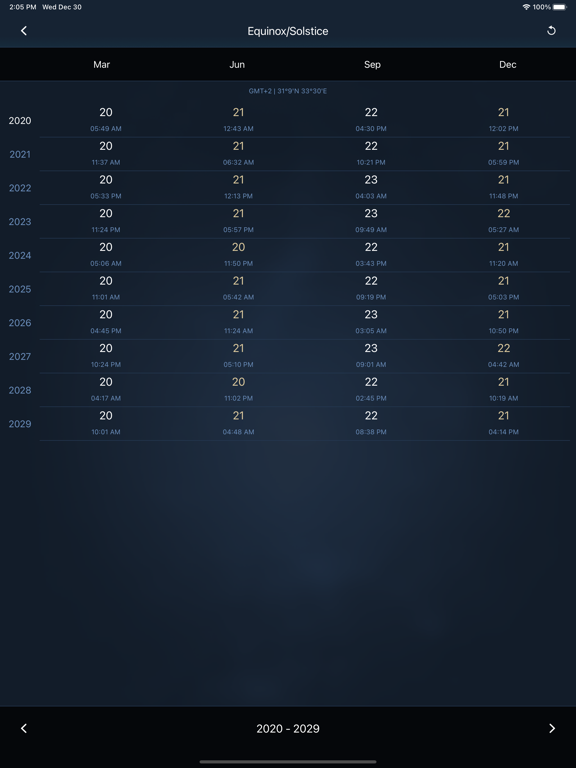
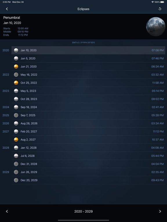
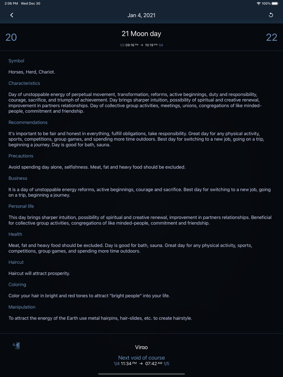
Мистическая и таинственная Луна, владыка ночного времени, с древних времён привлекала внимание людей. Используя самые современные технологии, мы создали для вас Deluxe Moon – стильное приложение для вашего премиального iPhone, iPad и Apple Watch. Это приложение с самой полной (без преувеличения) информацией о Луне. Программа содержит массу полезных таблиц, начиная от восходов-закатов, заканчивая затмениями и диаграммой светимости Луны. Незаменимый инструмент для астрономических наблюдений и навигации (RA, DEC, звёздное время, компас, восходы-закаты), для ночной охоты (диаграмма яркости), для фотографии (диаграмма яркости, компас, голубой/золотой час), для садоводства (фазы луны, луна в знаках зодиака), для скептицизма (круги зодиака с отличиями тропического, сидерического зодиака и реальных созвездий), для планирования (лунный цикл, лунные дни, луна в знаках, луна без курса, планетарны…
App details
What you can learn from Deluxe Moon • Лунный календарь
Every shipping app on the App Store has gone through the same decisions you're working through right now: which screenshot goes first, what caption sits over it, which device frame to show, what color the background should be. The 19 screenshots above are Deluxe Moon • Лунный календарь's answers to those questions — they're public, they're real, and they made it through Apple's review.
What the numbers say: Deluxe Moon • Лунный календарь runs a dark set where the background shifts from screenshot to screenshot (first shot #040404) — each image has to stand on its own, so the captions carry more of the story. The accent colour we picked up, #1C3454, is the one to reuse for badges, arrows and highlighted words if you borrow this look. Hit Use this style to open the editor with these exact colours and drop your own screenshot in.
Notice the first screenshot in particular. It's the one users see in search results and on the product page, and it's where most apps spend their best caption and tightest design. Look at the proportion of background to phone, where the text sits, what one thing the image is trying to communicate.
Want to see how other Weather apps approach the same problem? Browse more Weather apps in the showcase.
Take what works into your own screenshots
Open LaunchShots and design your App Store & Google Play screenshots — pick a device frame, drop captions, ship in minutes. Free, in your browser.
Open the screenshot editor →Apps with a similar look
Closest background + accent colours among the listings we've analysed — useful when you want to see the same palette handled by a different team.