Chart position — tracked daily by LaunchShots
Screenshot style breakdown
Sampled from 6 of 行動水情's App Store screenshots — background, accent and theme, measured by LaunchShots (not something Apple publishes).
#04D4FC bg
#03BADD
#6CD4FC accent
#111111 text
Screenshots




Icon palette
About this app
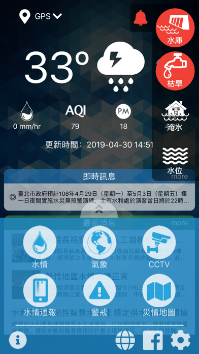
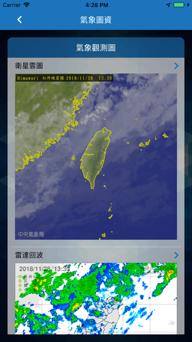
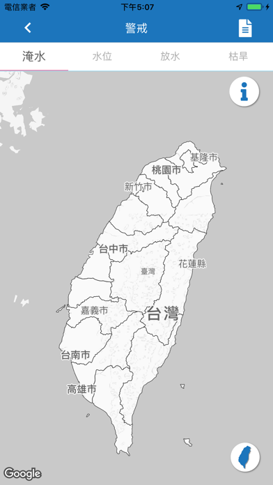
防災資訊hold的住、居家生活安心住 照過來,照過來~~~ 害怕忽然之間的淹水,淹掉你心愛的車子嗎?每當豪大雨時,擔心忽然間的淹水,會淹到你家附近嗎? 現在可以高枕無憂,安心睡覺。水利署提早告訴你,可能發生的淹水災情, 只要你透過智慧型手機上網,輸入「行動水情」。即可快速下載,水利署所提供的最新手機App服務。 一個巴掌大的小天地,就能讓您隨時隨地掌握即時防災資訊, 請給自己一個保障、一個擔當 保護您與家人的生命財產安全!
App details
What you can learn from 行動水情
Every shipping app on the App Store has gone through the same decisions you're working through right now: which screenshot goes first, what caption sits over it, which device frame to show, what color the background should be. The 8 screenshots above are 行動水情's answers to those questions — they're public, they're real, and they made it through Apple's review.
What the numbers say: 行動水情 runs a mixed light-and-dark set where the background shifts from screenshot to screenshot (first shot #04D4FC) — each image has to stand on its own, so the captions carry more of the story. The accent colour we picked up, #6CD4FC, is the one to reuse for badges, arrows and highlighted words if you borrow this look. Hit Use this style to open the editor with these exact colours and drop your own screenshot in.
Notice the first screenshot in particular. It's the one users see in search results and on the product page, and it's where most apps spend their best caption and tightest design. Look at the proportion of background to phone, where the text sits, what one thing the image is trying to communicate.
Want to see how other Weather apps approach the same problem? Browse more Weather apps in the showcase.
Take what works into your own screenshots
Open LaunchShots and design your App Store & Google Play screenshots — pick a device frame, drop captions, ship in minutes. Free, in your browser.
Open the screenshot editor →Apps with a similar look
Closest background + accent colours among the listings we've analysed — useful when you want to see the same palette handled by a different team.