Chart position — tracked daily by LaunchShots
Screenshot style breakdown
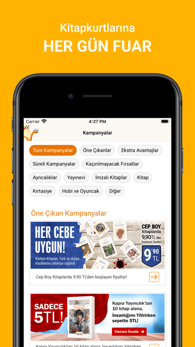
Sampled from 6 of Kitapyurdu's App Store screenshots — background, accent and theme, measured by LaunchShots (not something Apple publishes).
#FCB404 bg
#DD9E03
#0C345C accent
#111111 text
Reading the caption text from the screenshots in your browser…
Screenshots




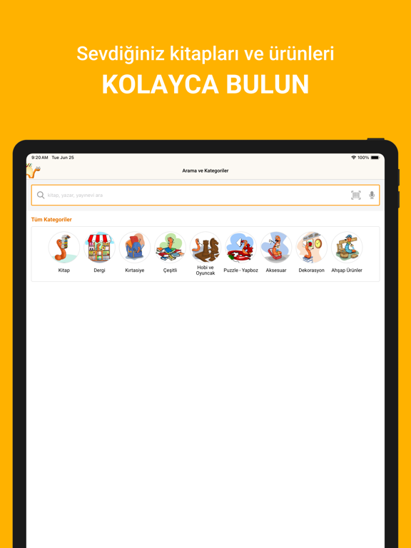
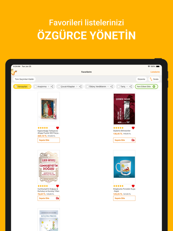
iPad screenshots



Icon palette
About this app
Kitapyurdu – Kitapkurtlarının Buluşma Noktası! Türkiye’nin En Çok Tercih Edilen Kitap Uygulaması Kitapyurdu, 2000 yılından bu yana Türkiye'nin önde gelen online kitapçısı olarak, 3.000'den fazla yayınevi ve geniş ürün yelpazesi sunar. Kullanıcı Dostu Arama ve Keşfetme Deneyimi Yenilikçi ve kullanıcı dostu Kitapyurdu uygulamasıyla kitap severlerin dünyasına adım atın. Kullanıcı dostu arayüzümüz, hızlı arama özellikleri ve etkileyici görsellerle desteklenen kategorilere göz atarak ilgi alanınıza uygun kitapları bulmanızı sağlar. Kitap okumayı ve keşfetmeyi kolaylaştıran uygulamamız, okurların gerçek deneyimlerini yansıtan zengin ve onaylı kullanıcı yorumları ile en iyi kitapları bulmanızı sağlar. Favorilerinizi Belirleyin ve Yönetin Favori etiketlerinizi düzenleyerek favori listenizi dilediğiniz gibi özelleştirebilirsiniz. Örneğin ödünç aldığınız veya ödünç verdiğiniz kitaplar için et…
App details
What you can learn from Kitapyurdu
Every shipping app on the App Store has gone through the same decisions you're working through right now: which screenshot goes first, what caption sits over it, which device frame to show, what color the background should be. The 20 screenshots above are Kitapyurdu's answers to those questions — they're public, they're real, and they made it through Apple's review.
What the numbers say: Kitapyurdu runs a light set with one background colour (#FCB404) carried across every screenshot — the listing reads as a single poster when the shots sit side by side in search results. The accent colour we picked up, #0C345C, is the one to reuse for badges, arrows and highlighted words if you borrow this look. Hit Use this style to open the editor with these exact colours and drop your own screenshot in.
Notice the first screenshot in particular. It's the one users see in search results and on the product page, and it's where most apps spend their best caption and tightest design. Look at the proportion of background to phone, where the text sits, what one thing the image is trying to communicate.
Want to see how other Shopping apps approach the same problem? Browse more Shopping apps in the showcase.
Take what works into your own screenshots
Open LaunchShots and design your App Store & Google Play screenshots — pick a device frame, drop captions, ship in minutes. Free, in your browser.
Open the screenshot editor →Apps with a similar look
Closest background + accent colours among the listings we've analysed — useful when you want to see the same palette handled by a different team.