Screenshot style breakdown
Sampled from 3 of 写真ぷるぷる's App Store screenshots — background, accent and theme, measured by LaunchShots (not something Apple publishes).
#040404 bg
#272727
#742414 accent
#FFFFFF text
Screenshots
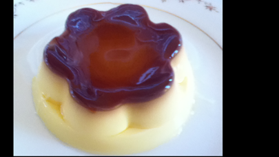
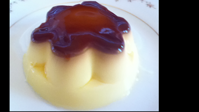
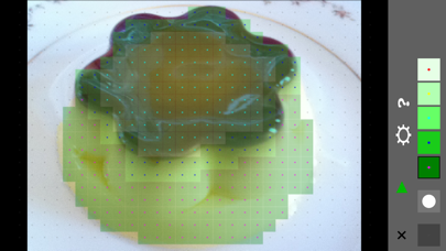
iPad screenshots
Icon palette
About this app
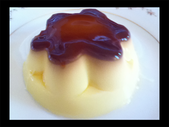
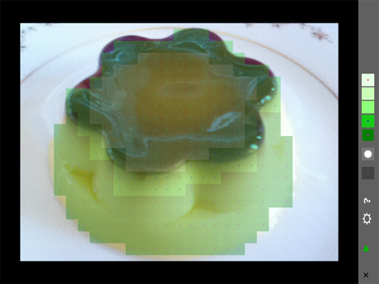
お手持ちの写真やWebから取得した画像の好きな部分をゆらして楽しむ揺れアプリです。 ゆらしたい部分を指定して、その部分を設定によりぷるぷる、ぷるん、ぷるんぷるんとゆらせます。 ゆらし方は「iPhoneを振る•傾ける」「画像をひっぱる」「背景を動かす」の3種類。 繊細なゆれ方をするので優しくゆらしてください。 ※ iPhone最強の写真揺れアプリを目指してます。よろしくお願いします@ ◇使い方 1.ゆらしたいイメージを選ぶ 2.ゆらす範囲と柔らかさを指定 3.揺らす ◇気持ちよくゆらすコツ 1.揺らしたいモノによって柔らかさを調整しよう 2.揺らし方を色々試そう ◇仕組み 繊細な揺れを再現するためバネ格子振動という物理シミュレーションをしています。 これによりゼリーのようなぷよんぷよんな揺れをお楽しみいただけます。 ◇機能 1.一覧から写真•画像を選ぶ ①写真を選ぶ ②アルバムから写真を選び一覧に追加 ③写真を撮り一覧に追加 2.ゆらす部分の設定 ①柔らかさの指定 ②ゆらす部分の範囲指定 ③設定したゆらす範囲指定のクリア …
App details
What you can learn from 写真ぷるぷる
Every shipping app on the App Store has gone through the same decisions you're working through right now: which screenshot goes first, what caption sits over it, which device frame to show, what color the background should be. The 6 screenshots above are 写真ぷるぷる's answers to those questions — they're public, they're real, and they made it through Apple's review.
What the numbers say: 写真ぷるぷる runs a dark set with one background colour (#040404) carried across every screenshot — the listing reads as a single poster when the shots sit side by side in search results. The accent colour we picked up, #742414, is the one to reuse for badges, arrows and highlighted words if you borrow this look. Hit Use this style to open the editor with these exact colours and drop your own screenshot in.
Notice the first screenshot in particular. It's the one users see in search results and on the product page, and it's where most apps spend their best caption and tightest design. Look at the proportion of background to phone, where the text sits, what one thing the image is trying to communicate.
Want to see how other Photo & Video apps approach the same problem? Browse more Photo & Video apps in the showcase.
Take what works into your own screenshots
Open LaunchShots and design your App Store & Google Play screenshots — pick a device frame, drop captions, ship in minutes. Free, in your browser.
Open the screenshot editor →Apps with a similar look
Closest background + accent colours among the listings we've analysed — useful when you want to see the same palette handled by a different team.