Chart position — tracked daily by LaunchShots
Screenshot style breakdown
Sampled from 5 of にゃんこ大戦争's App Store screenshots — background, accent and theme, measured by LaunchShots (not something Apple publishes).
#DCDCD4 bg
#C1C1BA
#C4743C accent
#111111 text
Screenshots

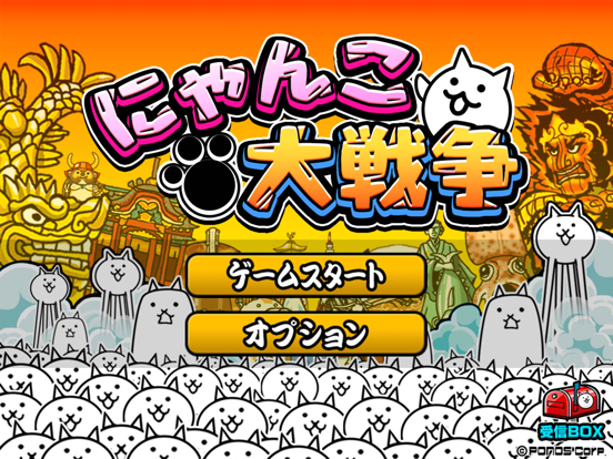
iPad screenshots
Icon palette
About this app
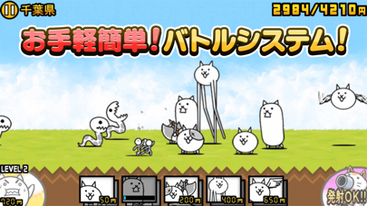
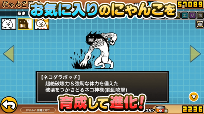
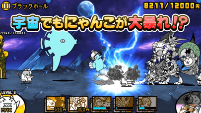
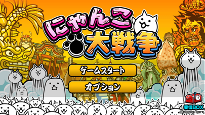
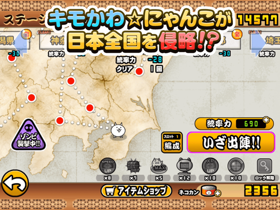
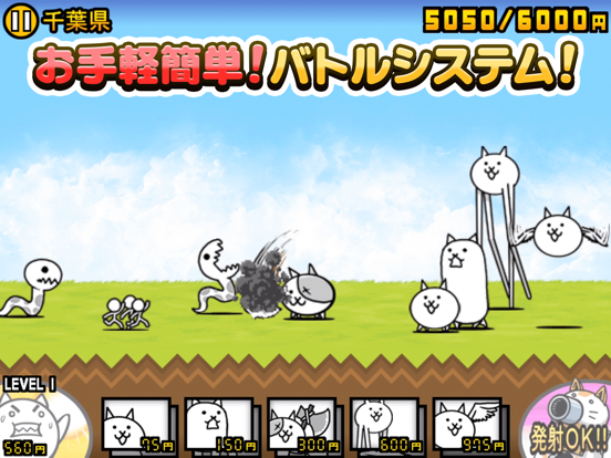
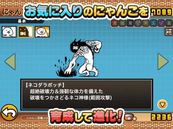
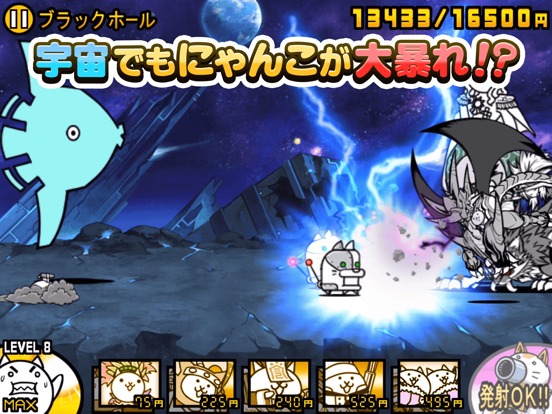
にゃんこ大戦争は全世界累計1億2000万DL達成! 世界中で大人気! 誰でもお手軽プレイ!! にゃんこバトルゲーム!! 「キモかわにゃんこ」が日本を、未来を、 宇宙の果てまで侵略中! 以前、遊んでいた人も新たに始めるチャンス!! ◆ルールは簡単!シンプルバトル!◆ 好きなにゃんこをタップして出撃!! 一撃必殺「にゃんこ砲」で大逆転!! 敵のお城を攻め落としたら勝利!! クリア出来ないステージも ググればだいたい攻略法が見つかる!! ◆自分のペースでゆったり楽しめる◆ このゲームはあなたとにゃんこだけのもの!! どこの馬の骨とも分からないフレンドは居ない!! あなたのペースでにゃんこと侵略を進めよう!! ◆キモく、かわいく、美しく◆ あなたの想像を超えたにゃんこ達が登場!! 予想外に進化するにゃんこ達を見届けよう!! にゃんこの世界を覗き見れる にゃんこ図鑑も要チェック!! ◆便利な機能続々追加!◆ 一度クリアしたステージの編成を保存 統率力回復アイテム「リーダーシップ」 ゾンビ襲来お知らせ機能 ゲリラステージの通知機能 以前に遊んでいた人もウェルカ…
App details
What you can learn from にゃんこ大戦争
Every shipping app on the App Store has gone through the same decisions you're working through right now: which screenshot goes first, what caption sits over it, which device frame to show, what color the background should be. The 10 screenshots above are にゃんこ大戦争's answers to those questions — they're public, they're real, and they made it through Apple's review.
What the numbers say: にゃんこ大戦争 runs a mixed light-and-dark set where the background shifts from screenshot to screenshot (first shot #DCDCD4) — each image has to stand on its own, so the captions carry more of the story. The accent colour we picked up, #C4743C, is the one to reuse for badges, arrows and highlighted words if you borrow this look. Hit Use this style to open the editor with these exact colours and drop your own screenshot in.
Notice the first screenshot in particular. It's the one users see in search results and on the product page, and it's where most apps spend their best caption and tightest design. Look at the proportion of background to phone, where the text sits, what one thing the image is trying to communicate.
Want to see how other Games apps approach the same problem? Browse more Games apps in the showcase.
Take what works into your own screenshots
Open LaunchShots and design your App Store & Google Play screenshots — pick a device frame, drop captions, ship in minutes. Free, in your browser.
Open the screenshot editor →Apps with a similar look
Closest background + accent colours among the listings we've analysed — useful when you want to see the same palette handled by a different team.