Chart position — tracked daily by LaunchShots
Screenshot style breakdown
Sampled from 6 of 豆瓣阅读's App Store screenshots — background, accent and theme, measured by LaunchShots (not something Apple publishes).
#FCD4DC bg
#DDBAC1
#14445C accent
#111111 text
Screenshots
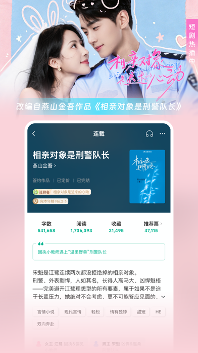
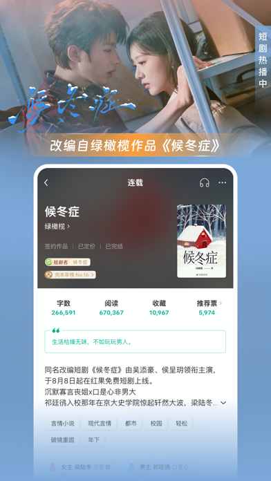

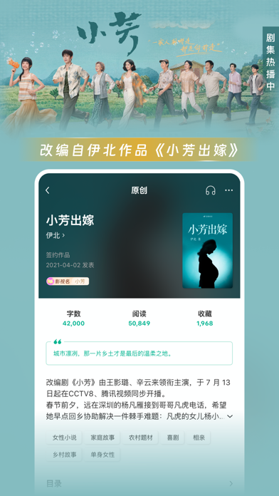


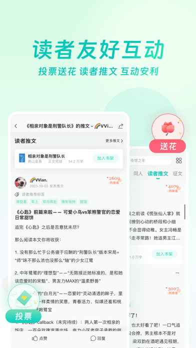
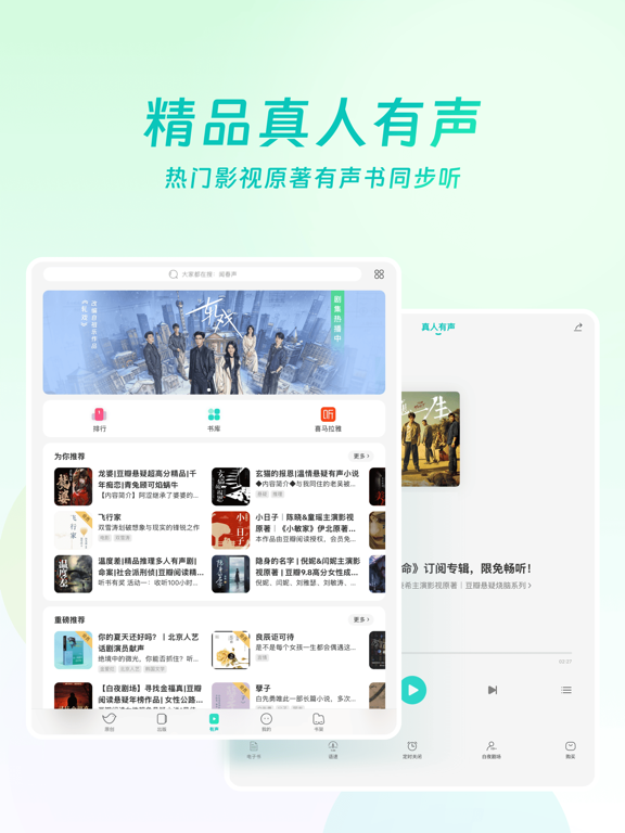
iPad screenshots
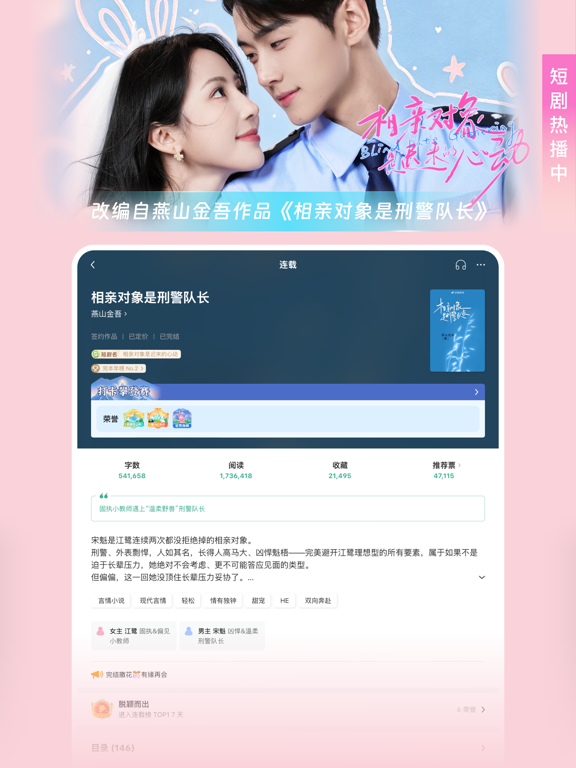
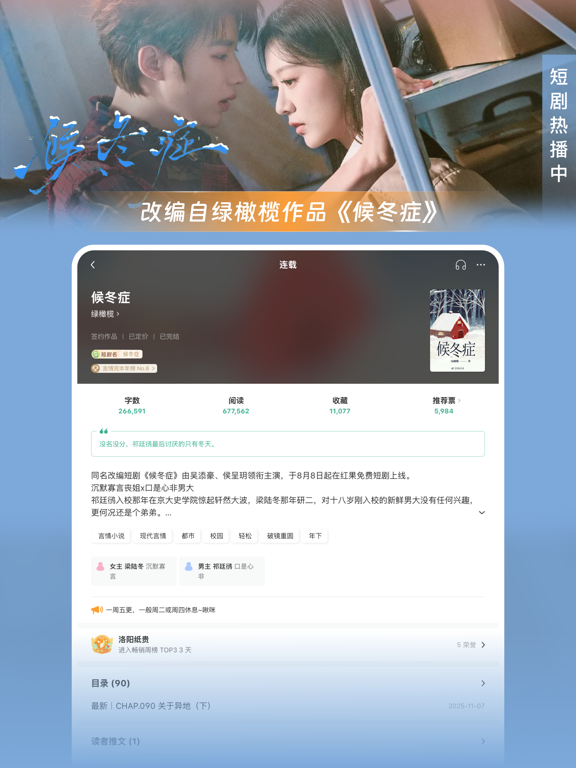
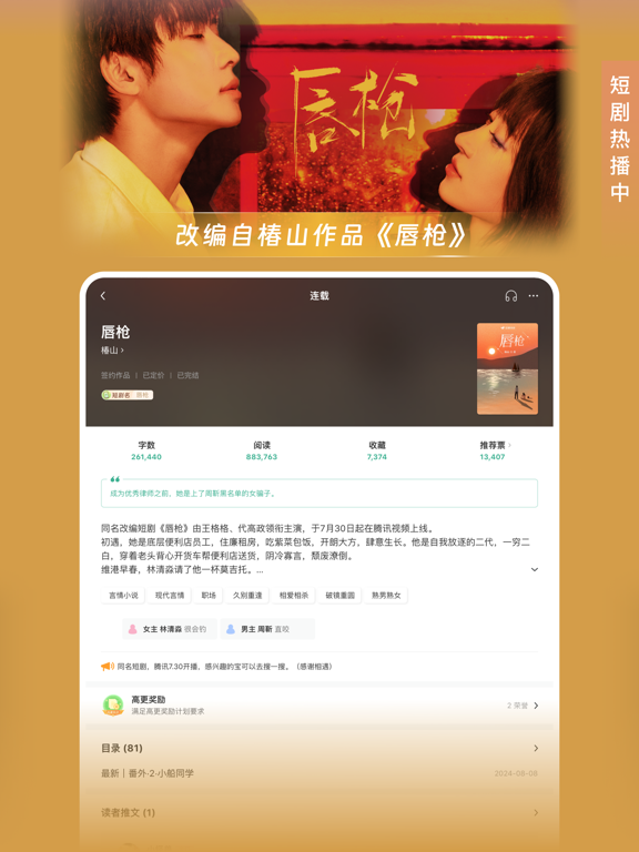
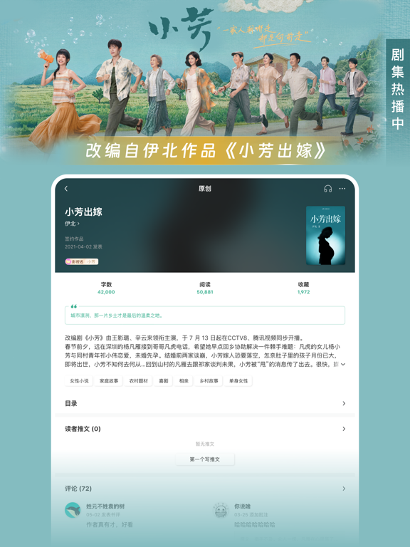



Icon palette
About this app
豆瓣,你的书影音世界。 豆瓣阅读,你的小说世界。 豆瓣阅读是豆瓣旗下的优质类型小说平台。 我们主打悬疑、女性、幻想、文艺、历史等类型,强调文学性和流行性的结合,打造「看的时候停不下来,看过之后回味再三」的精品小说。 豆瓣阅读是一个活跃的创作者与读者交流的社区。在这里,可以与更多豆瓣好友进行深入的讨论与交流。对喜欢的作品和作者,可以关注、订阅、评论、送花。 在豆瓣阅读里,你可以—— 读到优质小说 • 悬疑、女性、幻想、文艺、历史五大频道,拥有豆瓣评分 8.0 以上的优质小说,经过豆瓣读者数据检验。 • 绝对原创,每月新作 9000+,超过半数作品免费阅读。来自当下最优秀的青年创作者。 • 近 10 万种经过精细排版的正版电子图书,包括中信、读客、果麦、磨铁等多家著名出版社。 订阅作者长篇连载 • 订阅:专栏和连载有更新,第一时间提醒。 • 送花:给你爱的作品送花,帮助它成为花神。 • 批注:可以对书中的任何一个细节进行批注。豆瓣阅读每月新增批注 60000+,读到书友们令人叫绝的批注,是使用豆瓣阅读特有的乐趣。 • 评论:在豆瓣阅读评论…
App details
What you can learn from 豆瓣阅读
Every shipping app on the App Store has gone through the same decisions you're working through right now: which screenshot goes first, what caption sits over it, which device frame to show, what color the background should be. The 20 screenshots above are 豆瓣阅读's answers to those questions — they're public, they're real, and they made it through Apple's review.
What the numbers say: 豆瓣阅读 runs a mixed light-and-dark set where the background shifts from screenshot to screenshot (first shot #FCD4DC) — each image has to stand on its own, so the captions carry more of the story. The accent colour we picked up, #14445C, is the one to reuse for badges, arrows and highlighted words if you borrow this look. Hit Use this style to open the editor with these exact colours and drop your own screenshot in.
Notice the first screenshot in particular. It's the one users see in search results and on the product page, and it's where most apps spend their best caption and tightest design. Look at the proportion of background to phone, where the text sits, what one thing the image is trying to communicate.
Want to see how other Book apps approach the same problem? Browse more Book apps in the showcase.
Take what works into your own screenshots
Open LaunchShots and design your App Store & Google Play screenshots — pick a device frame, drop captions, ship in minutes. Free, in your browser.
Open the screenshot editor →Apps with a similar look
Closest background + accent colours among the listings we've analysed — useful when you want to see the same palette handled by a different team.