Chart position — tracked daily by LaunchShots
Screenshot style breakdown
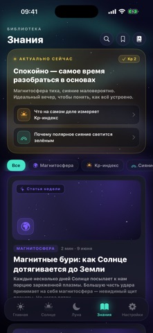
Sampled from 5 of Solar Weather's App Store screenshots — background, accent and theme, measured by LaunchShots (not something Apple publishes).
#141424 bg
#343442
#F4CC3C accent
#FFFFFF text
Screenshots



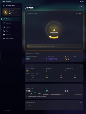
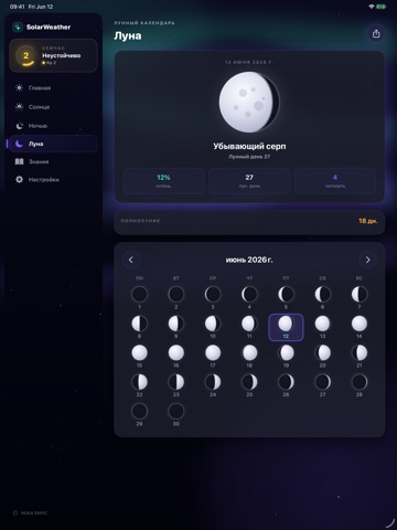
iPad screenshots


Icon palette
About this app
Solar Weather приносит мониторинг космической погоды в реальном времени прямо в ваш карман. Следите за планетарным Kp-индексом, прогнозируйте магнитные бури и наблюдайте за фазами Луны — всё в одном красиво оформленном приложении. СОЛНЕЧНЫЙ ВЕТЕР Смотрите за солнечным ветром, который всё это запускает, — скорость, а также важнейшее магнитное поле Bz и Bt прямо со спутника NOAA DSCOVR и тренд Bz за 24 часа. Южный Bz — самый ранний признак того, что зарождаются буря и сияние. ШКАЛЫ БУРЬ NOAA Следите за тремя официальными шкалами NOAA с одного взгляда — геомагнитные бури (G), солнечные радиационные бури (S) и радиосбои (R) — с прогнозом на 3 дня. Включите оповещения о радиационных бурях и радиосбоях. KP-ИНДЕКС В РЕАЛЬНОМ ВРЕМЕНИ Отслеживайте текущий уровень геомагнитной активности по наглядной шкале от 0 до 9 с цветовой индикацией состояния. Смотрите почасовые графики за последние 24 ча…
App details
What you can learn from Solar Weather
Every shipping app on the App Store has gone through the same decisions you're working through right now: which screenshot goes first, what caption sits over it, which device frame to show, what color the background should be. The 9 screenshots above are Solar Weather's answers to those questions — they're public, they're real, and they made it through Apple's review.
What the numbers say: Solar Weather runs a dark set with one background colour (#141424) carried across every screenshot — the listing reads as a single poster when the shots sit side by side in search results. The accent colour we picked up, #F4CC3C, is the one to reuse for badges, arrows and highlighted words if you borrow this look. Hit Use this style to open the editor with these exact colours and drop your own screenshot in.
Notice the first screenshot in particular. It's the one users see in search results and on the product page, and it's where most apps spend their best caption and tightest design. Look at the proportion of background to phone, where the text sits, what one thing the image is trying to communicate.
Want to see how other Weather apps approach the same problem? Browse more Weather apps in the showcase.
Take what works into your own screenshots
Open LaunchShots and design your App Store & Google Play screenshots — pick a device frame, drop captions, ship in minutes. Free, in your browser.
Open the screenshot editor →Apps with a similar look
Closest background + accent colours among the listings we've analysed — useful when you want to see the same palette handled by a different team.