Chart position — tracked daily by LaunchShots
Screenshot changes — detected by LaunchShots
Screenshot style breakdown
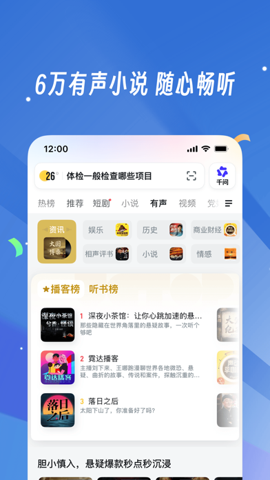
Sampled from 6 of UC浏览器-随心搜·畅快看's App Store screenshots — background, accent and theme, measured by LaunchShots (not something Apple publishes).
#3474D4 bg
#5087DA
#84ACEC accent
#FFFFFF text
Screenshots
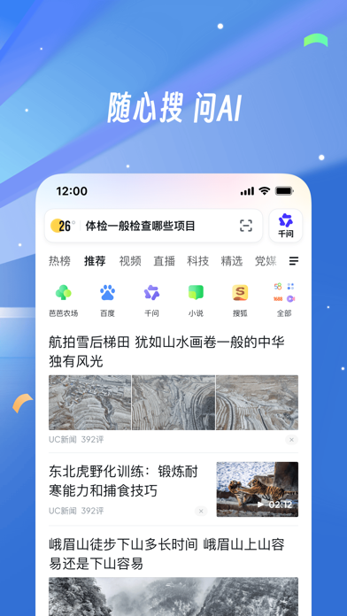
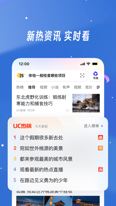
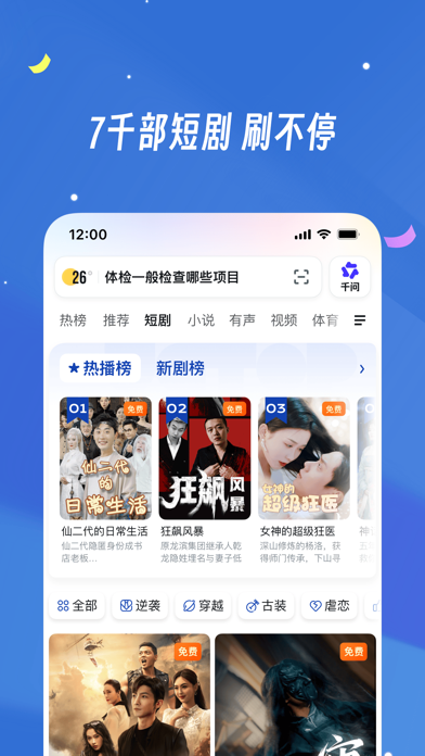

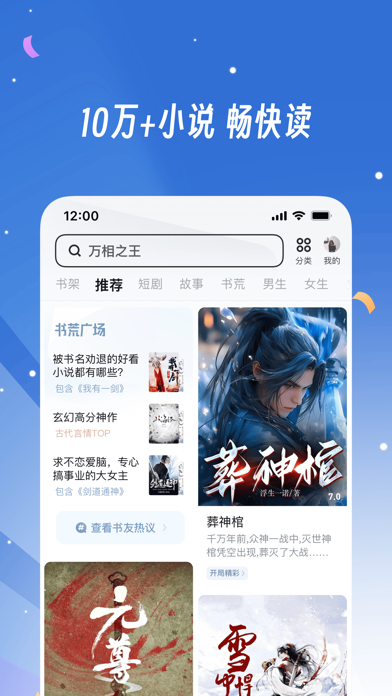


Icon palette
About this app
UC专注浏览器22年,成为全球主流第三方手机浏览器。有全面、精准的头条资讯,以及实时搜索热榜,可随时了解身边事。更有精彩视频、丰富小说、多种娱乐,放松不止一刻。 丰富功能包罗万象,让你爱不释手。 【头条资讯】 精选头条资讯,热点资讯实时推荐,细分视频、科技、数码、娱乐、体育、游戏、动漫、财经,类型丰富内容齐全,还可实时查收用户热评。 【搜索热榜】 搜索热榜细分24小时榜、视频榜,全面实时了解新鲜事,还可查看评论,看大家讨论新鲜事情。 【海量视频】 各类热门短视频、小视频实时更新,美食、探店、音乐、影视、经典怀旧视频,看个不停,还能记录身边事,跟网友分享快乐时刻。 【精品小说】 超多精品小说看不停,热门推荐、男生专区、女生专区、火热人气榜、完结热榜,快速进入小说模式,沉浸式阅读,尽享免费小说阅读乐趣 【智能搜索】 资讯,精美图片,生活小窍门,健康小知识,全网一搜即得。 【来自用户的心声】 从功能智能手机就一直在使用的浏览器,非常的好用,也一路见证了它的成长。虽然功能越来越强大,但使用过程中还是很轻量的——呼…
App details
What you can learn from UC浏览器-随心搜·畅快看
Every shipping app on the App Store has gone through the same decisions you're working through right now: which screenshot goes first, what caption sits over it, which device frame to show, what color the background should be. The 8 screenshots above are UC浏览器-随心搜·畅快看's answers to those questions — they're public, they're real, and they made it through Apple's review.
What the numbers say: UC浏览器-随心搜·畅快看 runs a dark set with one background colour (#3474D4) carried across every screenshot — the listing reads as a single poster when the shots sit side by side in search results. The accent colour we picked up, #84ACEC, is the one to reuse for badges, arrows and highlighted words if you borrow this look. Hit Use this style to open the editor with these exact colours and drop your own screenshot in.
Notice the first screenshot in particular. It's the one users see in search results and on the product page, and it's where most apps spend their best caption and tightest design. Look at the proportion of background to phone, where the text sits, what one thing the image is trying to communicate.
Want to see how other Utilities apps approach the same problem? Browse more Utilities apps in the showcase.
Take what works into your own screenshots
Open LaunchShots and design your App Store & Google Play screenshots — pick a device frame, drop captions, ship in minutes. Free, in your browser.
Open the screenshot editor →Apps with a similar look
Closest background + accent colours among the listings we've analysed — useful when you want to see the same palette handled by a different team.