Chart position — tracked daily by LaunchShots
Screenshot style breakdown
Sampled from 6 of Дом PRO - банк недвижимости's App Store screenshots — background, accent and theme, measured by LaunchShots (not something Apple publishes).
#343C44 bg
#50575E
#04B474 accent
#FFFFFF text
Screenshots


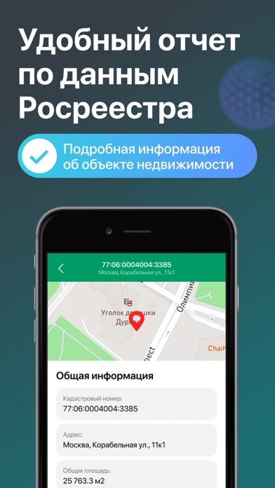

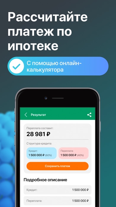

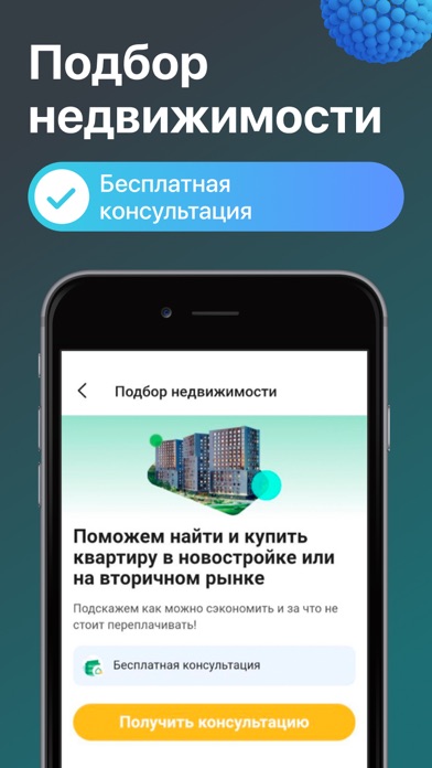
iPad screenshots


Icon palette
About this app
Дом PRO - банк недвижимости - это удобное мобильное приложение для покупки и проверки недвижимости в России. Независимо от того, ищете ли вы квартиру, дом или коммерческую недвижимость, приложение предоставляет вам доступ к обширной бесплатной базе объявлений о недвижимости в вашем регионе. Основные возможности приложения включают: 1. Удобный поиск недвижимости по различным параметрам. Вы можете настроить поиск с учетом вашего бюджета, желаемой площади, числа комнат и других важных критериев. Например, пользователь ищет 2-комнатную квартиру в центре Москвы с площадью не менее 60 квадратных метров и ценой до 10 миллионов рублей. 2. Простой процесс просмотра объявлений. Приложение предоставляет подробную информацию о каждой квартире, включая фотографии, планировки и особенности помещения. Например, пользователь может просмотреть фотографии интерьера квартиры, вид на окрестности и …
App details
What you can learn from Дом PRO - банк недвижимости
Every shipping app on the App Store has gone through the same decisions you're working through right now: which screenshot goes first, what caption sits over it, which device frame to show, what color the background should be. The 16 screenshots above are Дом PRO - банк недвижимости's answers to those questions — they're public, they're real, and they made it through Apple's review.
What the numbers say: Дом PRO - банк недвижимости runs a dark set where the background shifts from screenshot to screenshot (first shot #343C44) — each image has to stand on its own, so the captions carry more of the story. The accent colour we picked up, #04B474, is the one to reuse for badges, arrows and highlighted words if you borrow this look. Hit Use this style to open the editor with these exact colours and drop your own screenshot in.
Notice the first screenshot in particular. It's the one users see in search results and on the product page, and it's where most apps spend their best caption and tightest design. Look at the proportion of background to phone, where the text sits, what one thing the image is trying to communicate.
Want to see how other Reference apps approach the same problem? Browse more Reference apps in the showcase.
Take what works into your own screenshots
Open LaunchShots and design your App Store & Google Play screenshots — pick a device frame, drop captions, ship in minutes. Free, in your browser.
Open the screenshot editor →Apps with a similar look
Closest background + accent colours among the listings we've analysed — useful when you want to see the same palette handled by a different team.