Chart position — tracked daily by LaunchShots
Screenshot style breakdown
Sampled from 6 of 鳥貴族公式アプリ's App Store screenshots — background, accent and theme, measured by LaunchShots (not something Apple publishes).
#F4CC14 bg
#D6B311
#B41C24 accent
#111111 text
Screenshots

Icon palette
About this app
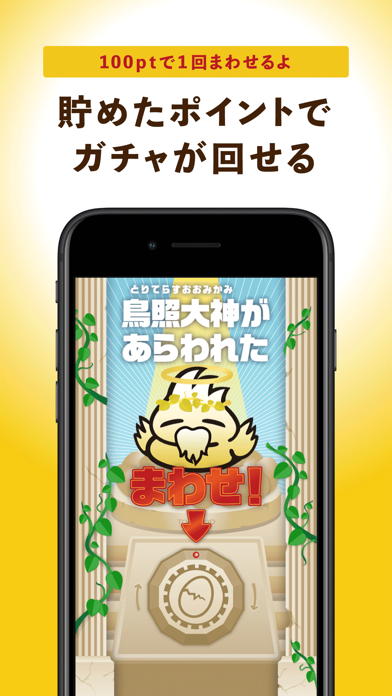
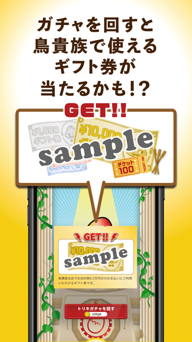
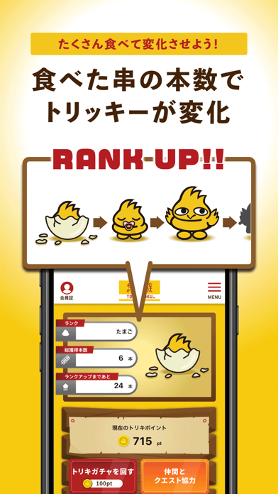
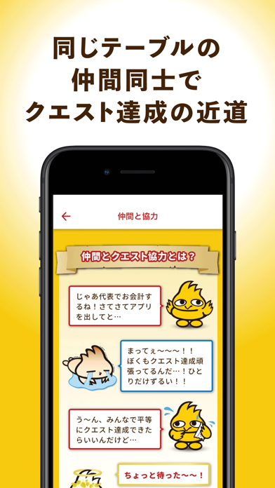
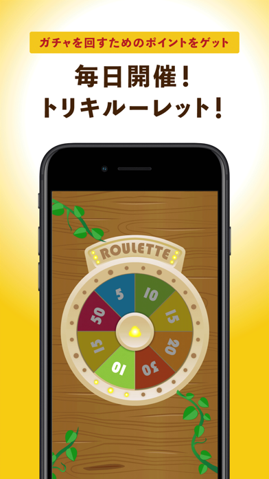
鳥貴族を、より一層好きになってもらいたいという想いからできたアプリです。 イベント・新メニュー情報の配信や、店舗検索などの提供はもちろん、遊びながらお得なギフト券がGETできる機能を搭載。 毎日開いて、ポイント貯めて、ガチャを回してお得なギフト券をGETしてください。 本アプリでは、ルーレットや一定の条件を満たす事で、トリキポイントを入手する事が出来ます。 このポイントを使って、トリキガチャが回せます。ガチャではお店で使えるお得なギフト券が当たります。 ※主な機能 ■名誉ランク 鳥貴族のキャラクター「トリッキー」が成長するランキング。 ご飲食いただいた串本数で、トリッキーが成長していきます。 ■トリキポイント アプリ内にある「トリキガチャ」を回すためのポイントです。 入手方法 ・毎日1回のトリキルーレット ・クエスト条件の達成 ■トリキガチャ アプリ内にあるトリキポイントを消費して回す事ができる無料ガチャです。 確率で1等~4等までの景品が当たります。 ■トリキルーレット 毎日1回ま…
App details
What you can learn from 鳥貴族公式アプリ
Every shipping app on the App Store has gone through the same decisions you're working through right now: which screenshot goes first, what caption sits over it, which device frame to show, what color the background should be. The 6 screenshots above are 鳥貴族公式アプリ's answers to those questions — they're public, they're real, and they made it through Apple's review.
What the numbers say: 鳥貴族公式アプリ runs a light set where the background shifts from screenshot to screenshot (first shot #F4CC14) — each image has to stand on its own, so the captions carry more of the story. The accent colour we picked up, #B41C24, is the one to reuse for badges, arrows and highlighted words if you borrow this look. Hit Use this style to open the editor with these exact colours and drop your own screenshot in.
Notice the first screenshot in particular. It's the one users see in search results and on the product page, and it's where most apps spend their best caption and tightest design. Look at the proportion of background to phone, where the text sits, what one thing the image is trying to communicate.
Want to see how other Food & Drink apps approach the same problem? Browse more Food & Drink apps in the showcase.
Take what works into your own screenshots
Open LaunchShots and design your App Store & Google Play screenshots — pick a device frame, drop captions, ship in minutes. Free, in your browser.
Open the screenshot editor →Apps with a similar look
Closest background + accent colours among the listings we've analysed — useful when you want to see the same palette handled by a different team.