Chart position — tracked daily by LaunchShots
Screenshot style breakdown
Sampled from 6 of VATKALI's App Store screenshots — background, accent and theme, measured by LaunchShots (not something Apple publishes).
#1C1C24 bg
#3B3B42
#CC9C7C accent
#FFFFFF text
Reading the caption text from the screenshots in your browser…
Screenshots



Icon palette
About this app
Vatkalı mobil uygulama ile artık Vatkalı alışverişleri daha zevkli ve daha kolay. Vatkalı, hayatın her anında tasarımı ön planda tutan, fark yaratmayı seven modern ve dinamik metropol kadınına hitap ediyor. Seyahat eden zarif, şık ve bağımsız kadının güçlü karakterinden ve parlak renklerinden ilhan alıyor. Modern dokunuşların ve feminen tavrının yanı sıra zengin kumaş seçenek ve renk tonları ile bir araya gelerek modaya dair kusursuz bir seçki sunmaktadır. • Çekici ve gelişmiş ürün sayfaları ile daha kolay online alışveriş, kolay filtreleme ile aradığınız ürüne rahatça ulaşabilir. Ürün detay görselleri arasında sağ-sol ekran kaydırması ile yeni ürünleri kolayca keşfedebilirsiniz. • Size özel kampanyalardan faydalanabilir. Kişiye özel tanımlanan indirim kuponları ile sezon ürünlerine avantajlı fiyatlarla sahip olabilirsiniz. • Vatkalı Prime hizmeti ile siparişinizi 4 saat içerisinde t…
App details
What you can learn from VATKALI
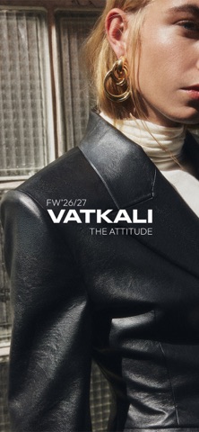
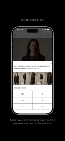
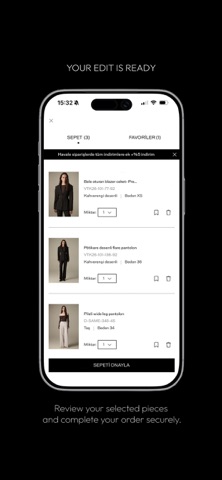
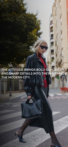
Every shipping app on the App Store has gone through the same decisions you're working through right now: which screenshot goes first, what caption sits over it, which device frame to show, what color the background should be. The 7 screenshots above are VATKALI's answers to those questions — they're public, they're real, and they made it through Apple's review.
What the numbers say: VATKALI runs a dark set with one background colour (#1C1C24) carried across every screenshot — the listing reads as a single poster when the shots sit side by side in search results. The accent colour we picked up, #CC9C7C, is the one to reuse for badges, arrows and highlighted words if you borrow this look. Hit Use this style to open the editor with these exact colours and drop your own screenshot in.
Notice the first screenshot in particular. It's the one users see in search results and on the product page, and it's where most apps spend their best caption and tightest design. Look at the proportion of background to phone, where the text sits, what one thing the image is trying to communicate.
Want to see how other Shopping apps approach the same problem? Browse more Shopping apps in the showcase.
Take what works into your own screenshots
Open LaunchShots and design your App Store & Google Play screenshots — pick a device frame, drop captions, ship in minutes. Free, in your browser.
Open the screenshot editor →Apps with a similar look
Closest background + accent colours among the listings we've analysed — useful when you want to see the same palette handled by a different team.